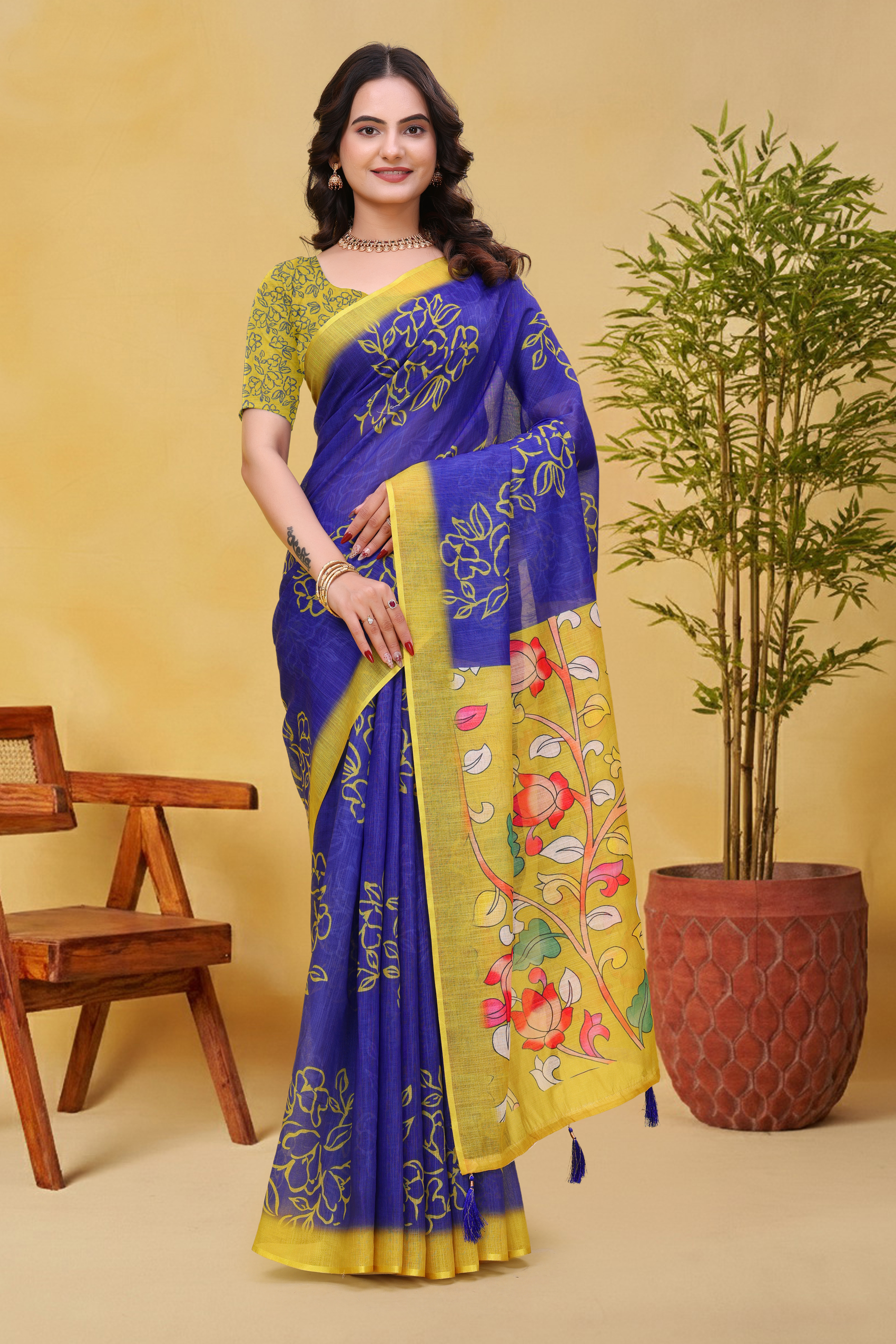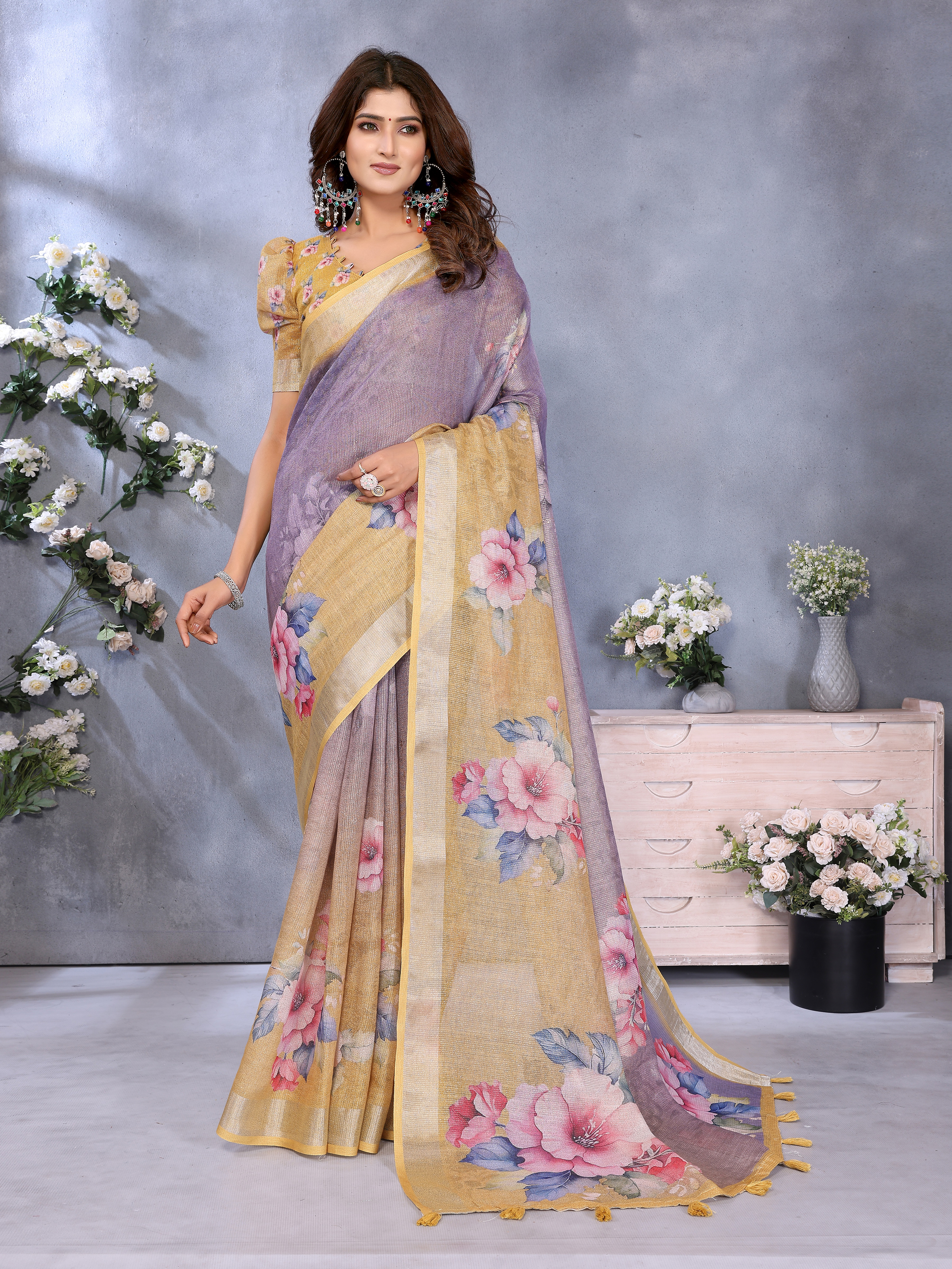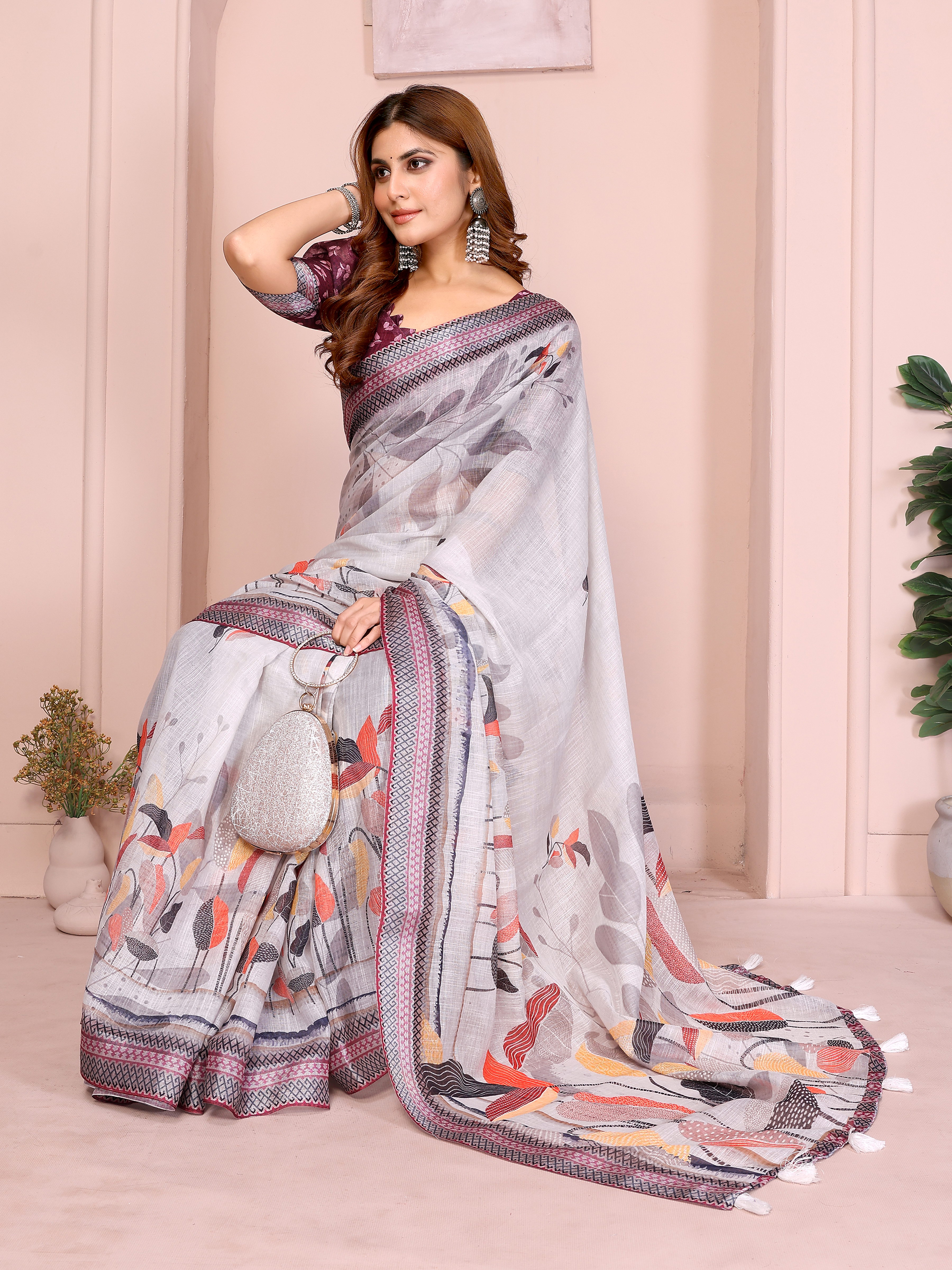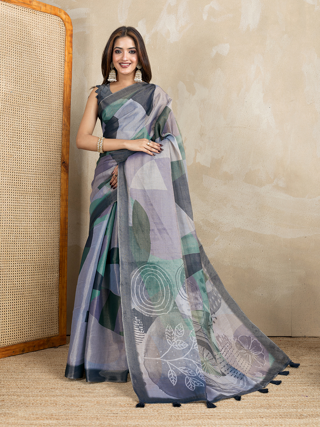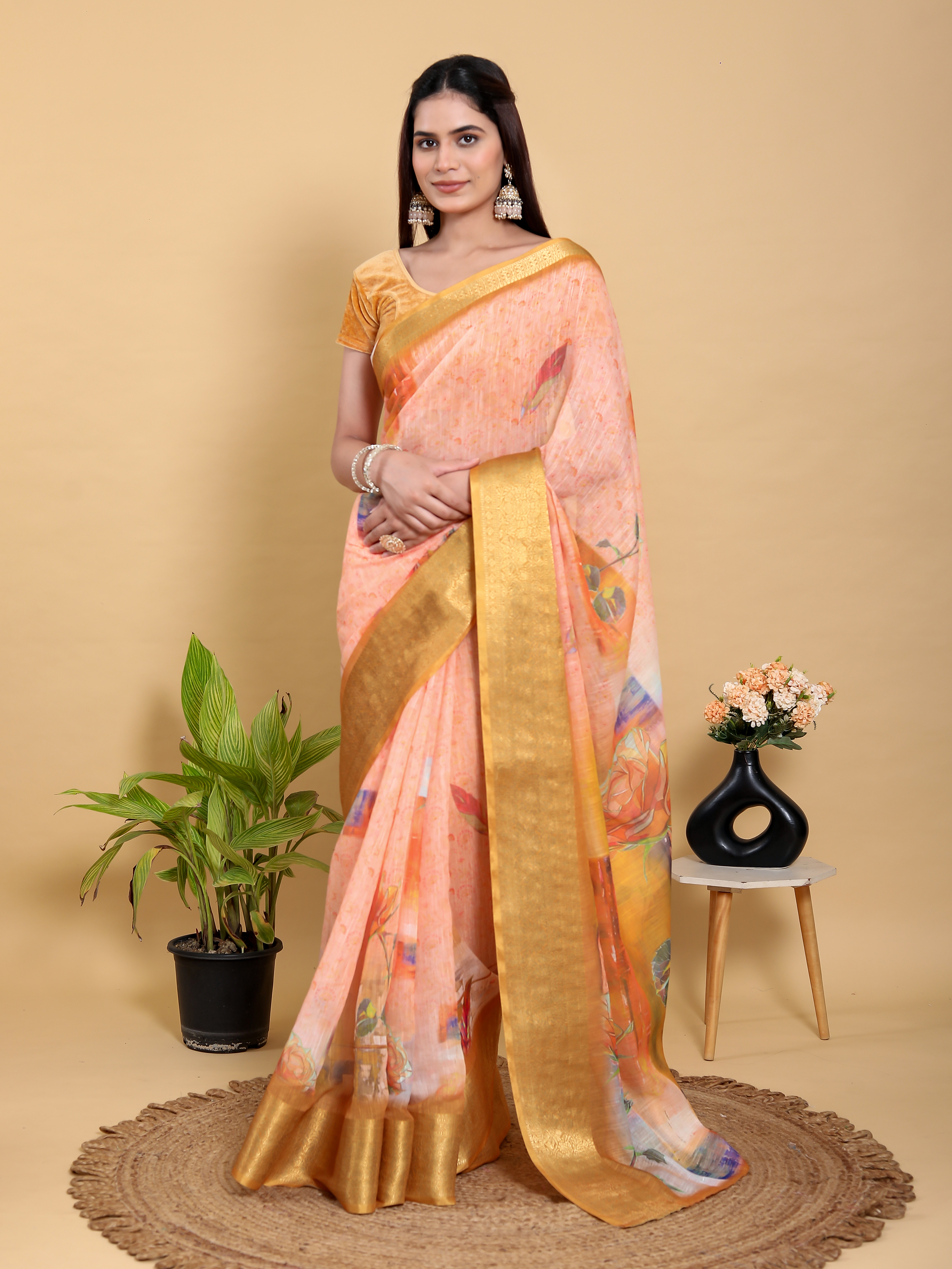
Why Dark Sarees Sometimes Look Lighter in Phone Photos has a practical explanation: a phone camera automatically changes exposure, contrast and colour to make the entire frame look balanced. A deep green saree photographed near a bright window may therefore look mossy, while charcoal linen cotton can look closer to grey than black. The fabric has not necessarily changed; the camera, light source, display and viewing angle have changed how the colour is recorded.
That difference matters when buying sarees online because dark shades show small shifts more visibly than pale shades. A buyer comparing a product photograph with an indoor phone screen may notice differences in depth, warmth or shine without there being a manufacturing problem. Understanding the chain from fabric to camera to screen makes colour decisions more reliable and helps you ask the right questions before ordering.
Why Dark Sarees Sometimes Look Lighter in Phone Photos
Dark sarees sometimes look lighter in phone photos because automatic exposure raises the brightness of shadowed fabric. Smartphone cameras are designed to produce a clear, evenly lit image rather than preserve the exact darkness of every textile.
A camera meter evaluates the whole frame. If a photograph contains a dark saree against a white wall, a pale floor or a bright window, the camera may increase exposure so the background doesn't look washed out. The saree then receives more digital brightness than the eye perceived in the room. Automatic High Dynamic Range, or HDR, can lift dark folds even further by combining several exposures.
Phone image processing also increases local contrast and sharpness. Those adjustments can make zari, jacquard motifs and glossy borders appear brighter against the base colour. A dark fabric with reflective threads may consequently look lighter in a product image than the same fabric under warm indoor lighting.
The reverse can happen under dim yellow light. A phone may reduce exposure to control bright highlights, making a navy or charcoal saree appear almost black. The same saree can look lighter in daylight, darker under a ceiling lamp and slightly bluer on one screen.
How Camera Exposure Changes a Saree's Apparent Colour
Camera exposure changes apparent saree colour by deciding how much light reaches the sensor and how the phone converts that light into pixels. More exposure reveals detail in dark folds, but more exposure doesn't always mean more accurate colour.
Modern phones make several decisions automatically:
- Exposure compensation: The phone brightens an underexposed frame so that dark areas contain visible detail.
- HDR processing: The phone combines bright and dark exposures, often making the saree's shadows look less deep.
- Shadow recovery: Editing software selectively lifts black and charcoal areas without raising every highlight equally.
- White balance: The phone estimates whether the light is warm, cool or neutral and adjusts the colour cast.
- Colour profiles: Saturation and vibrancy algorithms may make green, pink, red or gold appear more vivid.
These processes are useful for people photographs, but textiles contain large uninterrupted areas of colour that expose algorithmic changes. A plain dark saree gives the phone fewer neutral reference points than a room containing skin, wood, walls and paper. The camera can therefore make a reasonable technical correction that still feels visually inaccurate to a shopper.
Product photographs are usually more dependable when the saree is shown beside a neutral white, grey or beige background and in more than one lighting condition. A single close-up can demonstrate weave and border detail, but it should not be treated as the only authority for exact colour.
How Fabric Surface and Weave Affect Phone Images
Fabric surface affects phone images because light reflects from each yarn, fold and finish differently. A matte textile absorbs and scatters light, while a smooth or lustrous textile sends concentrated highlights into the camera.

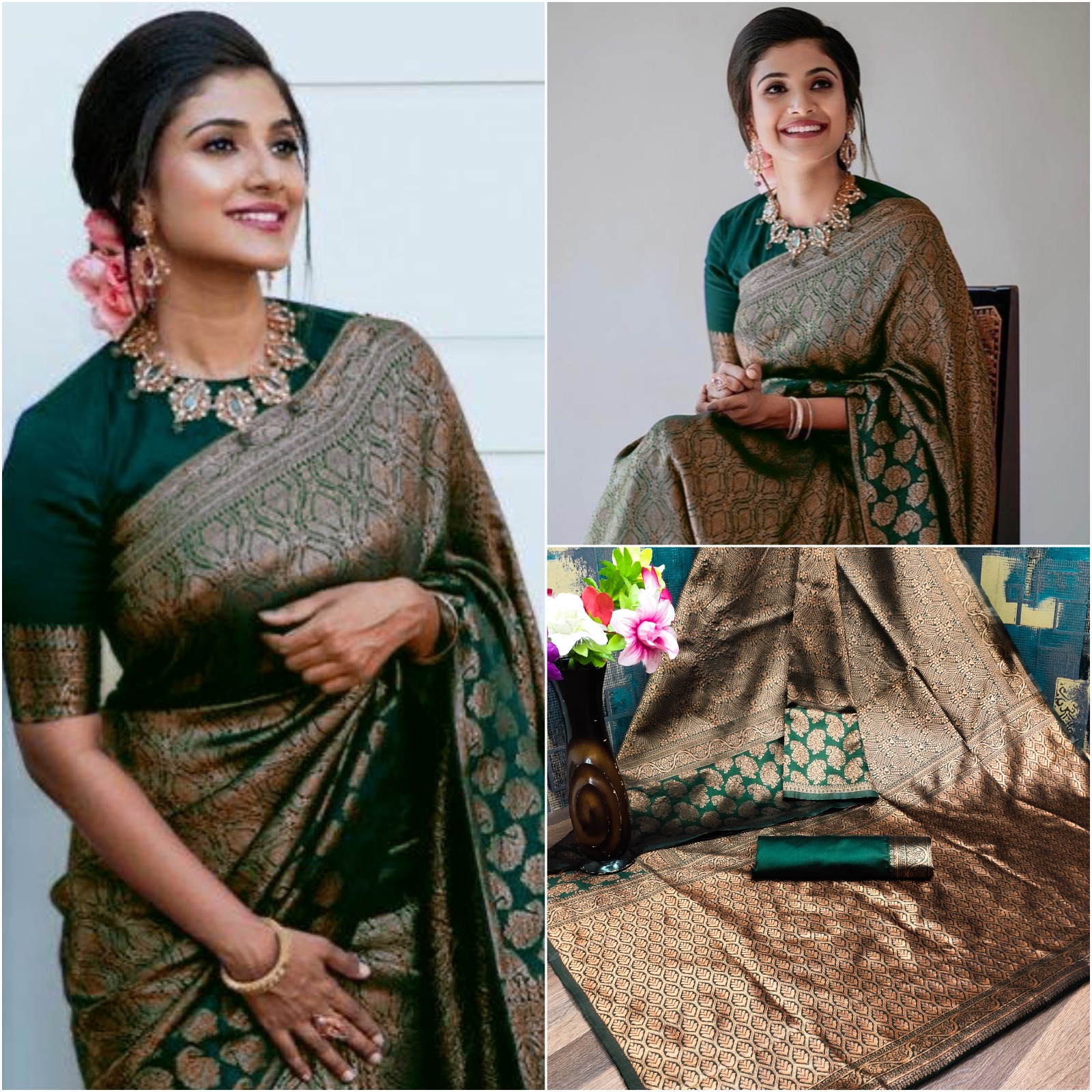
Banarasi silk, satin and silk blends can show a brighter central streak where the weave reflects a window or softbox. A phone may interpret that highlight as the dominant colour, especially when the image is small. Jacquard patterns create another complication: raised motifs reflect more light than the ground, making the dark base appear visually lighter around the design.
The Dark Green Lichi Silk Saree with Rich Golden Jacquard illustrates why a dark base should be assessed separately from its embellishment. Golden jacquard reflects warm light strongly, so the frame may feel greener, warmer and brighter than the unlit green areas. Looking at the broadest uninterrupted portion of the saree gives a better indication of its base shade than looking at the gold motif.
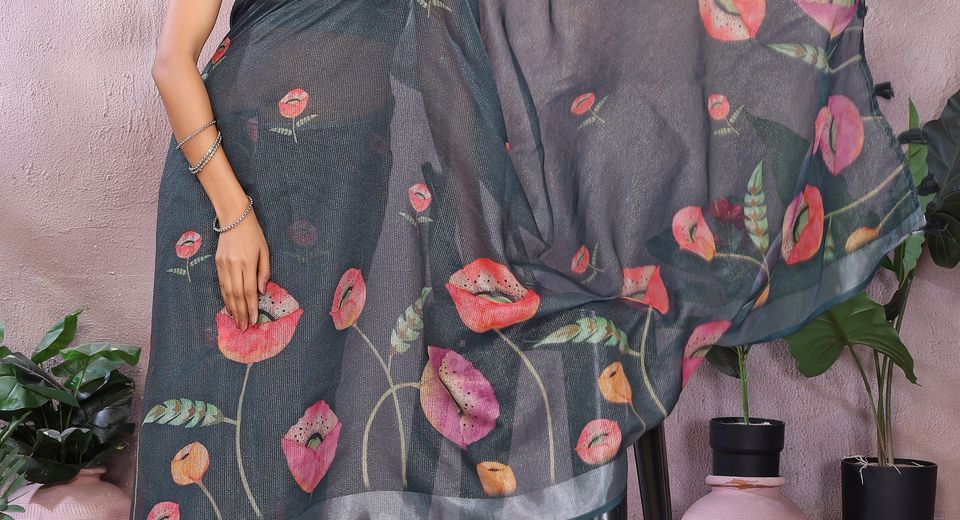
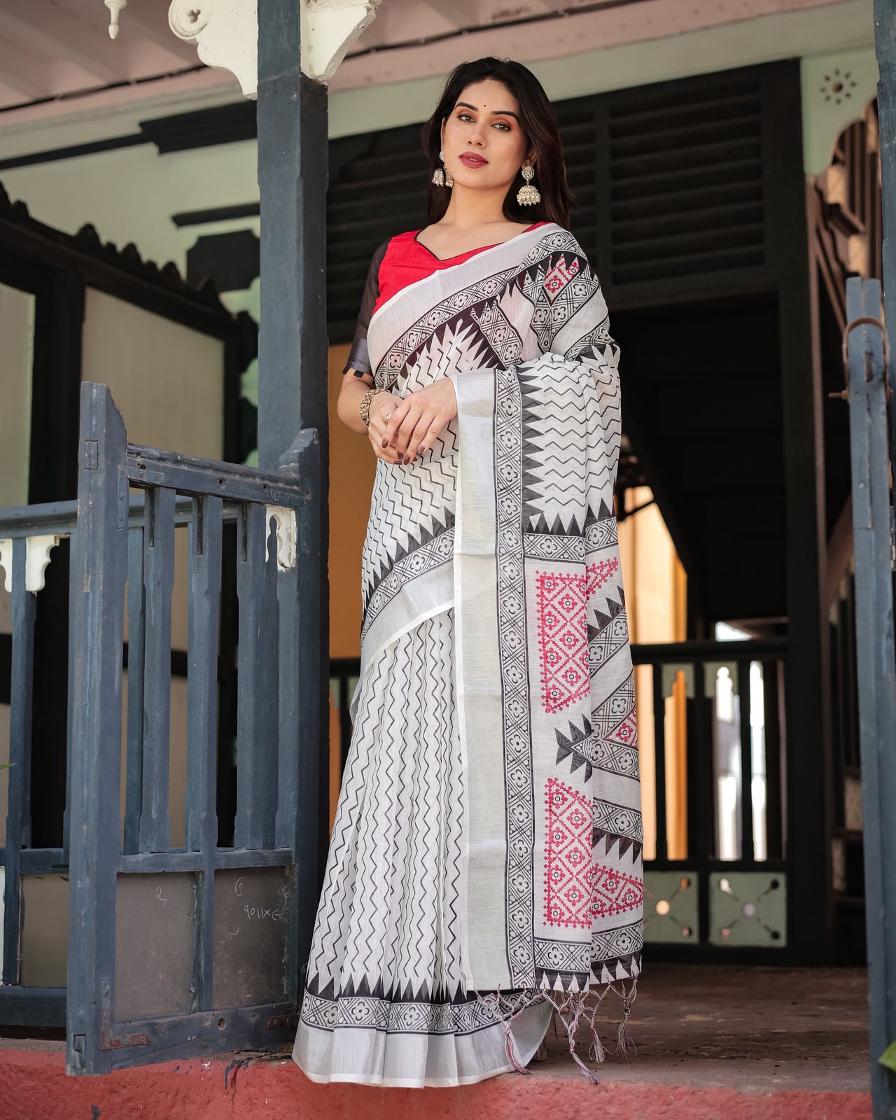
Linen cotton behaves differently. The irregular yarn surface breaks up reflections, and printed areas can look softer or greyer when the camera reduces fine contrast. The Charcoal Bloom Printed Linen Cotton Saree With Silver Edge may show a lighter charcoal ground beside a reflective silver edge, while the Charcoal Grey Linen Cotton Printed Saree with Tassels can appear more uniform because its tassels and print distribute visual contrast differently.
A glossy finish isn't proof that the underlying dye is lighter. Shine is directional: rotating the saree or changing the camera angle can move a bright band across the fabric without changing the pigment. Matte, brushed or textured fabrics usually offer a more stable reading across angles, although their shadows can still be lifted by HDR.
Which Lighting Conditions Make Dark Sarees Look Lightest?
Large, bright daylight sources usually make dark sarees look lightest in phone photos because they illuminate folds while giving the camera enough information to recover shadow detail.
Window light and overcast daylight
Window light can produce a gentle, lifted image when the saree is close to the window and the camera faces the fabric from the room. Overcast daylight is often more even because clouds diffuse direct sunlight, reducing hard black folds and sharp reflections. Direct afternoon sun is less reliable because it can create bright patches, deep creases and colour shifts across one drape.
Warm indoor lighting
Warm LED or tungsten lighting often makes dark sarees appear browner, redder or duller than they look in daylight. A deep green may acquire an olive cast, while charcoal may look brown-grey. Automatic white balance may correct part of the warmth, but different phone models make different corrections.
Flash and mixed light
Phone flash can make a dark saree look lighter near the camera while leaving distant folds dark. Mixed light, such as a cool window beside a warm lamp, is particularly difficult because one part of the fabric may photograph blue and another part yellow. A colour reading from mixed lighting should be treated as provisional.
Outdoor shade is usually a useful compromise for checking a saree's general depth. Shade avoids the harshest highlights while retaining a broad spectrum of daylight. A product team seeking consistent colour would ideally photograph the saree under controlled, neutral lighting and also provide a close-up of the base fabric without reflective borders dominating the frame.
Why Your Phone Screen Can Change the Saree Colour Again
Your phone screen can change the saree colour again through brightness, display calibration, night modes and ambient light. The photograph may be accurate while the display makes the image look warmer, cooler, lighter or more saturated.

Screen brightness is the simplest factor. At maximum brightness, shadow detail becomes easier to see, so charcoal, navy and forest green can look lighter. At low brightness, the same pixels lose visible detail and the saree may appear nearly black. Adaptive brightness changes the result while you move between a bright room and a darker one.
Night Shift, eye-comfort modes and blue-light filters add warmth to the display. These settings may turn a green saree olive or make a blue-black saree appear less blue. Vibrant display modes can intensify red, pink and green beyond the photograph's original values.
Screen size also matters. A large monitor may reveal subtle weave and shadow information that disappears on a small phone thumbnail. Compression on social platforms can reduce fine texture and alter contrast. For a more dependable check, view the original product image at normal brightness, turn off temporary colour filters, and compare several photographs rather than zooming into one highly processed crop.
How to Judge a Dark Saree's Colour Before Buying Online
You can judge a dark saree's colour more accurately online by comparing the base fabric across multiple images, identifying the light source and checking whether the border is affecting your perception.

- Start with the base area. Look for the largest section without zari, sequins, a printed border or strong folds. That area gives the clearest indication of the dye family and depth.
- Compare at least three views. A full drape shows overall impression, a close-up shows weave, and a border view reveals contrast. If the base colour remains similar in all three, confidence improves.
- Separate hue from brightness. Ask whether the saree is green, blue-green or olive before deciding whether it's light or dark. Phone processing often changes brightness more than the basic hue.
- Check the background. A white background can make a saree look deeper by contrast, while a black background can make the same saree appear lighter around its edges.
- Read the material description. Silk, satin, linen cotton and jacquard respond differently to light. Fabric information helps predict whether highlights will be prominent.
- Ask for a daylight video when exact matching matters. A short, unfiltered video that moves the fabric gently can reveal whether brightness comes from sheen or from the base colour.
- Allow for normal variation. Hand-dyed, handwoven or textured materials may show small differences between batches, while digital images can't guarantee laboratory-level colour matching.
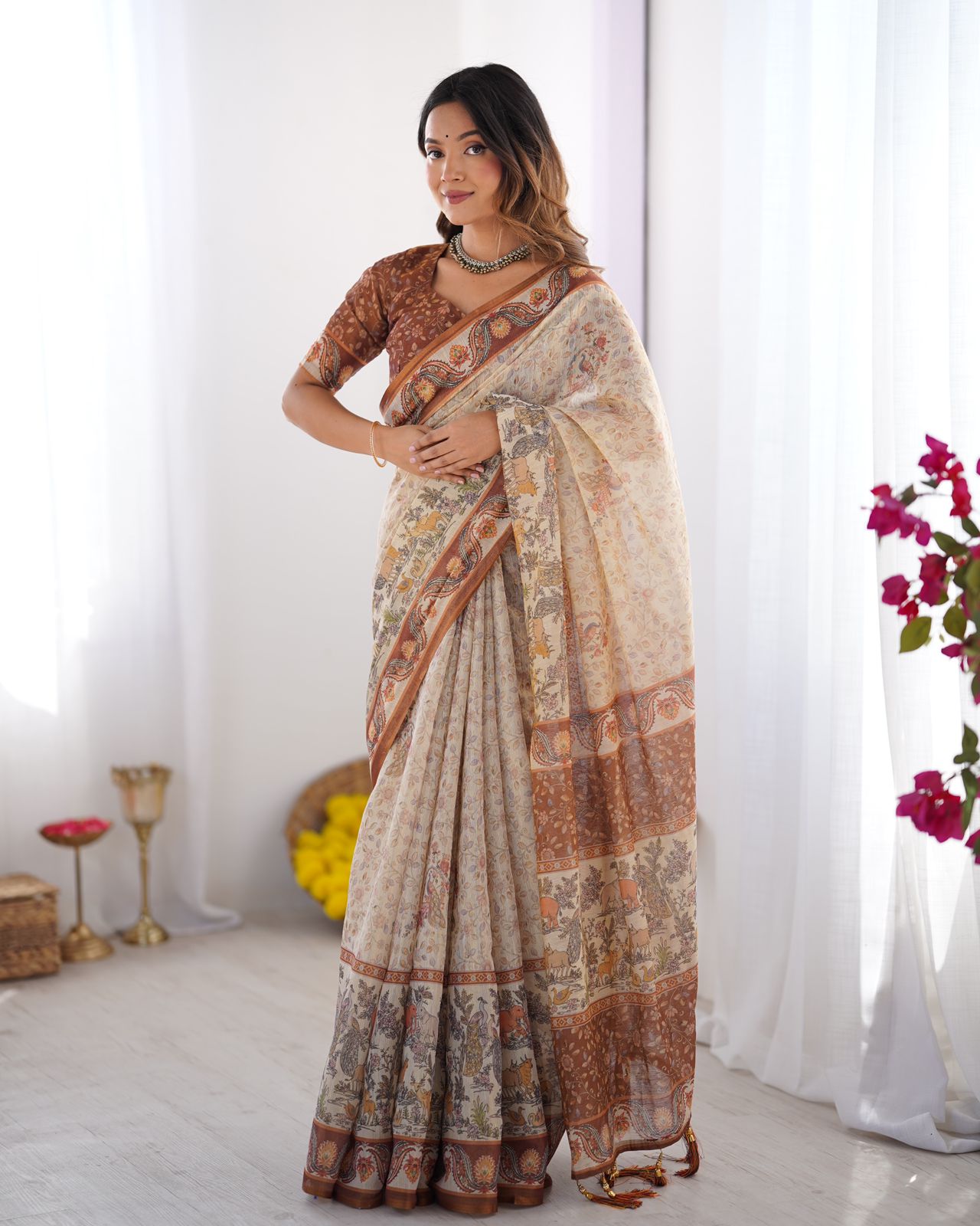
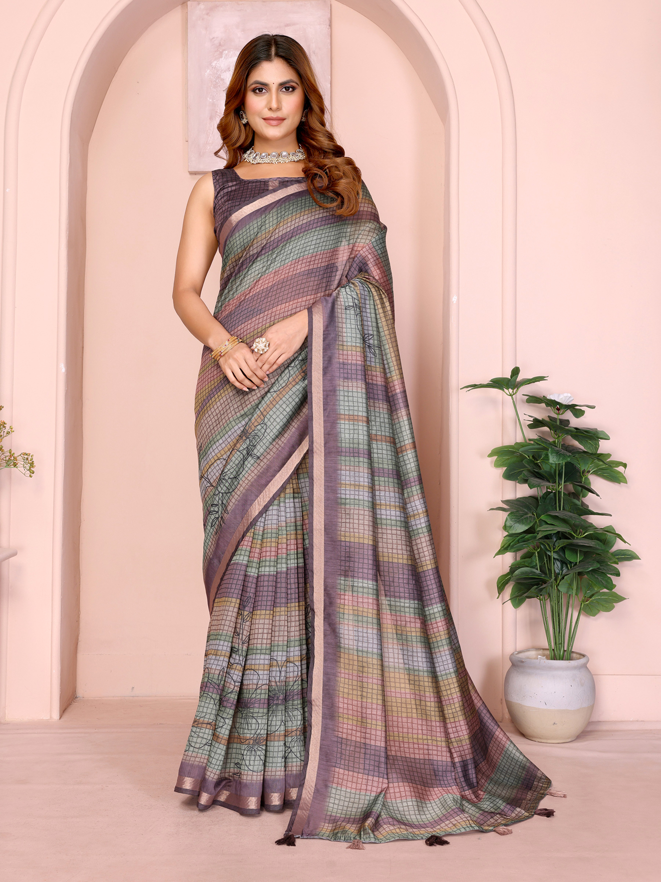
The Lightweight Grey Saree with Rust Designer Border demonstrates why border colour can influence the whole frame. Rust is warmer and more visually assertive than grey, so the grey base may seem warmer than it appears in isolation. The Printed Linen Cotton Saree in Beige with Metallic Grey Edge creates a related effect: metallic grey can make beige look cooler and brighter near the edge.
How Dark Sarees Read Under Different Textiles and Prints
Dark sarees don't all photograph alike because fibre content, surface texture, print scale and embellishment control the amount of reflected light.

Printed linen cotton generally looks softer and less glossy than silk. A charcoal floral print can appear lighter where white, silver or pale motifs interrupt the ground. The Charcoal Grey Linen Cotton Floral Saree with Printed Border may therefore read as a medium charcoal from a distance even when its unprinted base is deeper.
A pale saree can also help explain the camera's behaviour. The Lightweight Cream Saree with Designer Floral Pattern contains a light ground that gives the camera abundant brightness, so the surrounding image may not need the same aggressive shadow recovery used for a dark saree. The Light Pink Floral Satin Saree with Unstitched Blouse Fabric can show concentrated satin highlights, which may make pink look paler at one angle and stronger at another.
Comparing a dark saree with a neutral fabric in the same photograph can be useful, but the comparison isn't absolute. Cream, beige and grey backgrounds alter perceived contrast. Human vision adapts to surrounding colours, so a dark green beside warm gold may look cooler, while the same green beside silver may look bluer.
When a Lighter Photo Signals a Real Colour Difference
A lighter phone photo signals a real colour difference only when the lighter appearance remains consistent across controlled images, videos and neutral lighting. One bright frame alone can't establish that a saree is a different shade.
Look for repeated evidence: the base appears lighter in the full view and close-up; daylight and indoor images agree; the product description uses a lighter colour term; and the weave doesn't show strong reflective highlights that could explain the brightness. A persistent mismatch across these checks deserves a clarification before purchase.
Online shoppers can record the product name, image date and any written colour description when exact matching is important for a wedding outfit or coordinated blouse. The Lightweight Grey Saree with Rust Designer Border, for example, should be assessed as grey with a rust accent rather than judged from the warmest border area. The same principle applies to a charcoal saree whose silver edge occupies a large part of the photograph.
Colour perception also changes after delivery because a saree is viewed in a room, not as a flat screen image. Check the delivered saree in indirect daylight before comparing it with the phone photograph. Avoid judging under coloured bedroom lights, beside bright painted walls or immediately after looking at a highly saturated screen.
A Practical Colour-Checking Routine for Saree Buyers
A five-minute colour-checking routine can reduce avoidable confusion without requiring specialist equipment.
- Set the phone display to a comfortable middle brightness and disable Night Shift or a similar warm filter temporarily.
- View the full image first, then inspect the central base fabric at 100 percent rather than relying on a heavily enlarged crop.
- Compare the product photographs with a neutral white or grey object nearby, remembering that the object itself may reflect coloured light.
- Identify whether the fabric is matte, lustrous, jacquard, satin or metallic-edged before interpreting brightness.
- Use the written colour name as supporting information, not as a substitute for examining the image.
- Contact the seller when the base shade is central to your outfit, particularly for coordinated blouses, bridesmaid sarees or a specific family colour.
Price and promotion don't determine colour accuracy, but collection context can affect how quickly a buyer makes a decision. A shopper comparing options in Sarees from Rs 1000 to Rs 1500, Sarees Under 20% Off and Sarees Under 10% Off should still assess fabric and lighting before treating a lower price as evidence of a lighter or less saturated shade. Sarees Flat 60% Off and Sarees Flat 50% Off may contain varied textiles, so the same photography checks remain useful.
Phone photography will always involve some interpretation, especially with dark textiles. A careful buyer separates base colour, reflective detail, lighting and display effects instead of judging the entire image by its brightest section. That method makes online saree shopping more predictable and helps distinguish a genuinely lighter shade from a camera-created impression.
Common Questions About Dark Saree Colours in Phone Photos
Why does my dark green saree look lighter in a phone photo?
A phone may raise exposure and recover shadow detail, especially when the saree is photographed near a bright wall or window. Golden zari, satin shine or a reflective border can also make the green appear brighter and warmer.
Which lighting shows a saree’s colour most accurately?
Soft, indirect daylight usually gives the most useful general reading because it reduces harsh reflections and deep shadows. Mixed lighting, direct flash and warm yellow bulbs are less reliable for judging dark saree colours.
Why does the same saree look different on two phones?
Different phones use different camera processing, white-balance algorithms and colour profiles. Screen brightness, vivid display modes and blue-light filters can further change how the same photograph appears.
How can I check a saree colour before ordering online?
Compare the largest plain base area across the full image, close-up and any available video. Check the material and lighting, view the image at normal screen brightness, and ask for an unfiltered daylight video when exact colour matching matters.
Do zari and metallic borders make dark sarees look lighter?
Yes, reflective zari and metallic borders can brighten the surrounding frame and change perceived contrast. Judge the base shade separately from the gold or silver detail, especially when the border occupies a large part of the photograph.
Can a charcoal linen cotton saree look grey in photographs?
Yes, phone exposure can lift charcoal shadows, while the irregular linen cotton surface scatters light and reduces visual depth. Printed motifs, silver edges and a pale background can make the charcoal ground appear even lighter.