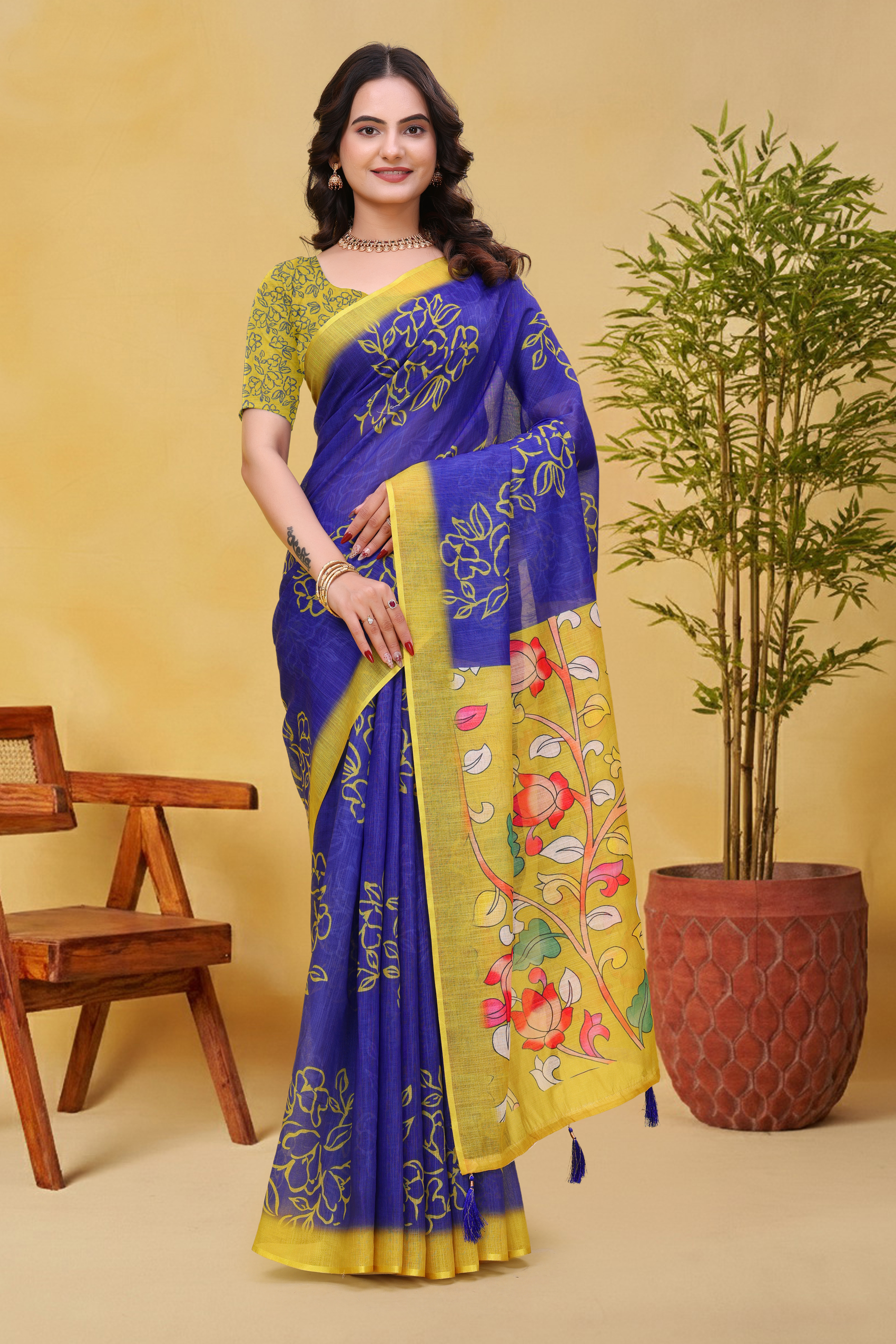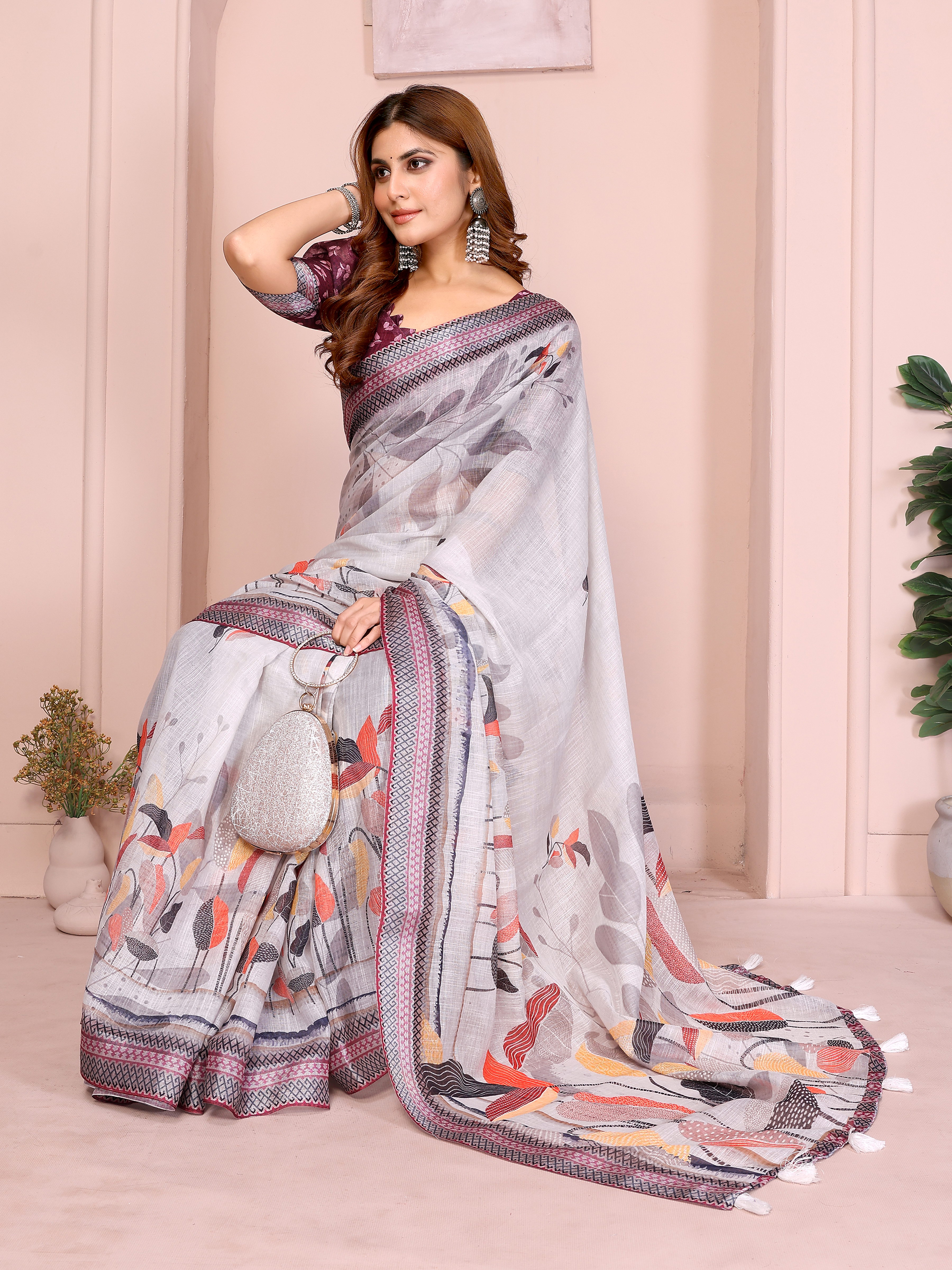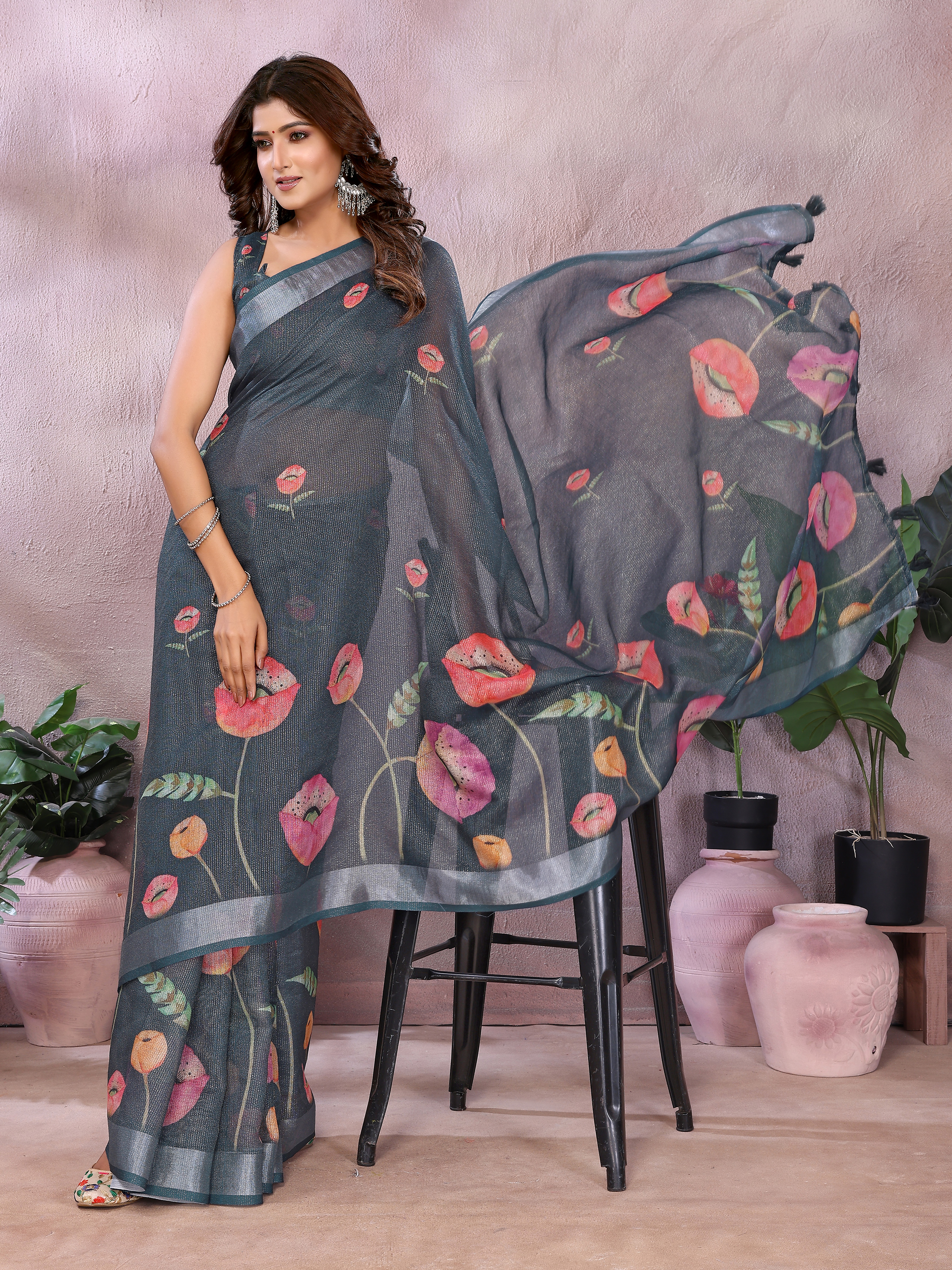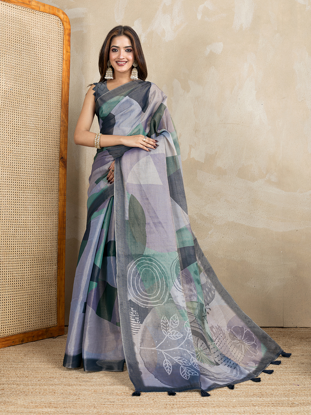
A pastel saree can look refined in daylight and strangely pale inside a wedding venue. What makes pastel sarees wash out under wedding hall lights is usually a combination of high exposure, low colour contrast, reflective fabric and warm or cool artificial light. The saree has not necessarily lost its colour; the lighting has reduced the visual difference between the fabric, skin, backdrop and camera frame.
Understanding that difference helps you choose more intelligently. A lavender saree with a defined border, a pink satin saree with a deeper blouse and a linen-cotton saree with visible print will behave differently under the same ceiling lights. The right decision depends on the venue, the fabric surface, your blouse contrast and whether photographs matter as much as the live appearance.
What makes pastel sarees wash out under wedding hall lights in the first place?
Pastel sarees look paler when bright artificial light reflects from their surface and leaves too little contrast for the eye or camera to register the original shade. Pale pink, lavender, sage, powder blue and soft peach already contain a high proportion of white, so extra illumination can make them approach the brightness of the background.
Wedding halls commonly use several light sources at once. White LED downlights may have a colour temperature around 4,000 to 6,500 kelvin, while chandeliers and decorative bulbs may sit closer to 2,700 to 3,200 kelvin. A pastel saree can appear cooler under a white spotlight, warmer beneath a chandelier and uneven when both sources fall across the pleats.
Camera exposure creates a second problem. A phone camera often increases exposure when it sees a dark stage, bright fairy lights or a white tablecloth in the same frame. The lighter parts of a pastel saree then lose tonal separation, particularly in the pallu and pleats. The result isn't always a completely white garment; delicate floral details, zari lines and subtle borders may simply become difficult to distinguish.
What makes pastel sarees wash out under wedding hall lights when the light is warm?
Warm lighting doesn't always improve a pastel saree because yellow light can mute blue, lilac and cool green undertones. Warm LEDs may make blush pink look flattering, but the same lighting can turn pastel lavender greyish or make sage appear beige. A neutral or balanced light source generally shows the most faithful colour, although the venue's actual lighting should guide your final choice.
What makes pastel sarees wash out under wedding hall lights according to fabric?
Fabric surface changes how much light is reflected, scattered or absorbed, so fabric choice directly affects the visibility of a pastel saree. Satin and tissue surfaces reflect light in concentrated highlights, whereas linen cotton and handloom cotton scatter light more softly and reveal texture across a wider area.

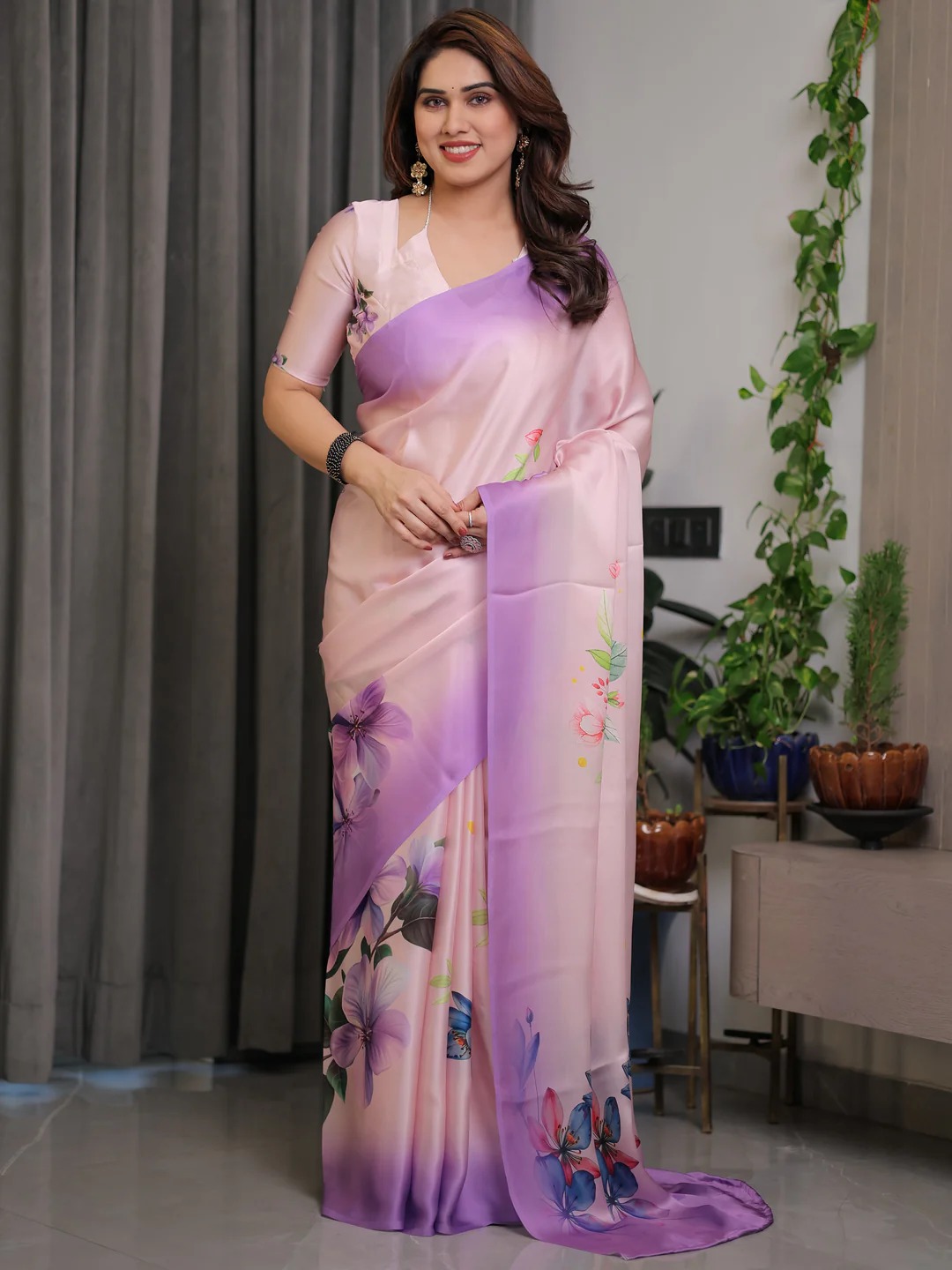
Satin can look luminous in a controlled photograph, but a strong overhead LED may create bright streaks across each fold. Pastel Blue Satin Floral Print Saree with Unstitched Blouse and Pastel Pink Satin Floral Print Saree with Unstitched Blouse can therefore appear more vivid in shaded daylight than beneath a hard spotlight. The issue is uneven reflection: one pleat catches the light while the neighbouring pleat appears flatter.
Tissue and zari introduce a related effect. Metallic yarn reflects a narrow, bright highlight, which can make the surrounding pastel ground seem lighter by comparison. Pastel Floral Tissue Handloom Cotton Saree with Zari Weaves illustrates why a restrained zari border can help define the drape, while excessive direct light on metallic details may compete with the base colour.
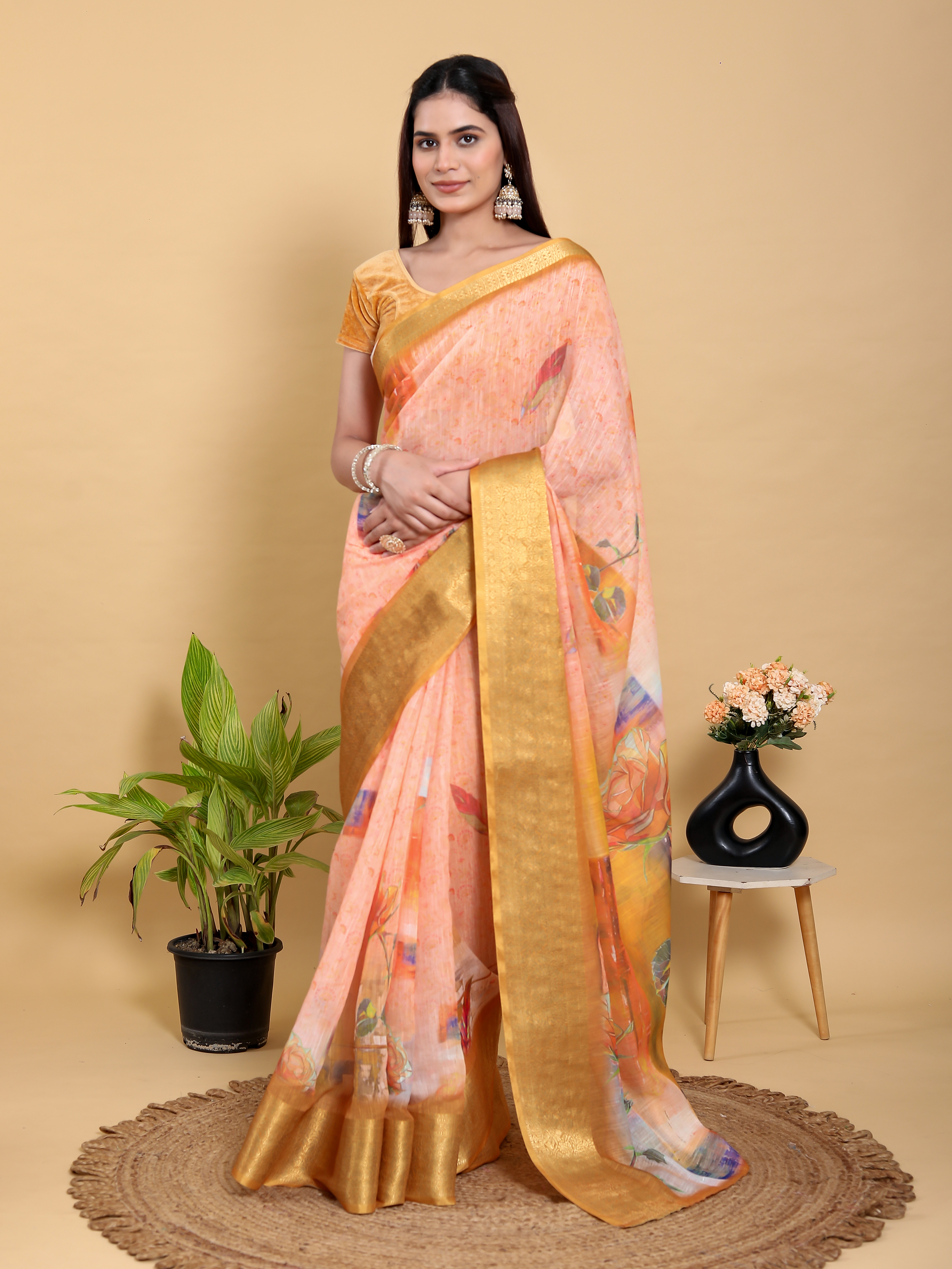
Linen cotton and handloom cotton usually provide more visual texture because their woven fibres don't produce one continuous mirror-like reflection. Pastel Linen Cotton Floral Print Saree with Designer Blouse and Pastel Sage Shimmer Linen Cotton Floral Ethnic Saree Womens offer useful examples of how texture and a small amount of shimmer can preserve interest without relying entirely on a glossy surface.
What makes pastel sarees wash out under wedding hall lights if the saree has a print?
Prints and borders help prevent washout because they create edges that remain visible when the base colour becomes overexposed. A floral pallu, gold trim, zari line or darker selvedge gives the eye a reference point and makes the saree look dimensional.
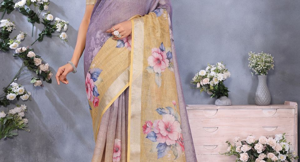
Pastel Lavender Floral Saree with Printed Pallu & Gold Trim has more visual anchors than a completely plain lavender drape. A floral print doesn't need to be dark to help; a difference in scale, finish or value can separate the pallu from the body. Light pink with a defined print, as seen in Light Pink Floral Satin Saree with Unstitched Blouse Fabric, can also photograph more successfully than an unbroken pale field.
What makes pastel sarees wash out under wedding hall lights in photographs?
Wedding-hall lighting changes saree photography by creating clipped highlights, mixed colour casts and weak separation between the saree and its surroundings. A photograph records the intensity and direction of light at one instant, so a colour that looks nuanced while moving may look flat in a still image.
Overhead lighting is especially unhelpful for pale fabrics because it illuminates the top folds while leaving lower pleats relatively dull. The pallu may catch a spotlight and lose its printed detail, while the waist and pleats appear grey by comparison. Direct flash can add another hard highlight to satin, zari and sequins.
Background colour matters as much as the saree. A pastel saree photographed against a white stage, cream wall or bright floral installation has little value contrast. The camera may expose for the brightest decoration, causing the saree to look darker, or expose for the person and cause pale fabric to lose detail. A mid-tone background, shaded entrance or darker wood panel often gives pastel clothing clearer separation.
What makes pastel sarees wash out under wedding hall lights when phones are used?
Phone cameras can make pastel sarees look washed out because automatic exposure and white balance react to the whole frame rather than only to the saree. Bright fairy lights, white décor and a dark stage can cause the phone to make several competing corrections at once.
Colour temperature changes the apparent undertone of a saree: cool light emphasises blue and violet, while warm light emphasises yellow, coral and gold. Mixed sources can place warm highlights and cool shadows on the same garment, making a single pastel shade appear inconsistent in photographs.
Before an important event, take test photographs at the venue from the stage, dining area and entrance. Tap the saree on the phone screen to focus and reduce exposure slightly if the pallu loses detail. A reduction of approximately one-third to two-thirds of a stop often preserves pale fabric texture, although the exact adjustment depends on the phone and the venue.
What makes pastel sarees wash out under wedding hall lights at different venues?
You can choose a pastel saree more reliably by matching colour depth, surface finish and contrast to the venue's lighting rather than choosing from an isolated product photograph. A bright banquet hall needs more definition; a dim heritage venue can support a softer, more reflective drape.
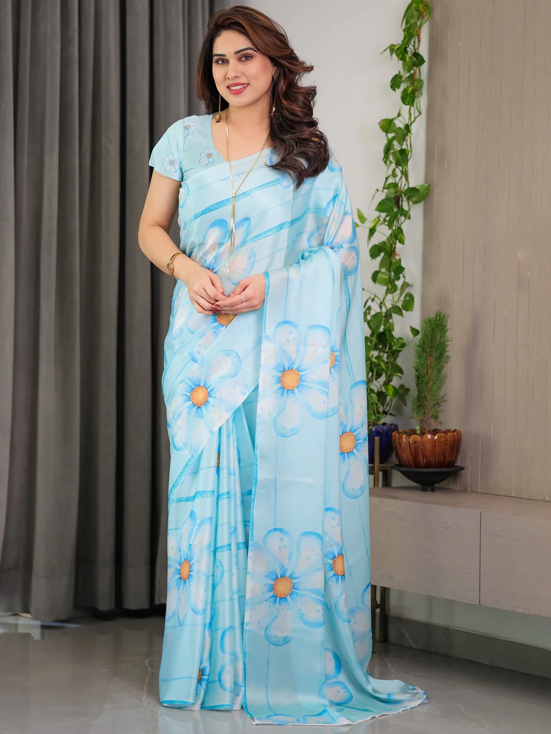
- For bright LED halls: Choose a pastel saree with a printed pallu, visible border, textured weave or medium-contrast blouse. Lavender with gold trim, powder blue with a defined floral print and sage with woven texture are safer than a completely plain, glossy pastel.
- For warm chandelier lighting: Blush pink, dusty rose, peach and muted coral usually retain warmth. Cool lilac and icy blue need a warmer blouse, antique-gold jewellery or a contrasting border to avoid looking grey.
- For outdoor-to-indoor weddings: Test the saree in daylight and under the venue lights. A colour that works in both settings should have a visible print or border, because outdoor shade and indoor LEDs reveal different aspects of the fabric.
- For photography-heavy ceremonies: Prioritise surface texture and tonal separation. Designer Pastel Chinnon Saree with Floral Print can provide movement and print definition, while a satin style needs careful control of direct flash and strong spotlights.
Venue scale also matters. In a large hall, a very delicate print can disappear from a distance, while a broad border or larger floral motif remains readable. In a smaller indoor ceremony, fine texture and a narrow zari edge may look more polished because guests view the saree at close range.
Budget can guide the search without deciding the colour by itself. The Latest Wedding Sarees Collection is useful when comparing different finishes, while Wedding Sarees Collection Under 4000 can help narrow the search when the saree, blouse and accessories need to fit one total budget. A low price doesn't automatically mean weak visibility; weave, print scale and contrast matter more under lights.
What makes pastel sarees wash out under wedding hall lights despite the right colour?
A well-chosen pastel colour can still disappear when the blouse, jewellery and makeup offer too little contrast. A blouse one or two steps deeper in colour usually gives a pastel saree enough definition to remain visible without overpowering it.
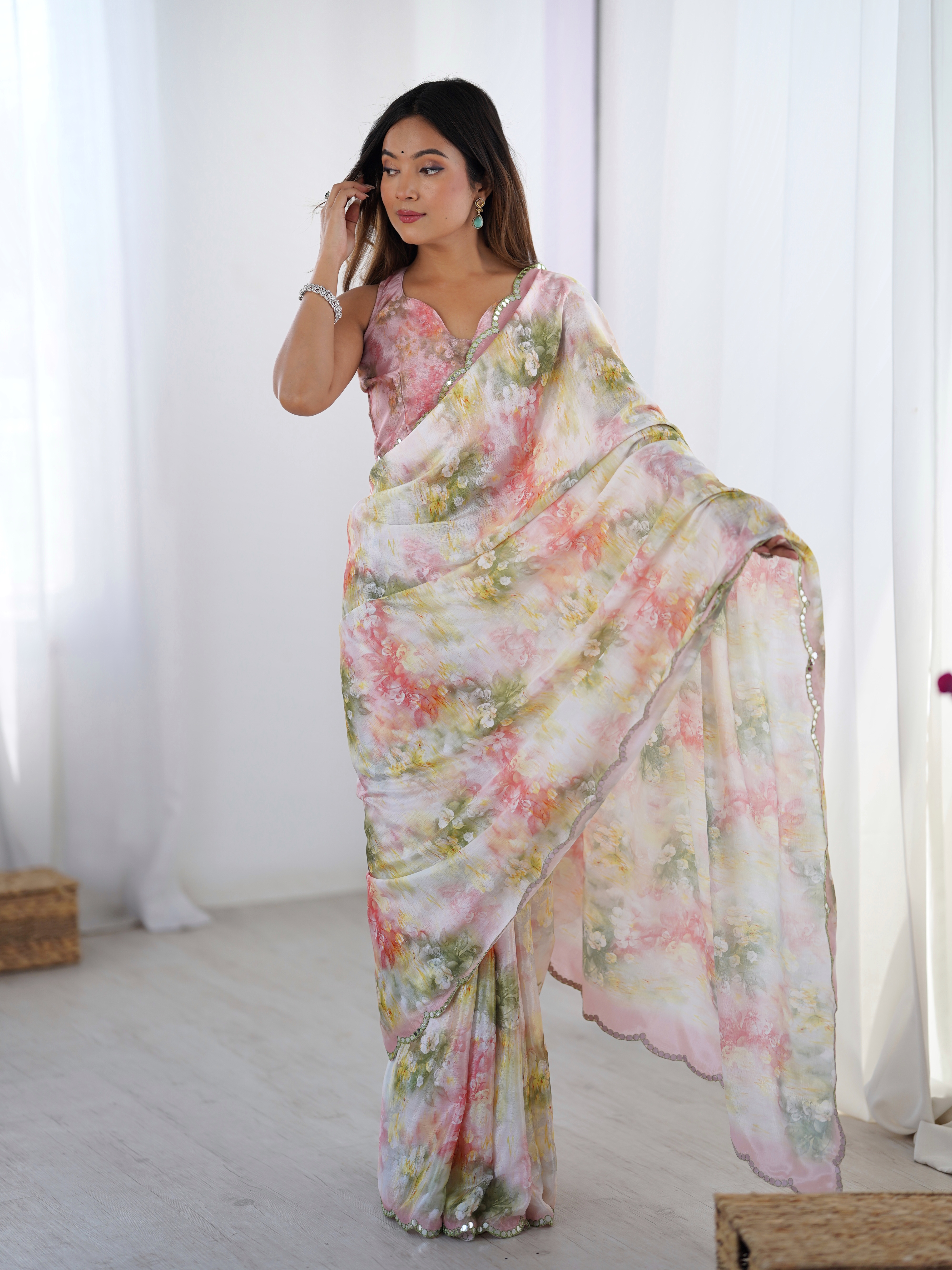
Pastel pink works with rose, berry, wine, muted rust or antique gold depending on the wedding's formality. Pastel lavender gains definition from plum, mauve, deep violet or a warm gold blouse. Pastel blue can be paired with ink blue, teal, silver or a slightly deeper powder blue. Pastel sage benefits from olive, emerald, champagne or antique gold.
A matching pastel blouse is still possible, but contrast should be added elsewhere. A textured brocade blouse, darker piping, a defined sleeve edge or a layered necklace can prevent the upper half of the outfit from blending into a pale background. Jewellery with a matte or antique finish often photographs with more definition than highly reflective white stones under intense LEDs.
Makeup affects perceived saree colour too. A completely pale base, nude lip and low-contrast eye makeup can make a pastel saree appear even weaker in a brightly lit hall. A defined brow, softly shaded eye, peach or rose lip and controlled blush create enough facial contrast for the saree to remain part of the overall composition.
Accessories can also connect a pastel saree to the wedding setting. Gold works naturally with zari and warm chandeliers, while silver complements cool LEDs and pastel blue. If the venue includes traditional textile décor, a Banarasi silk-inspired accessory or a small Kanjeevaram-style gold accent can add depth without changing the saree's delicate character. Silk Sarees Under 3000 With Discount may be worth comparing when a richer accessory or alternate drape is needed within a controlled budget.
What makes pastel sarees wash out under wedding hall lights and how can you test one?
You can test a pastel saree before the wedding by viewing it under three lighting conditions, photographing the pallu and checking whether the border remains visible from two metres away. A ten-minute test is more reliable than judging a colour only from an online image or a changing-room mirror.

- Check daylight: Stand near a window without direct sun and inspect the base colour, floral print and border. Note whether the saree looks pink, lavender, blue, sage or neutral rather than relying on a broad label such as "pastel."
- Check artificial light: Place the saree under a cool white LED and a warm bulb. Look for sudden changes in the pallu, zari and pleats. Strong colour shifts indicate that mixed venue lighting may affect photographs.
- Check contrast: Pair the saree with the intended blouse and jewellery. Photograph the full outfit against a pale wall and a mid-tone wall. If the saree disappears against both backgrounds, add a darker blouse, defined border or more substantial print.
- Check movement: Walk, pleat and drape the pallu. A fabric that shows texture while moving is less likely to look like a flat pale block in candid photographs.
Colour families can also be compared by occasion. Pink Georgette Sarees may offer a softer, fluid alternative for a warm evening event, while Red Banarasi Silk Sarees for Weddings Under 1100 provide a useful contrast if the venue is exceptionally bright and pastel shades repeatedly disappear in tests. Choosing a stronger colour isn't a failure of pastel styling; it's a practical response to the lighting environment.
The most dependable pastel wedding saree has at least two forms of definition: a visible print and border, a textured weave and deeper blouse, or a soft base colour with controlled zari. That combination keeps the saree recognisable when LEDs, chandeliers and phone cameras all behave differently.
Common Questions About Pastel Sarees Under Wedding Hall Lighting
Why does my pastel saree look white in wedding photos?
A pastel saree can look white when bright lighting overexposes its pale surface and removes the difference between the saree and a light background. A defined border, printed pallu, darker blouse or slightly reduced phone exposure can restore visible detail.
Which pastel saree colours work best under warm wedding lights?
Blush pink, dusty rose, peach and muted coral usually retain warmth under chandeliers and yellow LEDs. Pastel lavender, icy blue and cool sage may need antique-gold jewellery or a warmer contrasting blouse so they do not appear grey or beige.
Is satin or cotton better for a pastel saree at a wedding?
Neither fabric is universally better; the choice depends on the venue and lighting. Satin gives luminous highlights but can reflect spotlights unevenly, while linen cotton and handloom cotton usually show more stable texture under strong overhead LEDs.
How can I stop my pastel saree from disappearing in wedding photographs?
Use a blouse that is one or two shades deeper, photograph against a mid-tone background and avoid direct flash on satin or zari. A printed pallu, visible border and slight reduction in phone exposure can preserve the saree's structure.
Should pastel sarees have a contrasting blouse for weddings?
A contrasting blouse is helpful but not mandatory. A deeper blouse creates immediate separation, while a matching blouse can work when the saree has a defined border, textured fabric, stronger jewellery or a noticeable print.
How do I test whether a pastel saree will work in my wedding venue?
View the saree under daylight, cool white LED and warm bulb light, then photograph it with the intended blouse and jewellery. Check whether the pallu, pleats and border remain visible from about two metres away as well as in a phone close-up.