
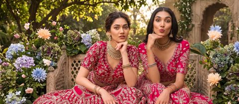
Mixing Two Prints in One Indian Ethnic Outfit Without Visual Clutter depends on four decisions: colour relationship, print scale, visual spacing and fabric weight. A floral saree with a geometric blouse can look considered when one print leads and the other supports it. The same pairing can look chaotic when both prints have equal contrast, similar density and competing colours. These guidelines help you make a two-print outfit for a wedding, festive lunch, Haldi ceremony or everyday ethnic wardrobe without relying on guesswork.
Mixing Two Prints in One Indian Ethnic Outfit Without Visual Clutter Starts with One Lead Print
The dominant print should occupy the larger or more visible area of the outfit. In a saree look, the saree usually leads because it covers the body, pallu and much of the lower silhouette, while the blouse acts as the supporting print. In a salwar suit or sharara set, the kameez or kurta generally becomes the lead and the dupatta carries the secondary pattern.
An effective ratio is approximately 70:30. The larger print supplies the main visual identity, while the smaller print adds interest without creating a second focal point. A saree with a broad geometric field can therefore take a narrow floral blouse, whereas a densely printed blouse needs a quieter saree border or pallu.
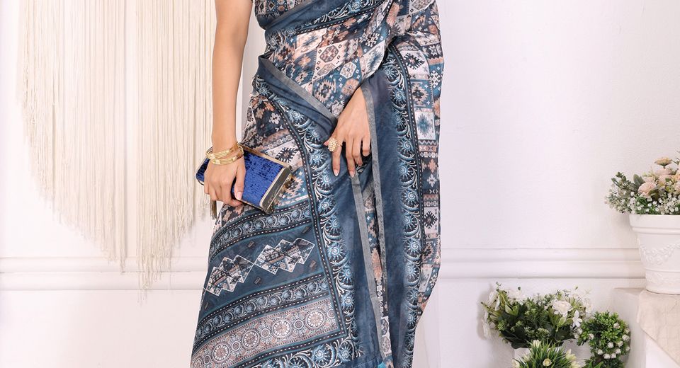
The Indigo Blue Geometric Print Saree with Contrast Pallu demonstrates why a print needs room around it. The geometric field and contrast pallu already create movement, so a second print should appear on a compact blouse area rather than across a heavily embellished jacket. A solid blouse in one of the saree's existing colours remains the safest option, but a small-scale print can work when its background matches the saree.
How does print scale create hierarchy?
Print scale determines which pattern the eye notices first. Large motifs attract attention quickly, medium motifs provide structure and small motifs recede into the outfit.
Pairing a large floral with a small geometric pattern is usually easier than pairing two large florals. A broad hand-painted flower on a dupatta can sit beside a fine buti on a kurta because the patterns occupy different visual levels. Two prints with equally large motifs often need a strong colour break, such as a plain blouse, belt, sash or border, to prevent them from merging.
Print scale should also relate to body placement. A large motif near the shoulder or bust becomes a focal point, while small repeating motifs create a smoother surface. A person who wants to draw attention away from the midsection can place the larger print on the dupatta or pallu and use a finer pattern on the kurta body.
Mixing Two Prints in One Indian Ethnic Outfit Without Visual Clutter Needs a Shared Colour Bridge
Two prints look connected when they share at least one clear colour, even when their motifs are unrelated. The shared colour acts as a bridge that tells the eye both patterns belong to one outfit.
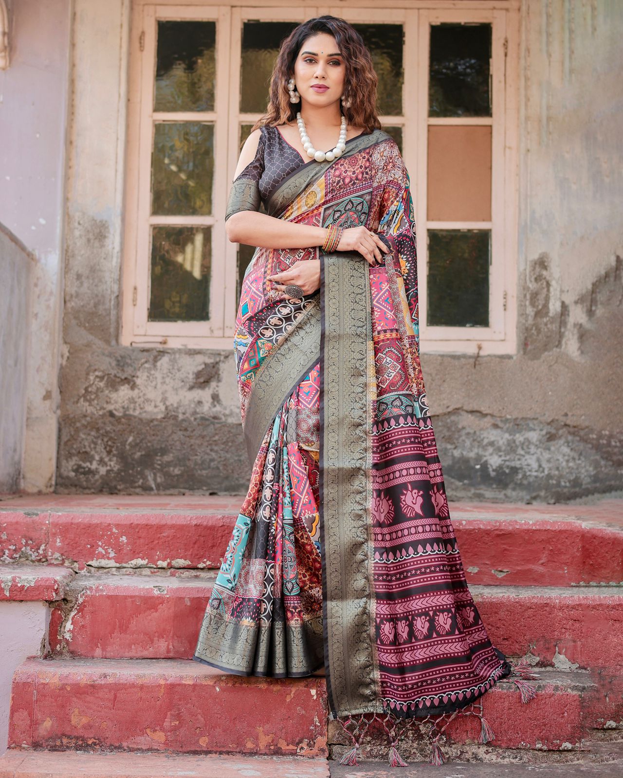
Choose one dominant shade, one supporting shade and one optional accent. For example, an indigo saree with ivory motifs can pair with an ivory blouse carrying a small blue print. A black saree with multicolour geometry can take a blouse that repeats black and only one bright accent instead of reproducing every colour in the saree.
The Black Chanderi Cotton Saree with Multicolor Geometric Print is a useful example of why selective matching works. A blouse that repeats black and a single colour from the geometric print will look more composed than a blouse containing red, yellow, green and blue in equal amounts. Matching every colour can make the outfit resemble a coordinated costume rather than a layered wardrobe.
Colour temperature matters as much as colour matching. Warm rust, marigold and coral prints can sit comfortably together, while cool blue, lilac and emerald patterns create a different mood. Combining warm and cool prints is possible, but one neutral such as ivory, black, beige or grey should appear in both pieces to soften the transition.
Why does the background colour matter?
The background of a printed fabric is often more important than the motif colour. Two prints with different flowers and shapes can still harmonise when both use an ivory, navy or beige ground.
The Ivory Chanderi Cotton Saree with Blue Ethnic Print Border offers a simple styling principle: repeat the ivory base in the blouse or dupatta, then introduce only a small blue pattern. The shared background creates breathing space even when the border contains a distinct ethnic motif.
When two backgrounds contrast strongly, add a separating element. A plain blouse, a narrow fabric belt, a solid dupatta edge or a long necklace can create a visual pause between the prints. The separator doesn't need to match either print exactly; a neutral textile often performs the job better.
Mixing Two Prints in One Indian Ethnic Outfit Without Visual Clutter Requires Density and Spacing Control
Print density describes how much of the fabric surface is covered by motifs. A sparse print leaves more background visible, while a dense print creates a continuous field of pattern. Pairing one dense print with one sparse print is generally more successful than combining two dense prints.
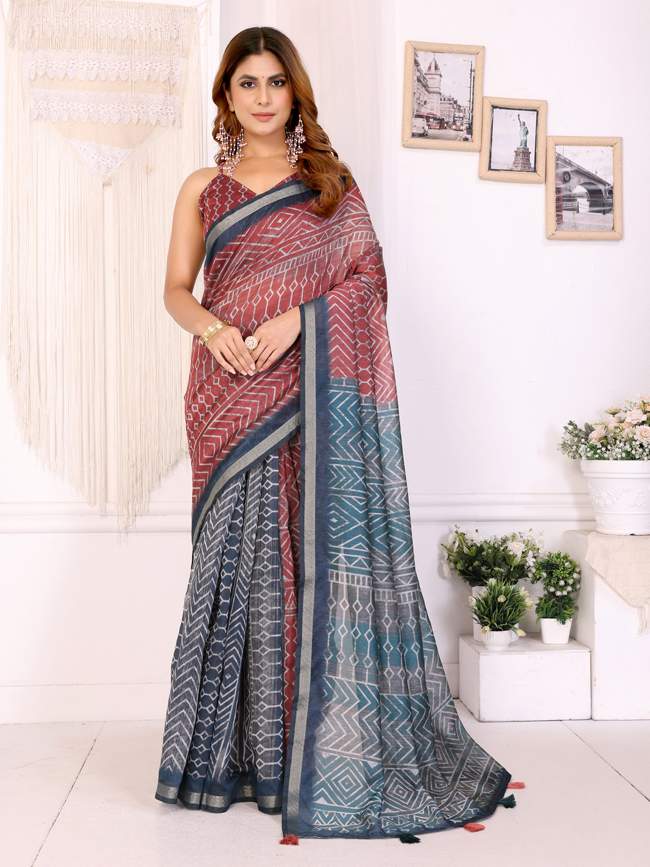
Direction adds another layer of control. Vertical stripes, elongated leaves and linear geometrics can lengthen the appearance of an outfit, while broad horizontal borders create a stronger break. If the saree has a dense horizontal border, a blouse with small scattered motifs may be calmer than a blouse with another horizontal stripe.
The pallu deserves special attention because it often crosses the torso and shoulder. A printed pallu can overlap a printed blouse, making both patterns visible within a small area. When the pallu is busy, keep the blouse print small, place the blouse print on the sleeves only, or choose a blouse whose background matches the pallu.
The Printed Mal Cotton Saree With Designer Pallu by VARNAVI shows how a statement pallu can become the main event. A printed blouse can be added only when the blouse pattern is less dense than the pallu and uses one colour already present in the saree. A plain blouse isn't a compromise in this situation; it protects the pallu's shape and keeps the drape legible.
How can borders prevent visual clutter?
A border can separate two prints when it's treated as a frame rather than as another competing pattern. A plain border, a restrained zari line or a narrow contrast piping can give the eye a clean edge.
A heavily printed saree with an ornate border should usually be paired with a blouse that has either no border or a very narrow sleeve and neckline finish. Repeating the full border motif on the blouse may create a boxed-in effect around the upper body. A simple sleeve edge in the border colour is often enough to make the pairing feel intentional.
Mixing Two Prints in One Indian Ethnic Outfit Without Visual Clutter Depends on Fabric Behaviour
Fabric weight and surface texture influence whether two prints appear coordinated. Similar-weight fabrics usually drape more naturally together, while contrasting weights require careful placement.
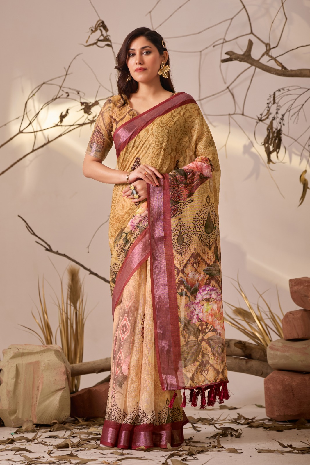
Chanderi cotton has a light, slightly crisp handle that can support small prints and delicate borders. Banarasi silk has more body and sheen, so a printed Banarasi silk saree can dominate a matte cotton blouse even when the colours are similar. If two fabrics have different levels of shine, keep the print on the shinier fabric simpler or let the matte fabric carry the smaller pattern.
The Multi Color Banarasi Silk Saree with Artistic Prints already combines lustre, colour and pattern. A heavily printed blouse in another glossy fabric can compete with the silk's surface. A matte blouse in one deep shade from the saree, or a fine printed blouse with a low-contrast ground, will preserve the silk as the focal point.
Mal cotton, Chanderi cotton and similar breathable fabrics are practical for daytime events because their texture reduces the need for heavy embellishment. A printed cotton saree and a printed cotton blouse can work when the prints differ in scale. Adding sequins, contrast embroidery and large jewellery at the same time can erase the visual separation that the fabrics created.
don't force two prints together simply because both garments are comfortable or available in the same fabric. Fabric compatibility improves drape, but colour and scale still determine visual balance.
Mixing Two Prints in One Indian Ethnic Outfit Without Visual Clutter Should Suit the Occasion
The event should determine how much contrast and ornament the outfit can carry. Daytime gatherings generally suit lower contrast, breathable fabrics and smaller motifs, while evening weddings can accommodate richer colour, sheen and stronger pattern separation.
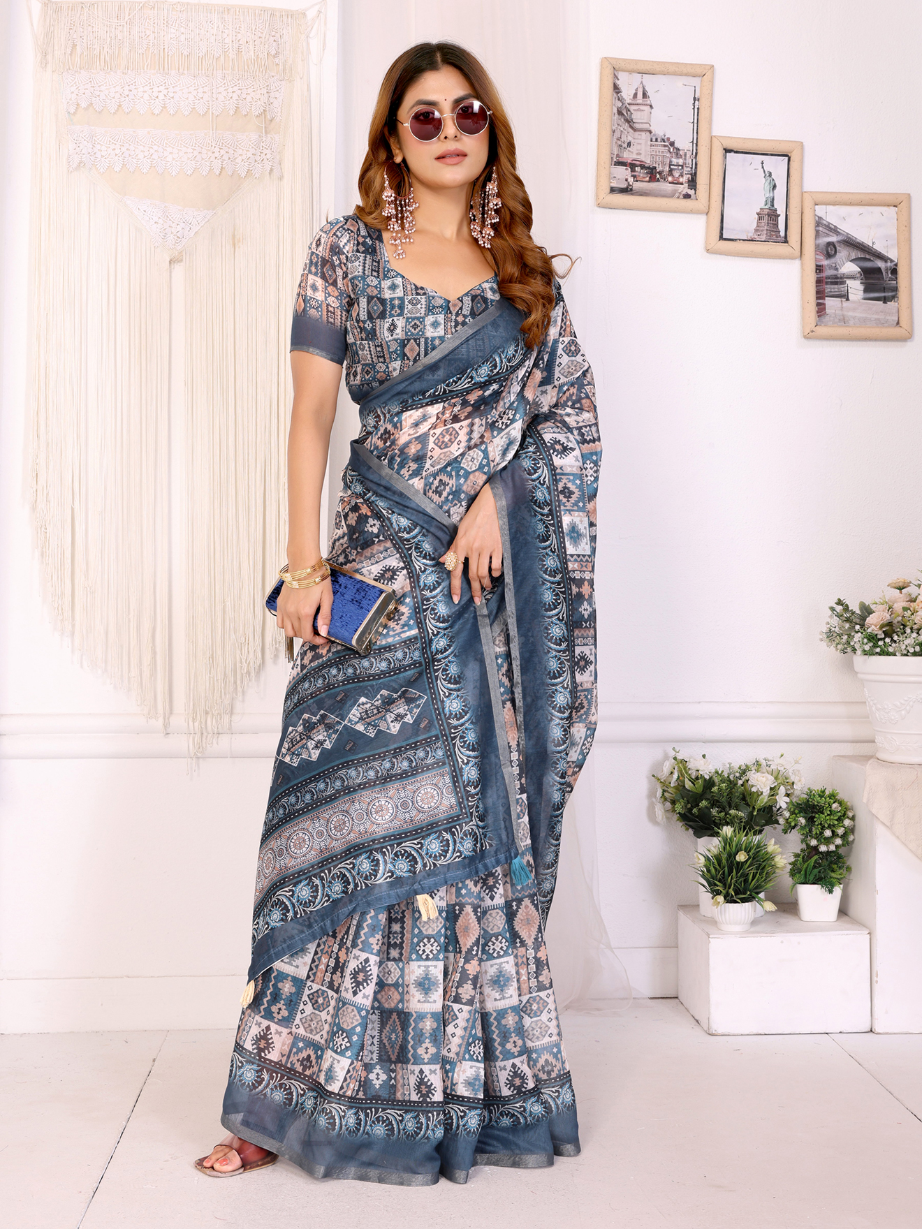
For a Haldi ceremony, yellow, ivory, green and soft pink prints can be paired with a plain blouse or a small floral print. Avoid placing two intensely saturated yellow prints together because the colour may flatten the distinction between the motifs. A cream or ivory background introduces useful relief.
For a daytime puja or festive lunch, the Mocha Brown Chanderi Cotton Floral Print Saree for Women can be paired with a small geometric blouse in ivory, rust or muted blue. The earthy brown ground gives the second print a stable base, while the Chanderi texture keeps the outfit light enough for daytime wear.
For an evening reception, the Blue Beige Floral Printed Chanderi Cotton Saree for Women's can support a geometric blouse using blue and beige with a touch of metallic thread. Keep the metallic element limited to zari at the neckline, earrings or a narrow border instead of adding shine to every printed surface.
For a destination wedding or formal fusion event, the Royal Patola Printed Designer Gown with Elegant Dupatta can be styled using the gown as the dominant print and the dupatta as the supporting layer. Because a gown already has a continuous silhouette, the dupatta should use a smaller motif or a quieter background. Pinning the dupatta at one shoulder rather than spreading it across the front also reduces pattern overlap.
How much jewellery works with two prints?
Two-print outfits usually need one clear jewellery focus rather than several competing accessories. Choose statement earrings, a layered necklace, bangles or a dramatic cuff, then keep the remaining pieces restrained.
Gold jewellery works naturally with marigold, rust, red and warm brown prints, while silver or oxidised metal can sharpen indigo, black, blue and grey combinations. Pearl jewellery can soften a high-contrast pairing because its surface is quiet and its colour works as a neutral.
Footwear and handbags should repeat an existing neutral or accent colour. A tan sandal with brown and ivory prints, or a black potli with black and jewel-toned prints, supports the outfit without introducing a third strong pattern.
Mixing Two Prints in One Indian Ethnic Outfit Without Visual Clutter Becomes Easier with a Final Edit
The final edit should remove one competing element before you leave the house. Look at the complete outfit from a distance of approximately two metres and identify the first area that attracts your eye. If the blouse, pallu, jewellery and footwear all demand attention equally, simplify one of them.

A useful three-question check is simple. Do both prints share a colour or background? Is one print visibly smaller, quieter or less saturated? Is there enough plain space around the face, waist or pallu? If the answer to two questions is no, change the blouse, reduce the jewellery or add a solid layer.
Photograph the outfit in daylight before an important event. Indoor yellow lighting can make warm colours look closer than they're and can hide the difference between navy and black. A daylight photograph reveals whether the two prints actually connect and whether the border creates a clean transition.
Tailoring can solve problems that styling alone can't. A high neckline, smaller sleeve print or narrower blouse border reduces the amount of pattern near the face. A well-placed waist seam or neatly pinned dupatta can preserve negative space and prevent prints from bunching during movement.
Successful print mixing doesn't require identical motifs. A shared colour, deliberate scale difference, compatible fabric and visible breathing space create enough order for contrasting Indian prints to feel personal and polished.
Common Questions About Mixing Two Prints in Indian Ethnic Outfits
Can I wear a printed blouse with a printed saree?
Yes, a printed blouse can work with a printed saree when one print is dominant and the other is smaller or lower in contrast. Repeat one colour or the background shade between both pieces, and avoid matching two dense prints of the same scale.
Which two prints are easiest to combine in Indian wear?
A large floral with a small geometric print is one of the easiest combinations because the motifs have different visual weights. A broad ethnic border with a sparse buti or a fine stripe also creates a clear hierarchy.
How many colours should a two-print ethnic outfit contain?
Three main colours usually provide enough variety without making the outfit look crowded. One dominant colour, one supporting colour and one accent work particularly well, while ivory, beige, black or grey can act as a neutral bridge.
Can I mix floral and geometric prints in one saree look?
Yes, floral and geometric prints can be combined when their scales differ and at least one colour connects them. Keep the geometric print small if the floral saree has a large motif, or use a plain border to separate the patterns.
What jewellery should I wear with a two-print outfit?
Choose one jewellery focus, such as statement earrings or a layered necklace, and keep the remaining accessories simple. Gold suits warm rust, brown and marigold palettes, while silver, oxidised metal and pearls work well with blue, black and cool-toned prints.
How can I tell whether two prints look too busy?
View the complete outfit from about two metres away and check whether one area clearly leads. If the blouse, pallu, jewellery and footwear attract equal attention, remove one pattern, reduce an accessory or add a solid separating layer.


