
How Contrast Blouse vs Matching Blouse Change the Saree Look becomes easier to judge when you stop treating the blouse as a small accessory. The blouse controls where the eye pauses, how tall or compact the outfit appears, and whether a saree feels traditional, graphic, understated or festive. A matching blouse creates continuity, while a contrast blouse introduces a deliberate visual break. The right choice depends on the saree's border, print scale, fabric weight, drape and the setting in which you plan to wear it.
An useful starting point is to photograph the saree in daylight with two or three blouse colours placed beside it. A blouse that looks attractive in isolation may compete with a strong zari border or disappear against a dense print. Looking at the complete colour balance before stitching helps you make a styling decision based on the finished outfit rather than on the blouse alone.
How Contrast Blouse vs Matching Blouse Change the Saree Look
A contrast blouse adds a visible colour stop, while a matching blouse extends the saree's colour line and creates a more unified silhouette. The difference is especially noticeable around the shoulders and upper torso, where the blouse frames the face and determines the first point of visual attention.
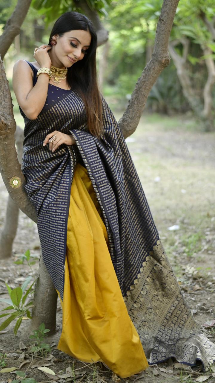
A matching blouse works when you want the saree to appear longer, quieter and more polished. A cream saree with a cream blouse can make the drape look uninterrupted, whereas a black saree with a bright blouse creates a stronger horizontal division between the upper body and the pleats. Neither approach is automatically more elegant; each creates a different visual rhythm.
Colour contrast can be high, such as cobalt blue with orange, or low, such as ivory with beige. Low contrast gives definition without making the blouse dominate. High contrast makes the blouse a styling feature and is useful when the saree itself has a simple body, a restrained border or a small repeat pattern.
When Does a Matching Blouse Create a Better Silhouette?
A matching blouse usually creates a longer, more continuous silhouette because the eye reads the saree and blouse as one uninterrupted colour area. The effect is valuable when the saree has a narrow border, a delicate print or a lightweight drape that you don't want to divide visually.
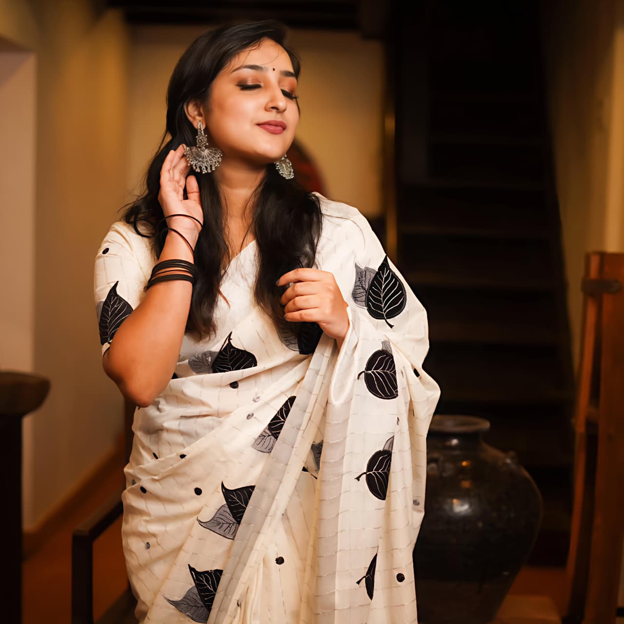
The Designer Cream Linen Saree with Matching Blouse demonstrates why tonal dressing can feel composed. Cream keeps the fabric, blouse and pleats in one soft field, allowing jewellery, a bright lip or a textured hairstyle to become the focal point. A similar approach suits Chanderi, linen cotton and other fabrics where the beauty comes from surface texture rather than heavy ornament.
Matching doesn't require an identical shade. A blouse one or two tones deeper than the saree can add shape while preserving continuity. For example, a warm ivory saree paired with a muted beige blouse remains coordinated, but the neckline and sleeves are still visible. Matching the blouse to a border rather than the saree body also creates a controlled version of tonal styling.
Which details keep a matching blouse from looking flat?
A different texture, neckline or sleeve treatment keeps a matching blouse from looking flat. A matte cotton saree can gain interest from a slightly lustrous blouse, while a silk saree may benefit from a blouse in a similar colour with a plain finish.
Use construction details carefully. A square neckline, elbow-length sleeve, covered buttons or a narrow piping line can supply definition without introducing another colour. With Banarasi silk or a zari-rich saree, a plain matching blouse often prevents the upper body from becoming overly ornate. With a printed saree, matching the blouse to one background colour can make the print appear more intentional.
When Should You Choose a Contrast Blouse?
Choose a contrast blouse when the saree needs a clear focal point, stronger colour balance or a more contemporary finish. Contrast is particularly effective when the saree contains a border colour that appears only in small amounts, because the blouse can repeat that accent and make the entire outfit feel coordinated.
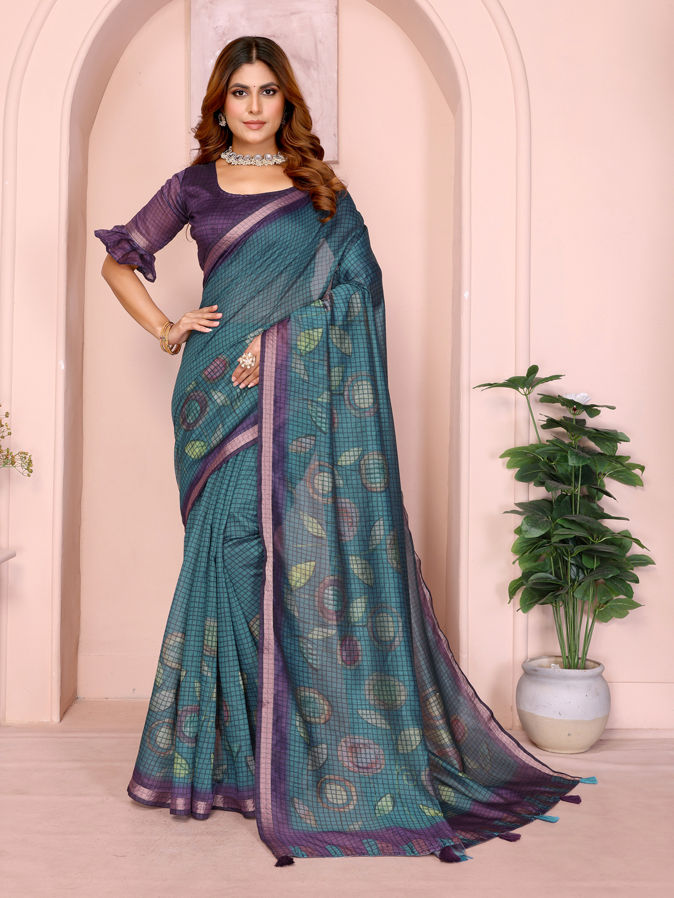
The Multicolour Floral Linen Cotton Saree with Blue Border Look offers a practical example: a blue blouse can reinforce the border, while a coral, mustard or deep green blouse can pull out a secondary colour from the floral pattern. The best contrast is usually already present somewhere in the saree. A completely unrelated colour can work, but it requires stronger support from jewellery, footwear or a handbag.
A contrast blouse also changes the perceived formality of a saree. A jewel-toned blouse can make a simple cotton saree suitable for an evening gathering. A plain black blouse can sharpen a colourful printed saree for a gallery visit or dinner. A bright pink blouse with a muted saree feels festive without requiring sequins across the whole outfit.
Contrast can be created through texture rather than colour. A plain blouse against a patterned saree makes the print clearer. A checked or woven blouse beside a plain saree creates a graphic effect. Avoid combining a large print on the saree with an equally large print on the blouse unless the colours and scales are carefully controlled; two competing patterns can make the drape look crowded.
How Do Border, Print and Fabric Affect the Blouse Decision?
The saree's strongest existing feature should determine whether the blouse matches, contrasts or stays neutral. A broad border, large floral print, dense zari field or high-contrast weave already supplies visual emphasis, so the blouse often works best when it repeats one colour or uses a calm texture.
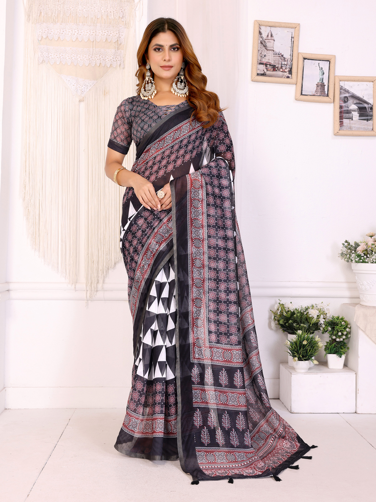
The Black Chanderi Cotton Saree with Contemporary Checked Weave has a structured surface that can support a crisp contrast blouse, but a busy checked blouse could compete with the weave. A black blouse keeps the outfit sleek; a jewel-toned blouse makes the checked texture feel more fashion-forward. The choice depends on whether you want the saree's fabric or the upper body to lead.
The Elegant Black Kalamkari Silk Saree with Blouse shows a different problem. Kalamkari-inspired motifs can contain several earthy colours, so the blouse should usually pick one grounded shade from the artwork rather than introduce a new neon accent. Rust, maroon, muted mustard or black can preserve the visual connection between blouse and printed silk.
Kanjeevaram sarees often have strong contrast borders and zari, which means a blouse may match the border, coordinate with the body or deliberately reverse the dominant colour. Chanderi tends to reward restrained tonal combinations because its appeal often lies in translucency and weave. Cotton sarees can handle clearer colour breaks, especially for daytime dressing.
Should the blouse match the saree body or the border?
The blouse should match the saree body when you want continuity and the border when you want definition around the face and shoulders. Matching the border is one of the safest ways to create contrast because the colour already exists in the saree.
For a black saree with a gold zari border, a black blouse produces a long, formal line, while a gold blouse echoes the border and brings light towards the face. For a pink saree with a green border, a green blouse makes the border more prominent and gives the outfit a classic colour relationship. Consider the proportion of the border: a very narrow border may need repetition through earrings or bangles so that the blouse doesn't feel disconnected.
How Do Printed and Embellished Sarees Change the Equation?
Printed or embellished sarees usually benefit from a simpler blouse, because a calm upper section gives the eye somewhere to rest. A matching blouse creates a continuous canvas, while a contrast blouse can frame the print and make one motif colour more visible.
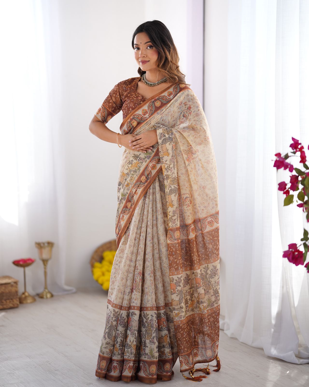
The Designer Rose Floral Print Mirror Work Saree with Matching Blouse for Women already combines floral print and mirror work, so a blouse with another large motif could dilute the outfit's structure. The supplied matching direction keeps the surface coherent. If you later choose a contrast blouse, a plain rose, wine or ivory option would be more controlled than an additional floral print.
The Rani Pink Floral Handloom Saree with Blouse can move from daytime to celebration through blouse colour and finish. A matching rani pink blouse keeps the handloom character prominent. A deep green or maroon blouse creates a richer festive contrast, especially when paired with antique-finish earrings instead of highly reflective diamond-style accessories.
For a saree with mirror work, sequins or dense zari, limit the blouse's shine if the saree already catches a lot of light. One reflective surface is often enough. If the saree is plain, a lightly embellished contrast blouse can supply occasion wear impact without making the pleats heavy.
How Can One Saree Work for Work, Festivals and Weddings?
One saree can serve different occasions when the blouse, jewellery and drape are changed as a coordinated set. The blouse is usually the fastest way to shift the perceived formality without altering the saree itself.
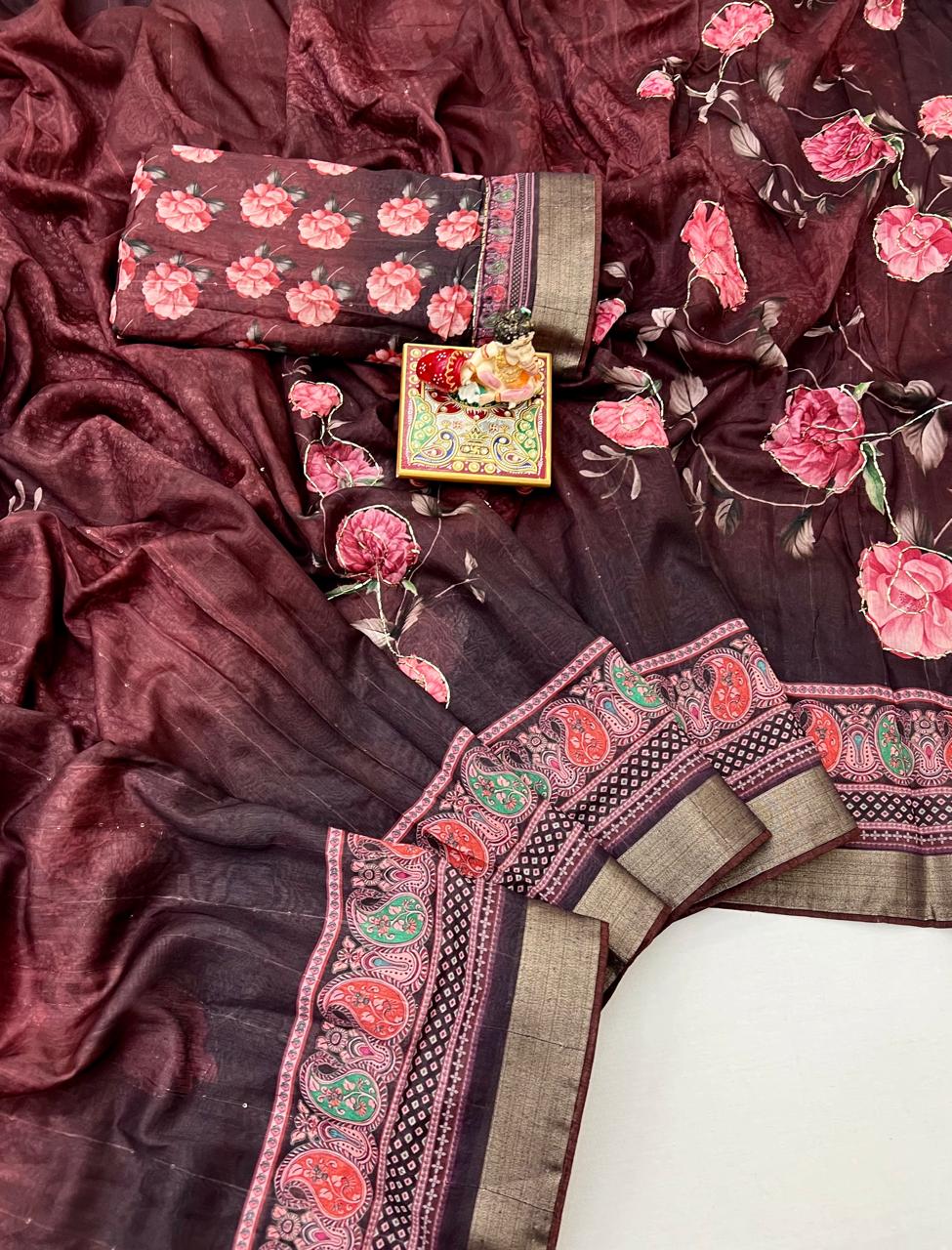
For work, select a matching or low-contrast blouse in a breathable fabric, a moderate neckline and sleeves that stay comfortable under a jacket or dupatta. A black blouse with a printed saree, a cream blouse with linen cotton, or a muted border-colour blouse with handloom fabric creates a professional balance. Keep jewellery small and let the saree's weave provide interest.
For a Haldi ceremony, a bright contrast blouse can echo marigold yellow, turmeric orange, leaf green or fuchsia used in the décor. Choose a secure neckline and sleeves that allow movement, because ceremony activities can involve sitting on the floor, reaching forward and managing colour or water. Cotton, linen cotton and lightweight silk blends are generally easier to manage than very heavy drapes during a long daytime event.
For a wedding reception, a darker contrast, zari detail or richer silk blouse can increase formality. The Black Kalamkari Tussar Silk Saree with Blouse can be styled with a blouse that repeats a deep motif colour, while the Elegant Mustard Dola Butti Silk Saree With Blouse can take a maroon, bottle-green or matching mustard direction depending on the jewellery. Keep the blouse lining smooth and the shoulder fit secure so that embellishment doesn't distract from movement.
For a family puja or festival, matching a blouse to the saree or border usually feels respectful and balanced. Kanjeevaram, Banarasi silk and silk-cotton sarees can all be styled this way, although the level of zari and jewellery should suit the time of day and the scale of the gathering.
What Fit and Neckline Make the Colour Choice Work?
A well-fitted blouse makes either colour strategy look intentional, while poor fit can make a carefully selected combination appear untidy. The shoulder seam should sit at the shoulder edge, the armhole should allow movement without gaping, and the bust area should lie flat when both arms are raised.
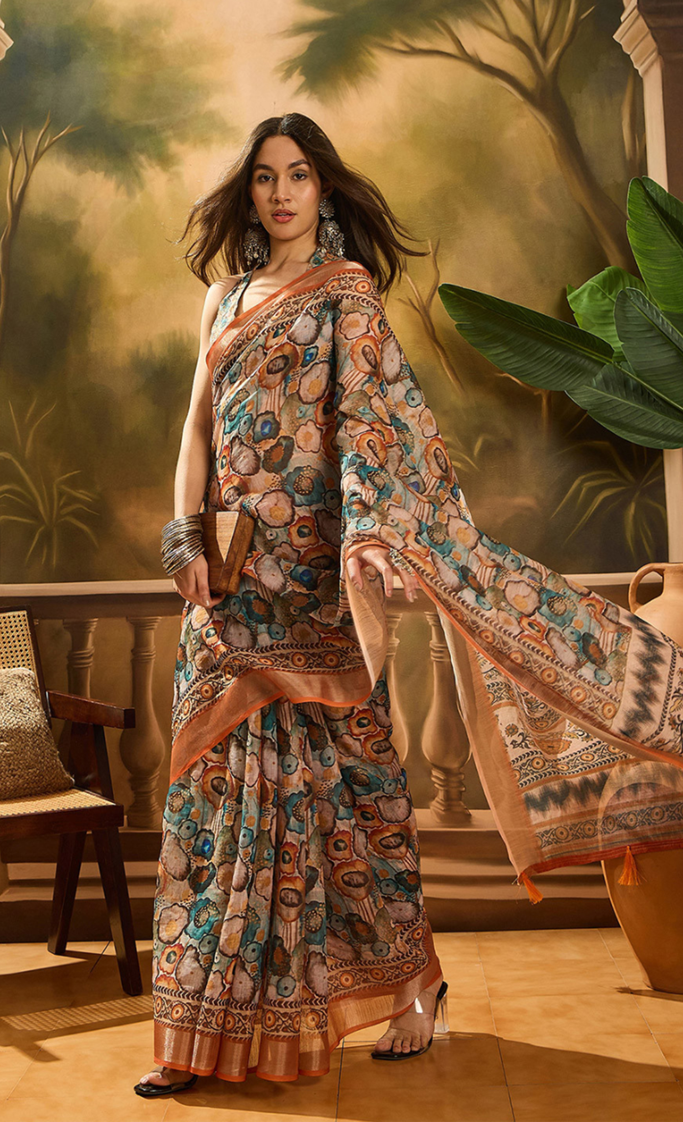
A contrast blouse attracts attention to the upper body, so neckline and sleeve proportions become more visible. A high round neck gives a compact, formal effect. A square neck adds structure. A V-neck creates a vertical opening that can balance a strong horizontal border. Elbow-length sleeves can make a bright blouse feel more time-honoured, while short sleeves often look lighter with casual cotton sarees.
A matching blouse allows more freedom because the colour transition is less dramatic, but fit still matters. A blouse that's too loose can break the continuous line that makes tonal styling effective. A blouse that's too tight creates pulling at the hooks and armhole, which is especially noticeable in photographs.
Take measurements while wearing the bra or inner garment intended for the saree. Check sitting, arm-raising and forward-reaching movement before finalising the blouse. A practical alteration allowance is valuable because a blouse may need adjustment after lining, piping or embroidery is added.
How Do You Make the Final Choice Without Guesswork?
Make the final choice by ranking the saree's dominant feature, the occasion and the desired visual focus. This three-step test is more reliable than choosing a colour because it looks attractive on a swatch.
- Identify the lead element. Decide whether the saree's lead element is its border, print, weave, zari, colour or drape. Let the blouse support that element rather than compete with it.
- Choose the visual effect. Select matching for continuity, low contrast for definition or high contrast for a statement. A low-contrast blouse is often the most versatile option when you're uncertain.
- Check the full outfit. Place the blouse, saree, jewellery and footwear together in daylight. Photograph the combination from the front and at three-quarter angle, because a colour that seems balanced in a flat lay may dominate once worn.
Budget and availability can also guide the decision. Collections such as Sarees from Rs 1000 to Rs 1500 can be useful for building flexible everyday combinations, while Sarees Under 20% Off and Sarees Under 10% Off may help you test a new colour direction without committing to a heavily embellished wardrobe piece. Compare the cost of a separate blouse, lining, tailoring and finishing when planning the complete outfit.
The most dependable rule is simple: match when the saree already has plenty of visual information or when you want a graceful uninterrupted line; contrast when the saree needs a clear accent or when you want the blouse to frame your face. A considered contrast isn't merely a brighter colour, and a matching blouse isn't merely the easiest option. Both are deliberate tools for changing proportion, mood and occasion value.
Common Questions About Choosing a Contrast or Matching Saree Blouse
Is a contrast blouse better than a matching blouse for a saree?
Neither option is universally better. A contrast blouse creates a clear focal point and adds energy, while a matching blouse gives a longer, more unified silhouette. Choose according to the saree's border, print, fabric and the formality you want.
Should a saree blouse match the body or the border?
Match the blouse to the saree body for a continuous tonal look and match it to the border for stronger definition. Border matching is especially dependable because the blouse colour already appears in the saree.
Which blouse colour suits a multicolour floral saree?
Choose one colour already present in the floral print or border. A blue blouse works naturally with the blue border of the Multicolour Floral Linen Cotton Saree with Blue Border Look, while a secondary coral, mustard or green shade can create a livelier contrast.
Can I wear a contrast blouse with a printed saree?
Yes, but keep the blouse pattern simple when the saree has a large or detailed print. A plain blouse in one of the saree's existing colours will frame the print more effectively than another competing motif.
What blouse works with a black saree?
A black blouse creates a sleek and formal uninterrupted line, while gold, jewel tones or a muted motif colour can make the outfit more expressive. The best option depends on whether the black saree has zari, checks, Kalamkari motifs or another strong surface detail.
How can I style one saree for both daytime and a wedding?
Use a restrained matching or low-contrast blouse, minimal jewellery and a practical drape for daytime. For a wedding, change to a richer contrast blouse or a more detailed neckline, then add heavier earrings, bangles and a dressier drape.


