Are Customer Photos Enough to Judge a Saree Colour? The short answer is no, not on their own. Customer photos are valuable evidence, but the visible shade can change because of indoor lighting, phone-camera processing, screen settings, fabric texture and surrounding colours. A reliable online colour judgement combines customer images with the product description, fabric name, close-up views, seller photographs and an understanding of how light affects the saree.
Colour accuracy matters especially for multicolour sarees, pastel sarees, satin sarees and fabrics with zari or reflective surfaces. A teal saree can appear blue under cool white light, while a mustard shade can look more orange in warm indoor lighting. The right approach isn't to reject customer photos, but to read them as one part of a larger set of clues.
Customer photos are enough to estimate a saree's colour family, but they're rarely enough to confirm an exact shade. A customer photograph can show whether a saree is broadly teal, wine, pastel, mustard or multicoloured, yet the image may not reproduce the precise undertone or intensity.
Customer images are particularly useful for questions that a studio photograph may not answer. A customer photograph can show how the saree falls, whether the border looks prominent when worn, how much of the blouse piece is visible and whether the print appears large or delicate on a person. Customer photos can also reveal how a fabric behaves away from controlled lighting.
Exact colour matching requires more caution. A saree that needs to coordinate with a specific blouse, family outfit or wedding décor should not be purchased based on one photograph alone. A difference between blue-green and green-blue, or between dusty rose and mauve, can become obvious only when the saree is placed beside another garment.
Are Customer Photos Enough to Judge a Saree Colour Under Different Lighting?
Customer photos are not fully reliable under different lighting because light sources change the warmth, brightness and saturation of a saree. Daylight, yellow bulbs, cool LEDs and direct sunlight can all produce different impressions of the same fabric.

Lighting changes the visible undertone
Daylight usually gives the most useful colour reference, but daylight varies by time and location. Direct afternoon sun can make colours appear brighter and more saturated, while shade can make them look cooler and slightly muted. Yellow bulbs add warmth, and cool LED bulbs may push a saree towards blue or green.
A customer photo taken beside a window may therefore look different from a studio image taken under softbox lights. A wine floral saree photographed in a warm bedroom can appear redder than the same saree photographed outdoors. A white background can also make a colour appear stronger than a beige or wooden background.
Phone cameras alter colour automatically
Phone cameras often apply automatic white balance, contrast and saturation before an image reaches the viewer. Beauty filters and social-media compression can intensify pinks, reds and oranges or reduce subtle differences between neighbouring shades.
Older phones may under-record shadow detail, while newer phones can brighten dark areas and sharpen printed motifs. Neither result is necessarily inaccurate in a general sense, but neither should be treated as a calibrated colour sample. A customer photograph is an interpretation of the saree, not a laboratory reference.
Your screen affects the final impression
Your screen affects the final impression because brightness, colour temperature, display technology and night-mode settings vary between devices. The same saree may appear cooler on a laptop, more vivid on an AMOLED phone and duller when viewed with a blue-light filter enabled.
Screen brightness also changes perceived depth. High brightness can wash out a pastel Chanderi saree, while low brightness can make a dark wine shade appear almost brown. Checking an image on two devices can reveal whether the apparent difference comes from the product or the display.
Are Customer Photos Enough to Judge a Saree Colour and Fabric Texture?
Customer photos become more informative when they're read alongside the saree's fabric and weave, because texture changes how light is reflected. Fibre content, yarn arrangement and surface finish affect whether a shade looks matte, luminous, translucent, soft or intense.
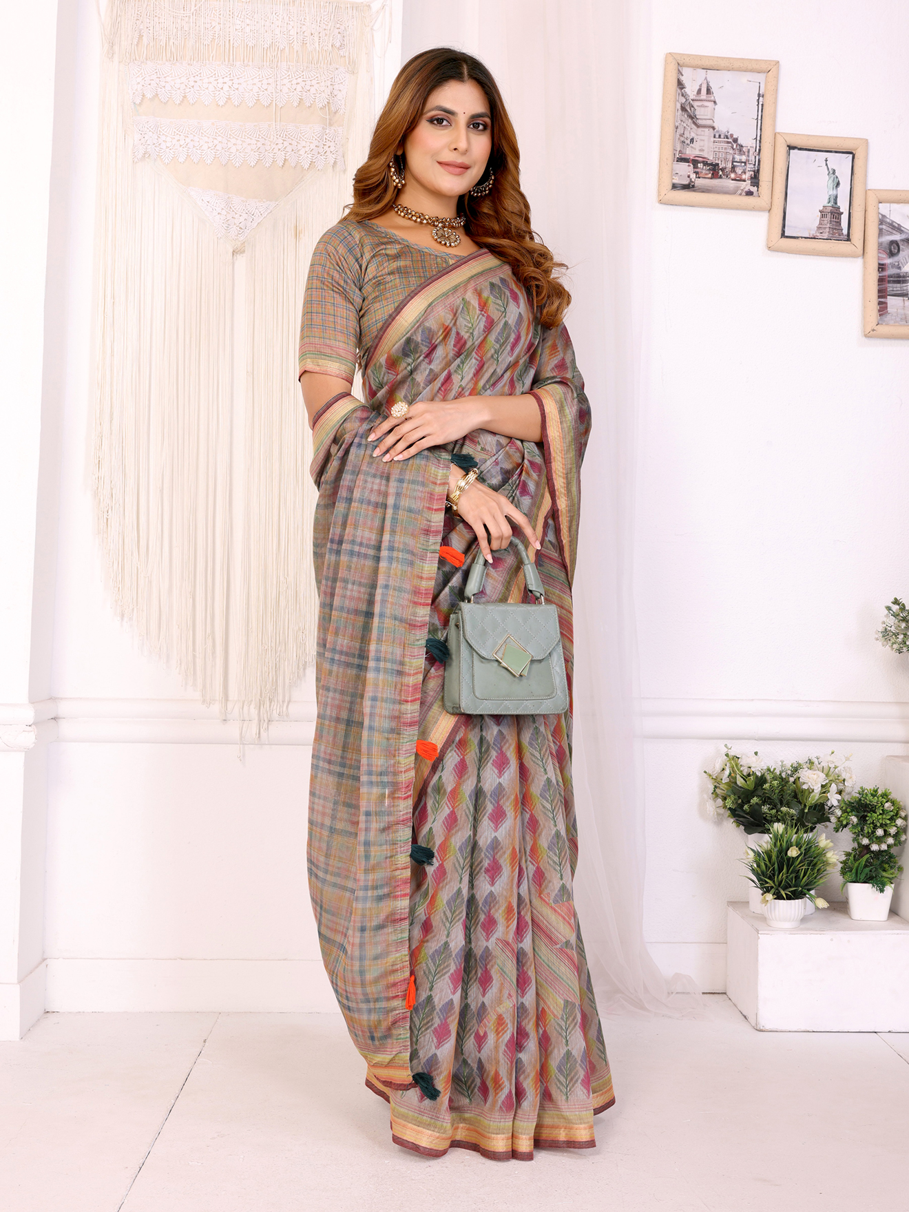
Chanderi cotton has a light surface that can make colours look airy and gently luminous. Linen cotton generally has a more textured, natural appearance that can soften the sharpness of a printed shade. Satin reflects light directionally, so one section may look brighter while another appears deeper as the pleats move.
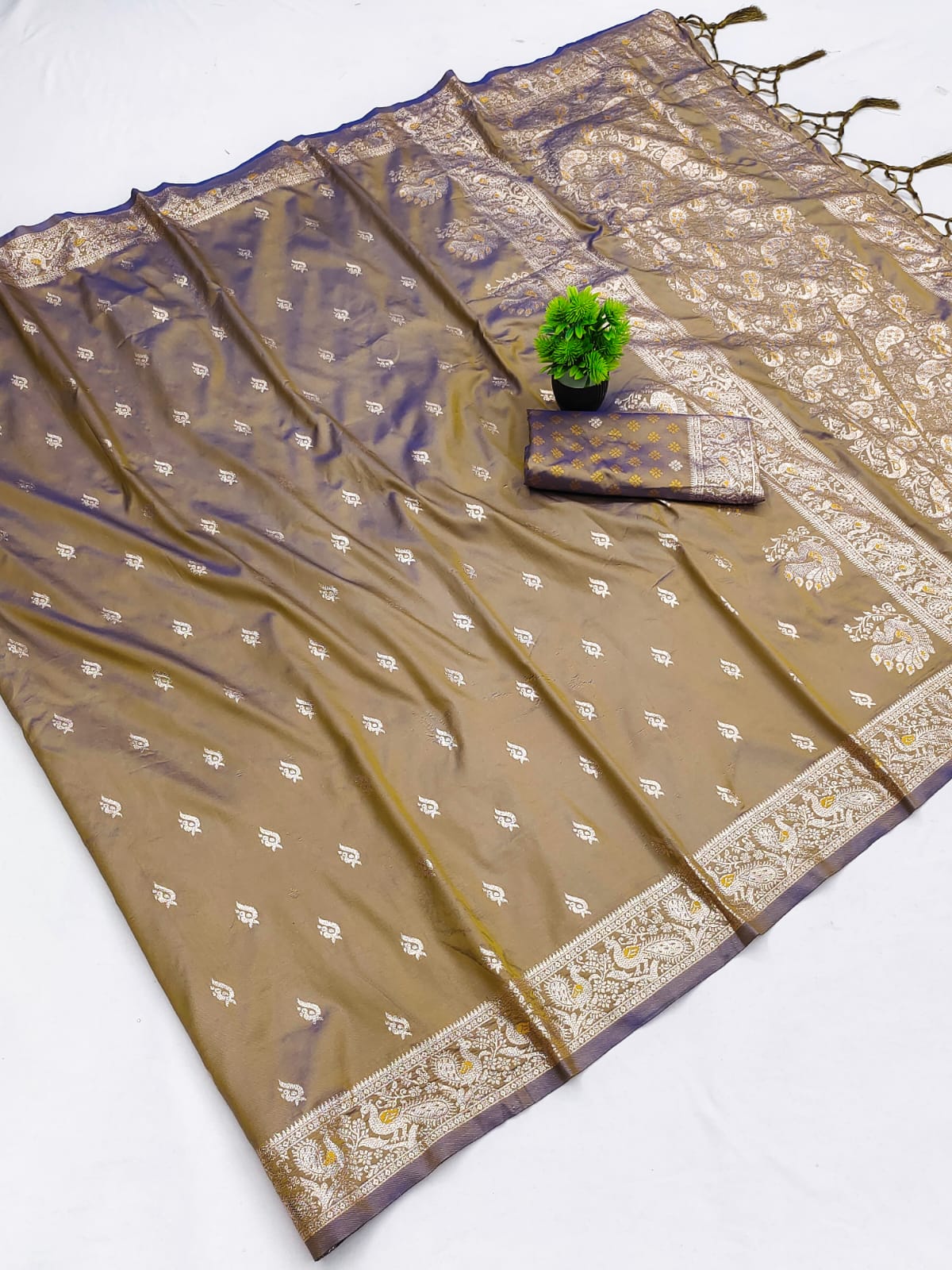
Crystal embellishment and zari create another complication. Reflective details can throw highlights onto nearby fabric, making a border seem brighter or changing the apparent contrast between the body and the pallu. A golden border may look pale champagne under daylight and richer yellow under warm lighting.
Multicolor Chanderi Cotton Saree with Artistic Leaf Pattern illustrates why texture matters. A leaf print on a light Chanderi ground can appear more delicate in a flat product photograph and more dimensional when the fabric is draped. Pastel Checkered Chanderi Cotton Saree with Soft Border may also look less saturated on screen because pastel tones contain a high proportion of light.
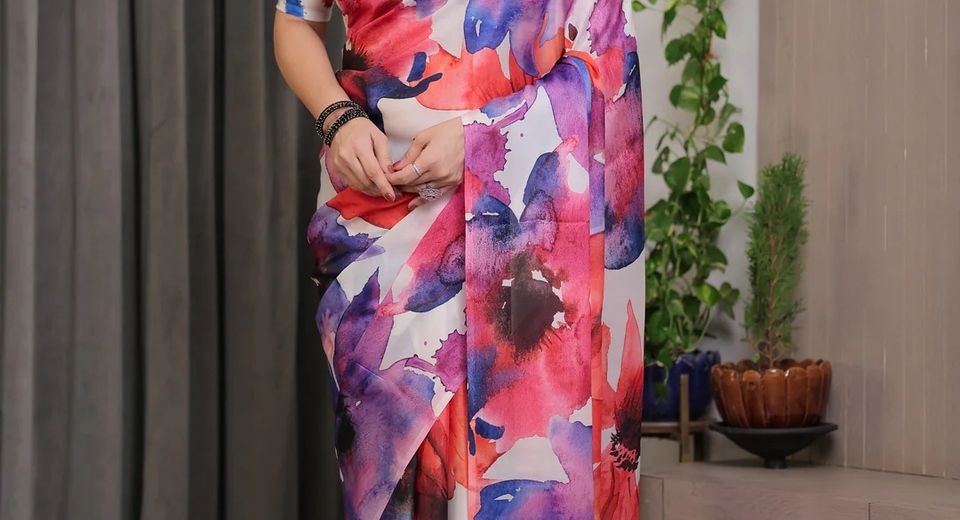
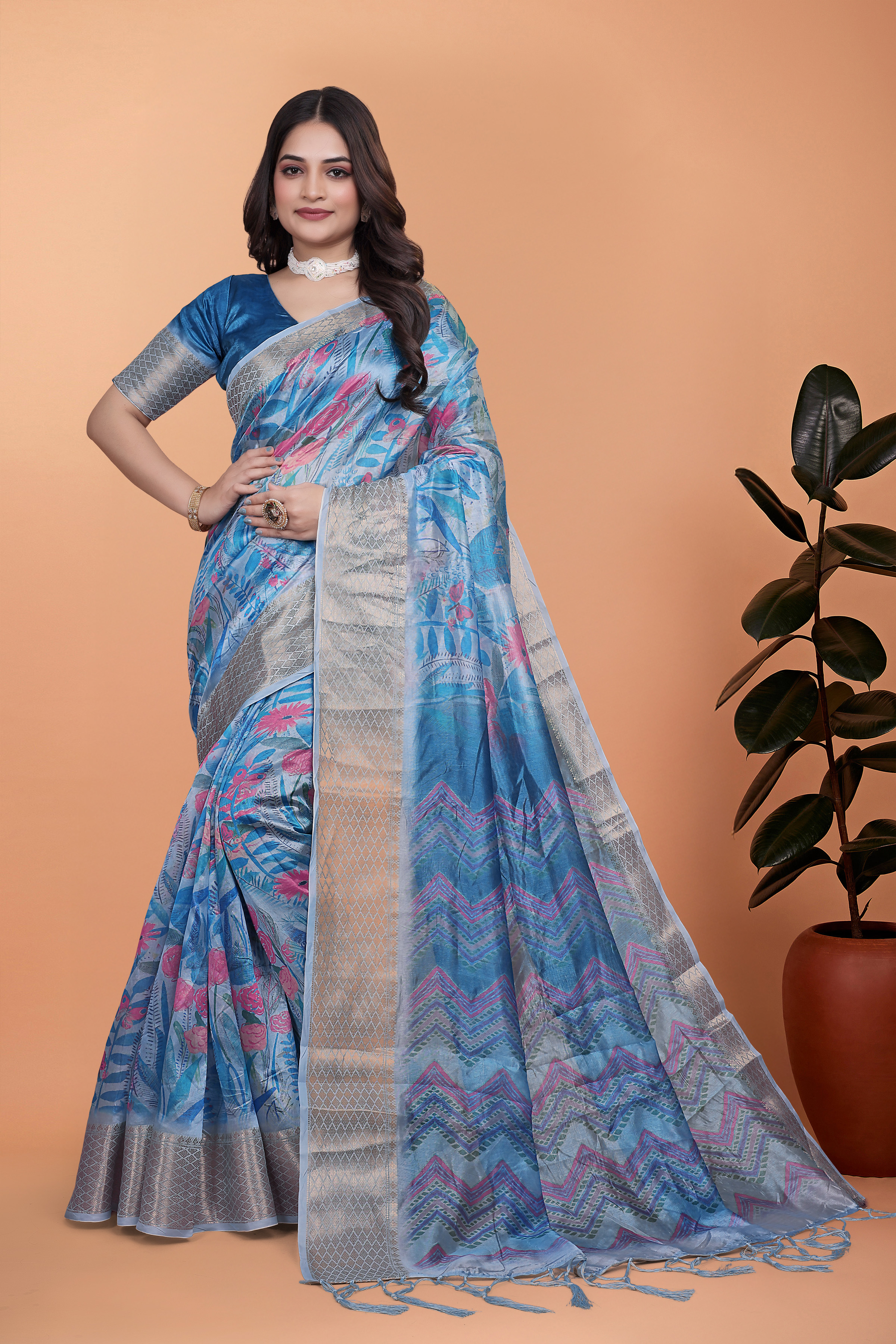
Multicolor Abstract Satin Saree with Unstitched Blouse Piece demonstrates the opposite effect. Satin can catch a bright stripe of reflected light, causing the same colour to look lighter on one fold and deeper on another. A viewer should judge the dominant shade across the full body, not the brightest highlight.
Are Customer Photos Enough to Judge a Saree Colour Without Comparing Images?
Customer photos are more dependable when several images show a consistent colour under different conditions. One photograph can be misleading, while repeated evidence across customer reviews, product photographs and close-ups can reveal the saree's likely colour range.
- Look for repeated evidence: If three customers show a saree as blue-green, a single image that makes it look royal blue is probably affected by lighting.
- Check the background: White, grey and natural outdoor backgrounds make colour comparison easier than red walls, yellow curtains or decorative lights.
- Study different areas: Compare the body, border, pallu and blouse piece because contrast can make one section influence how another section appears.
- Prefer unfiltered images: A casual image with ordinary lighting can be more informative than a heavily edited fashion photograph.
- Read the written review: Words such as "more muted," "warmer than shown" or "exactly as pictured" provide context that an image can't supply alone.
Artistic Multicolor Crystal Blend Saree with Golden Borders should be examined through several customer images because crystal details can reflect light unevenly. A review showing the saree indoors and outdoors is more useful than a single close-up under decorative lighting.
Are Customer Photos Enough to Judge a Saree Colour Before Ordering?
Customer photos are not enough by themselves before ordering, but they can support a dependable five-minute colour check. The check should identify the dominant colour family, the undertone, the strongest contrast and the effect of the fabric surface.

- Read the listed colour name carefully. "Teal," "mustard orange," "wine" and "pastel" describe broad families, not exact Pantone-like specifications. The word "multicolour" means the secondary shades deserve equal attention.
- Compare the product image with customer photos. Look for the colour that remains consistent across lighting conditions. Treat a shade visible in only one image as uncertain.
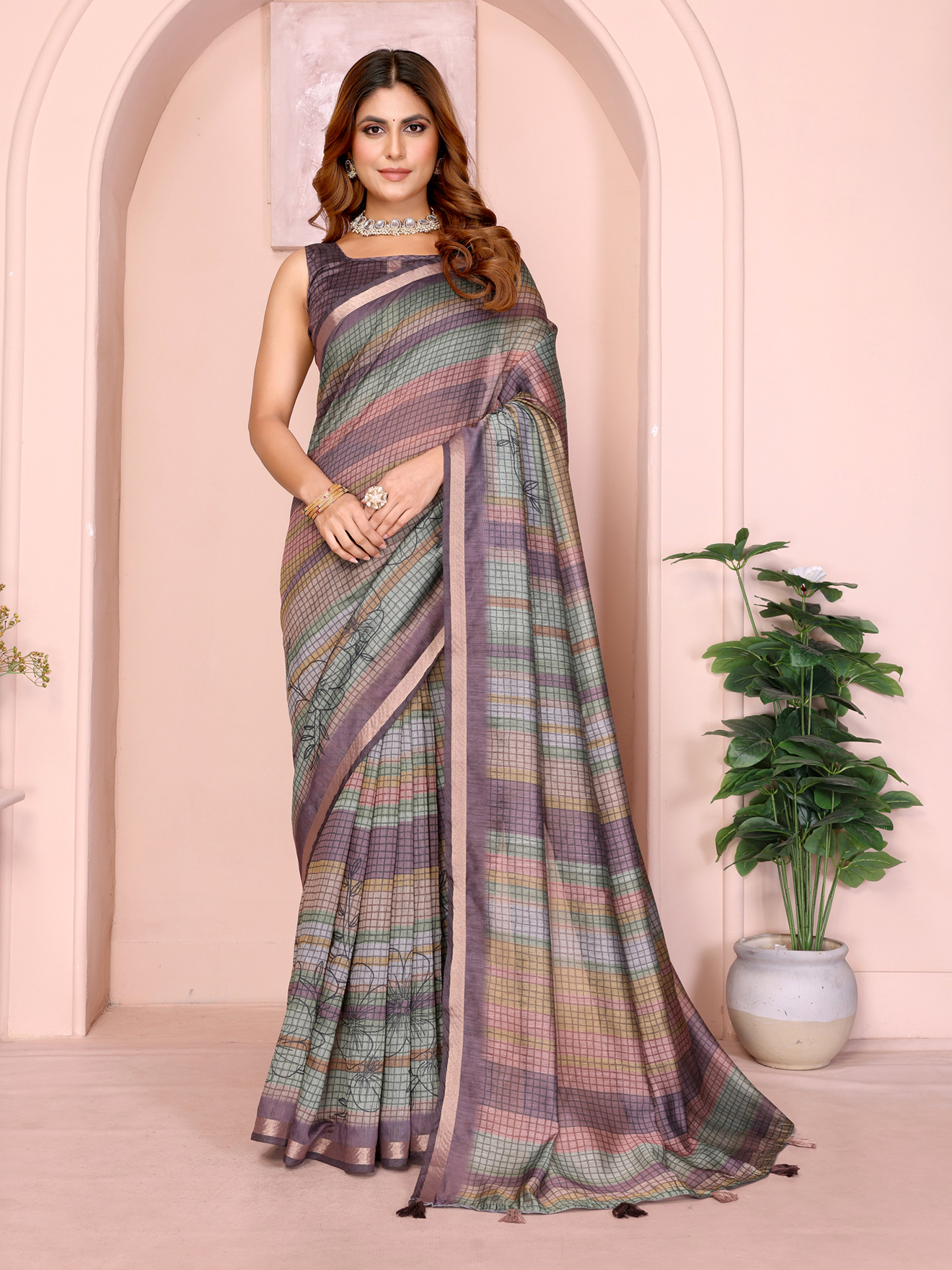
- Inspect the border and pallu separately. A purple border, golden zari or contrast print can make the body look different by comparison. Multicolor Grid Print Linen Cotton Saree with Purple Border needs to be assessed as a combination of body colour and border colour.
- Use nearby product information. Fabric details, close-up images and a blouse-piece photograph can clarify whether the surface is matte, sheer, textured or glossy.
- Contact support with a precise question. Ask whether the dominant body shade is warm or cool, whether the colour runs darker than the image and whether the blouse piece matches the body. Specific questions produce more useful answers than "Is the colour accurate?"
- Allow for natural variation. Handloom textures, printed surfaces and blended fibres may create small differences between batches or between the body and border. Colour variation should not automatically be treated as a defect.
Teal Mal Cotton Woven Print Saree With Blouse - VARNAVI is a useful example of why a buyer should distinguish a named colour from its visual temperature. Teal can lean towards blue or green, and woven texture may make the shade look softer than a flat digital swatch.
Are Customer Photos Enough to Judge a Saree Colour in Multicolour Designs?
Customer photos are most useful for multicolour sarees when a buyer identifies the dominant base, strongest secondary shade and border contrast instead of searching for one exact colour. Multicolour designs naturally produce different impressions at different distances.

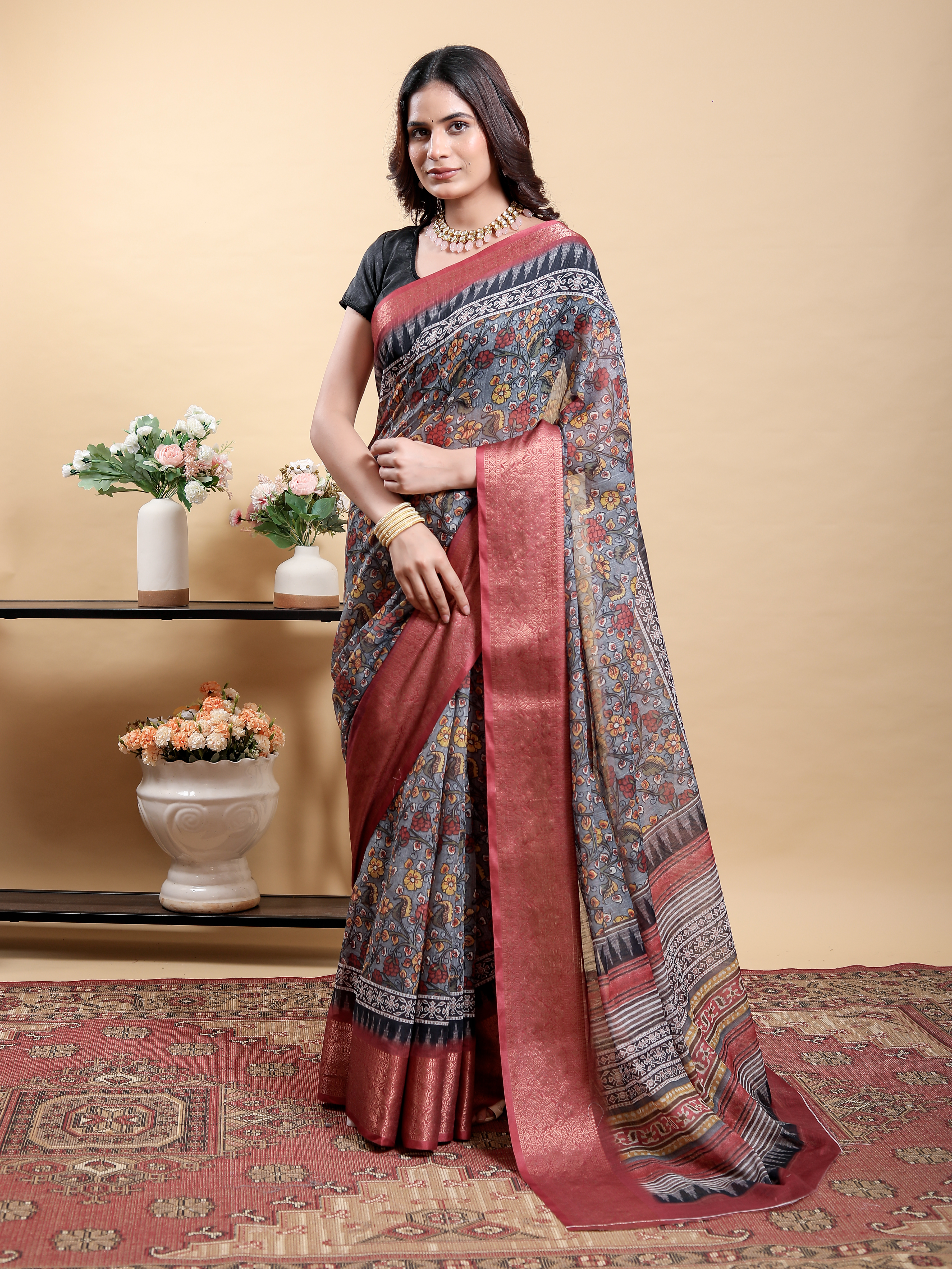
At arm's length, a printed saree may read as one blended tone. At close range, individual motifs may reveal orange, pink, purple, blue or green details. Mustard Orange Linen Cotton Saree with Multicolor Floral Print may look predominantly mustard when draped, even though orange and several floral colours are prominent in close-up photographs.
Wine Floral Linen Cotton Saree with Elegant Contrast Border should be judged by separating the wine body from the contrasting border. A contrasting border can make the body appear deeper, warmer or more purple depending on the surrounding colours and the viewing distance.
Multicolour sarees also change visually according to pleating. A pallu with broad colour blocks may show one shade clearly when spread flat, but the same shades may blend when pleated over the shoulder. Customer photographs taken while the saree is worn can therefore be especially useful for understanding the overall visual balance.
Are Customer Photos Enough to Judge a Saree Colour for Blouse Matching?
Customer photos are not sufficient for precise blouse matching unless the blouse fabric is shown under comparable lighting. A blouse should be matched to the saree's dominant body or border shade after considering undertone, texture and reflectivity.

For a teal saree, a buyer should decide whether the intended blouse is blue-teal, green-teal, navy or a neutral shade. For a mustard-orange saree, ivory, rust, deep green or a matching mustard may coordinate differently depending on the print. A screenshot should not be used as a colour swatch for tailoring.
Blouse-piece photographs can still provide useful evidence. Compare the blouse piece with the saree body rather than viewing it alone, because the same shade can appear lighter beside a dark border and darker beside a pale ground. Ask for a daylight comparison if the blouse colour is central to the outfit plan.
Colour risk is also easier to manage when choosing from a clearly described price range and collection. Sarees from Rs 1000 to Rs 1500 can be a practical category for everyday experimentation, while Sarees Under 20% Off and Sarees Under 10% Off may help shoppers compare styles without assuming that a discount guarantees colour accuracy. Sarees Flat 60% Off and Sarees Flat 50% Off still require the same image-checking process because a lower price doesn't remove the effects of lighting or screens.
The Final Decision Rule
Customer photos are enough for a confident colour estimate when several unfiltered images agree, the product description names the dominant shade, the fabric is understood and the border or pallu has been assessed separately. Customer photos are not enough for an exact match when only one image exists, the lighting is strongly warm or cool, the saree is satin or embellished, or the purchase depends on matching a specific garment.
Use customer photographs to answer how the saree looks when worn, use product images to understand the design, use fabric information to predict light reflection and use written reviews to identify recurring colour differences. This layered method is more reliable than trusting either a polished studio photograph or a single customer selfie.
A small amount of caution is worthwhile for pastel, multicolour, printed and reflective sarees. Looking at images on a second device, disabling night mode and asking one precise colour question can significantly improve an online purchase decision.
Common Questions About Judging Saree Colour Online
Can customer photos show the true colour of a saree?
Customer photos can show the approximate colour family, but they cannot guarantee an exact shade. Lighting, phone-camera processing, filters and screen settings can all alter the visible colour.
Why does a saree look different on my phone and laptop?
A saree can look different because phones and laptops use different displays, brightness levels and colour profiles. Night mode, blue-light filters and high screen brightness can also change how warm, cool or saturated the saree appears.
How can I check whether an online saree colour is warm or cool?
Compare several product and customer photos taken in neutral daylight, then look at whether the shade leans towards yellow, orange, red, blue or green. You can also ask support whether the dominant body colour has a warm or cool undertone.
Are customer photos useful for matching a saree with a blouse?
Customer photos are useful for estimating the overall combination, but they should not be treated as exact colour swatches. Compare the blouse piece, saree body and border together, and request a daylight comparison if the match is important.
Why do satin and zari sarees look different in photographs?
Satin and zari reflect light directionally, so one fold or embellishment may look brighter than another. The same saree can appear lighter, deeper or more golden depending on the angle of the light.
What should I do if customer photos disagree about a saree colour?
Give greater weight to repeated images taken in daylight and to written reviews that describe the colour consistently. If the disagreement remains, ask a precise question about the dominant body shade, undertone and whether the saree is darker or warmer than shown.