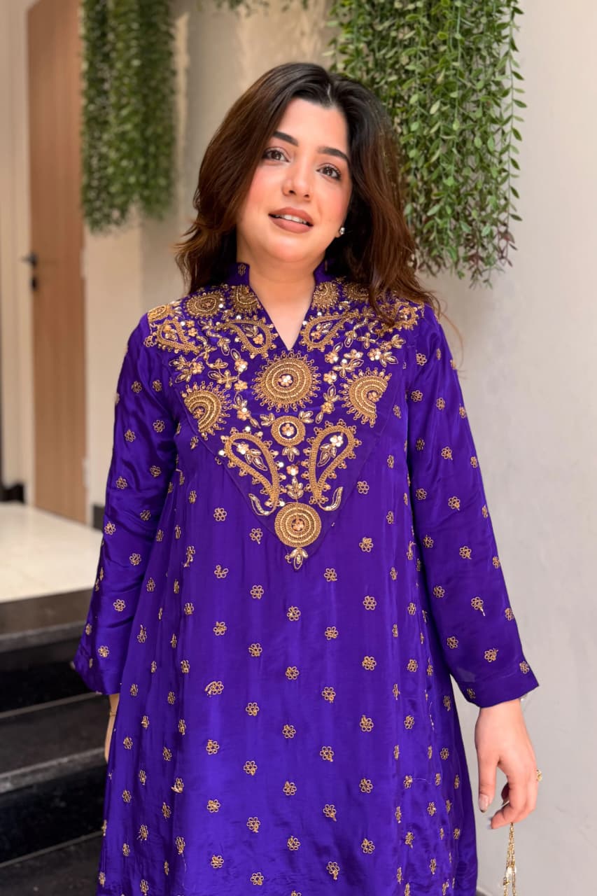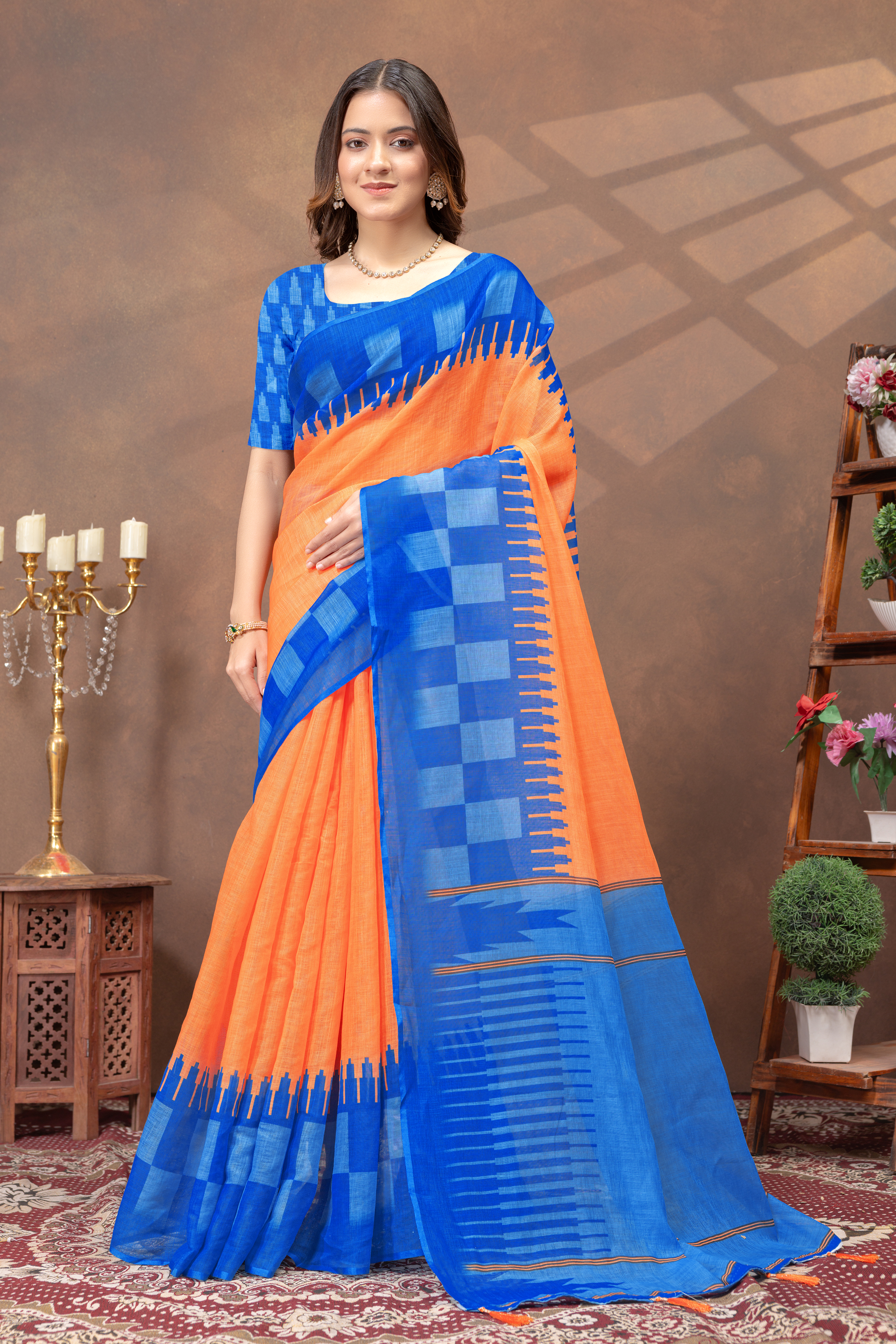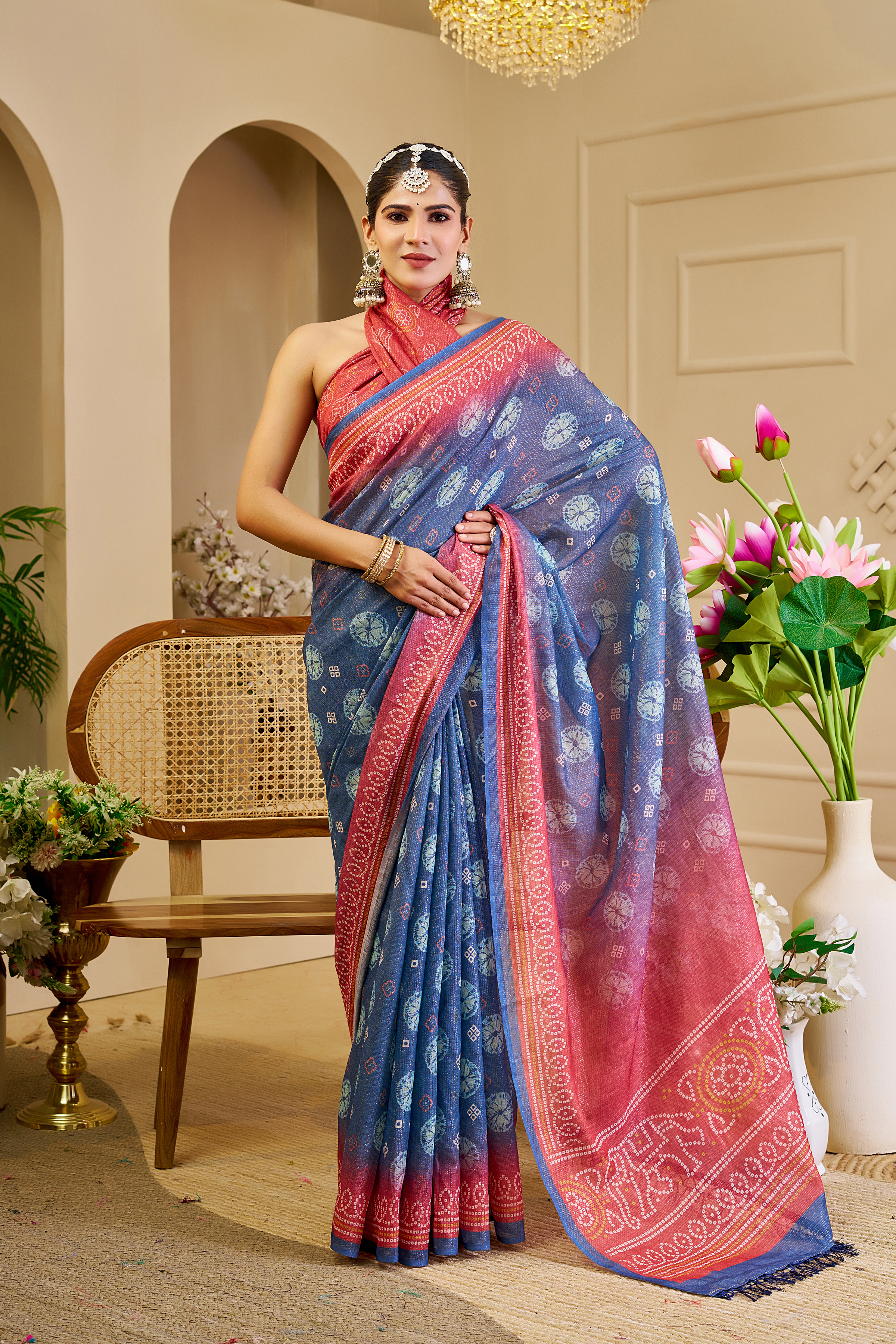
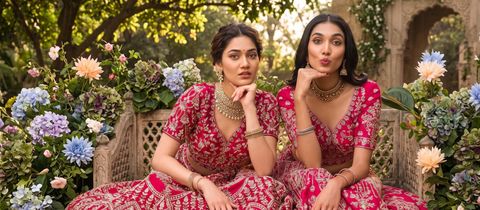
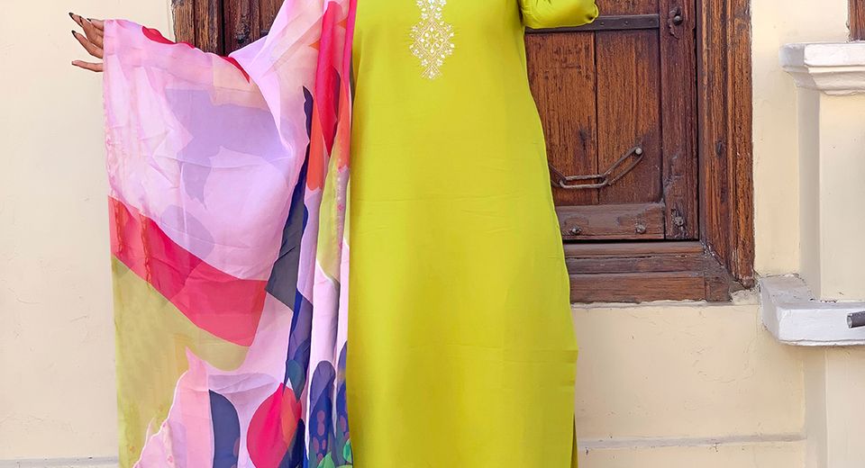
When Does a Straight Salwar Suit Need a Contrasting Dupatta? The answer depends on the kurta's colour, print, neckline, fabric and the occasion. A contrast dupatta is useful when the suit looks visually flat, when a small accent colour needs emphasis, or when a simple straight silhouette needs more movement. A matching dupatta is usually better when the kurta already has dense embroidery, multiple colours or a strong border.
A straight salwar suit has an even vertical line from shoulder to hem, so the dupatta becomes an important styling tool. A dupatta can create a second line of colour, soften a dark outfit, connect accessories to the kurta or introduce festive detail without changing the cut. The most reliable approach is to choose contrast deliberately rather than treating any different colour as automatically stylish.
Start With Colour Balance
A straight salwar suit needs a contrasting dupatta when the outfit lacks colour separation, needs an occasion-appropriate lift, or contains a secondary shade that can be repeated in the drape. Contrast works especially well with solid kurtas, restrained prints and straight suits with simple necklines.
A plain ivory or cream kurta can support a dupatta in red, wine, teal, indigo or black because the lighter base gives the second colour room to stand out. A black straight suit can benefit from a red, white, rust or jewel-toned dupatta, depending on whether the intended result is festive, formal or contemporary. A printed kurta may also need contrast when one minor print colour is strong enough to become the dupatta colour.
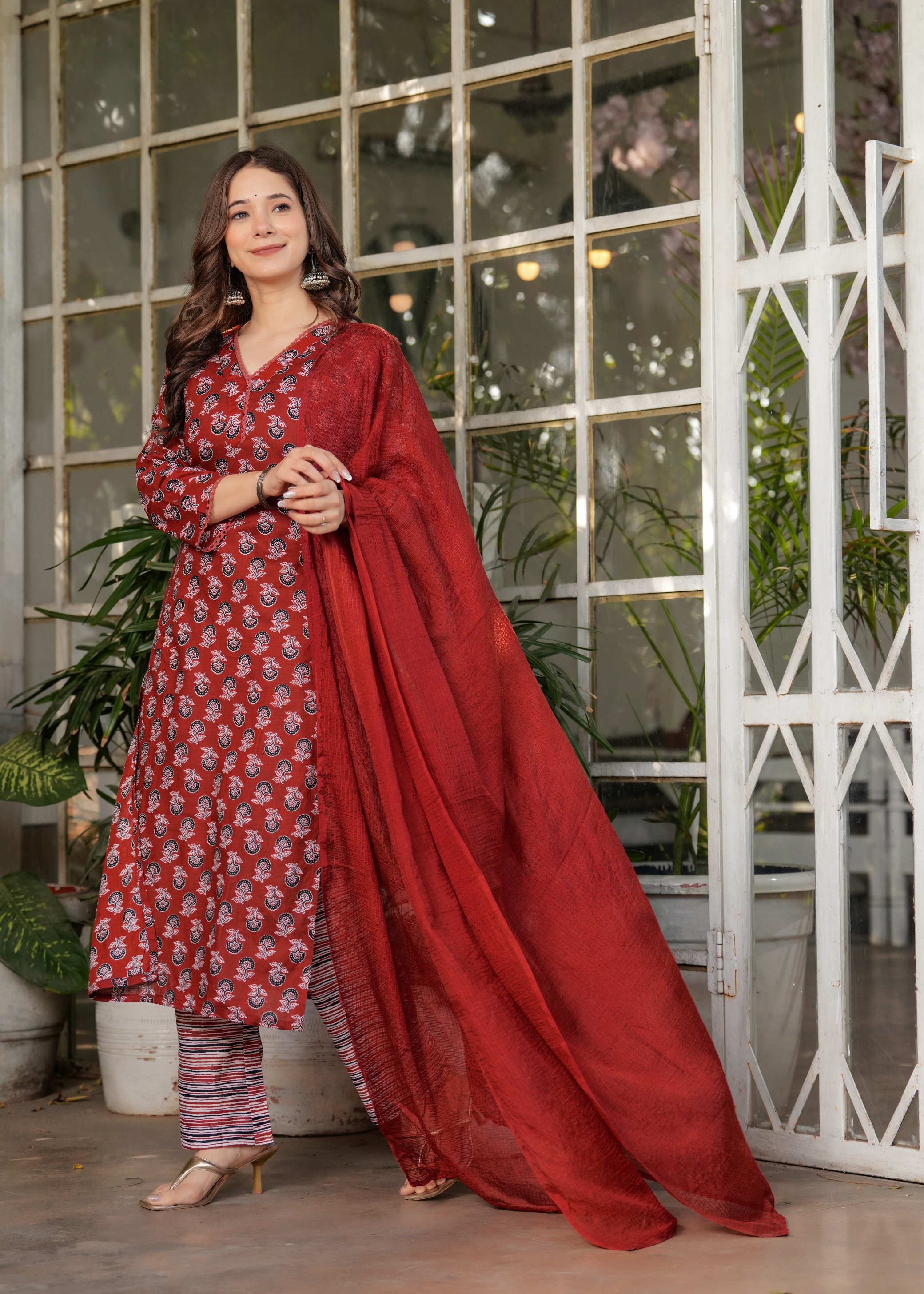
Contrast isn't limited to opposite colours on a colour wheel. A deep maroon dupatta with a muted pink kurta creates tonal contrast. An ivory dupatta with a charcoal kurta creates value contrast. A printed dupatta with a plain kurta creates pattern contrast. Recognising these three types makes colour pairing easier than relying on vague rules about bright and dark shades.
Read the Silhouette
A contrasting dupatta can add width, movement or a focal point to a straight salwar suit, but the best colour placement depends on the wearer's preferred visual balance. A lighter dupatta generally opens up a dark outfit, while a deeper dupatta gives definition to a pale kurta.
Use value contrast for a clearer frame
Value contrast means pairing light and dark shades, such as cream with black or red with ivory. A dark kurta with a light dupatta usually looks crisp because the dupatta breaks up a solid vertical block. A light kurta with a dark dupatta creates a stronger focal point and works well when the neckline, earrings or border deserve attention.
The Black White Floral Embroidered Readymade Salwar Suit demonstrates why value contrast should be assessed alongside print density. Black and white already provide clear separation. A solid red, charcoal or soft grey dupatta would preserve definition without competing with the floral embroidery. A neon shade or a second high-contrast floral print could make the upper half appear unnecessarily busy.
Use tonal contrast for a refined result
Tonal contrast uses related shades with different intensity, such as blush pink with berry, powder blue with navy or sage with emerald. Tonal combinations look polished because the outfit has variation without a hard visual break. Tonal contrast is particularly useful for daytime gatherings, work-friendly festive dressing and family functions where an outfit should look composed rather than dramatic.
The Cream Pink Printed Rayon Readymade Salwar Suit already combines a light base with a warmer accent family. A rose, dusty pink or muted berry dupatta can amplify the print, while a saturated fuchsia dupatta creates a more celebratory effect. The more intense the dupatta, the quieter the jewellery and footwear should become.
Match Print Density
A plain dupatta should be preferred when the kurta already contains dense print, embroidery, zari, a prominent border or several competing colours. A printed dupatta is more successful with a plain or lightly textured kurta.
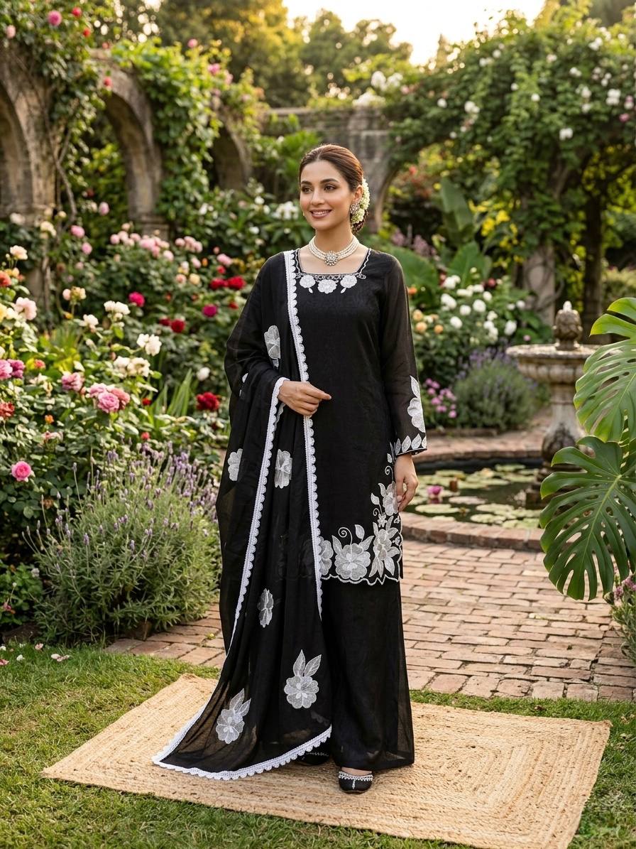
The Black White Floral Embroidered Readymade Salwar Suit benefits from restraint because the floral embroidery already supplies surface interest. A plain dupatta in black, white, red or grey will look intentional and keep the embroidery visible. The Off White Floral Embroidered Straight Suit Set can follow the same principle: a plain contrast in wine, bottle green, rust or black introduces depth without hiding the embroidery.
The Red Silk Blend Floral Straight Suit with Dupatta can support a dupatta that repeats one floral shade, but print scale matters. Small, spaced motifs keep the look graceful. A large, high-contrast pattern may compete with the floral kurta and make the upper half look crowded.
Pattern contrast can still work when two prints share one anchor colour. A cream kurta with a red-and-green dupatta feels connected because cream, red or green can be repeated through jewellery or footwear. Two unrelated prints with no shared colour often appear assembled rather than coordinated.
A useful proportion rule is to let one element lead and the other support. A heavily printed kurta calls for a quieter dupatta. A plain kurta can carry a more expressive dupatta. An embroidered neckline and a broad printed border should not both compete with a large, multicoloured drape.
Consider Fabric Weight
The dupatta should be close enough in visual weight to the straight suit that it drapes comfortably and doesn't pull the outfit out of proportion. Heavy fabric with embellishment looks formal, while a light fabric with a simple kurta creates an easy daytime combination.
Light cotton and rayon suit combinations
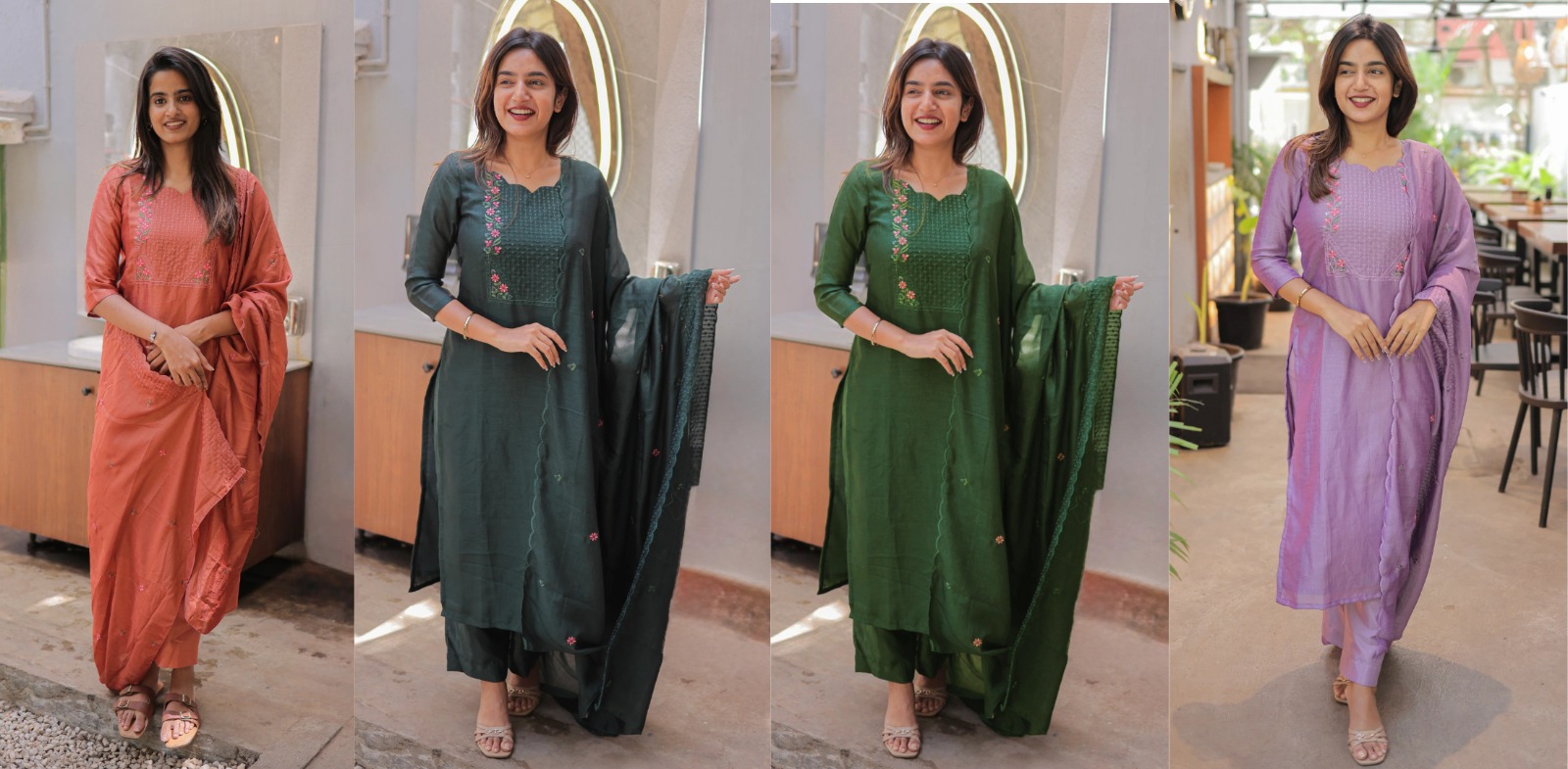
Cotton, rayon and khadi suits usually pair well with cotton, mulmul, voile or lightweight printed dupattas. Breathable fabrics maintain movement and are practical for warm weather. The Vertical Cotton Straight Kurta Set with Dupatta suits a restrained contrast such as indigo with white, mustard with cream or maroon with beige because the colour provides interest without adding unnecessary weight.
The Cream Khadi Cotton Straight Kurta Set with Dupatta can take a hand-block-inspired, striped or solid contrast in earthy shades. Rust, brick, olive and indigo complement khadi's matte texture more naturally than highly glossy satin. A contrast dupatta in a similarly breathable fabric is also easier to pin and less likely to slide during a long day.
The Cream Printed Straight Kurta Set with Dupatta can be styled for daytime by selecting a dupatta that repeats one muted print shade. A structured shoulder drape, small studs and flat footwear keep the straight suit practical. A highly saturated contrast can still work, but one other styling element should remain quiet.
Silk blends and festive fabrics
Silk-blend straight suits can carry richer contrast because their sheen already signals occasion dressing. A jewel-toned dupatta, narrow zari edge or woven border can make the outfit suitable for a reception, Diwali gathering or evening celebration. The Red Silk Blend Floral Straight Suit with Dupatta benefits from a colour choice that echoes the floral details instead of adding a completely unrelated metallic tone.
Fabric contrast can be as important as colour contrast. A matte cotton kurta with a softly lustrous silk-blend dupatta looks layered and considered, while a shiny kurta paired with a glossy dupatta may reflect too much light. For comfort, check whether the dupatta is broad enough to cover the shoulder securely and whether the fabric can be folded without bulky creases.
Dress for the Occasion
The right contrast depends on the formality, lighting and movement expected at the event. Daytime, workwear and festive evening dressing each favour a different level of colour and surface detail.
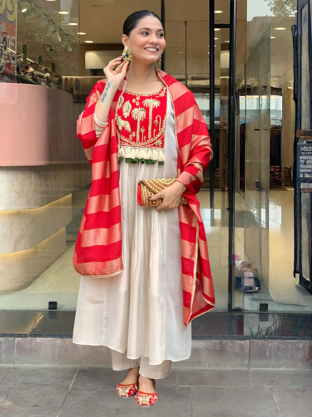
For office wear and daytime events
Office wear and daytime events generally suit low-to-medium contrast with matte fabrics and controlled prints. Pair a pale kurta with indigo, muted green or terracotta, or pair a dark kurta with cream, beige or soft grey. Keep the dupatta border narrow and avoid combining a bold print, heavy tassels and large jewellery in the same outfit.
A straight suit with a contrast dupatta also works well for a Haldi ceremony when the colours are bright but the fabric remains comfortable. Yellow with pink, orange with green or ivory with turmeric yellow can look celebratory without requiring heavy embellishment. Cotton, rayon and lightweight silk blends are practical choices when the event involves standing, movement and outdoor heat.
For weddings and festive gatherings
Weddings and festive gatherings can support stronger contrast, metallic borders and more visible texture. Red with pink, emerald with ivory, cobalt with mustard and plum with rose are effective combinations when the garment's print remains controlled. Zari, sequins or woven borders should ideally repeat a detail already present in the suit.
The Black Red Fendy Silk 3 Piece Readymade Salwar Suit Set offers a naturally dramatic base, so the contrast should reinforce its black-and-red direction rather than introduce several new colours. Gold accessories can connect with warm details, while silver accessories can sharpen black without necessarily complementing a warm red surface.
For regional and craft-led styling
Regional textile references provide useful colour starting points, but they should not be mixed indiscriminately. Kalamkari Print Salwar Suits often suggest natural reds, indigo, mustard and cream. Gujarat Bandhej Salwar Suits can invite bright complementary colour, while Odisha Sambalpuri Salwar Suits can take red, black, white and woven-border combinations.
Maharashtra Paithani Inspired Salwar Suits often work with jewel tones and carefully placed metallic accents. Punjab Patiala Salwar Suits can support a livelier contrast because the styling tradition welcomes energetic colour and movement. The regional reference should guide the palette, while the actual fabric, print scale and occasion should determine how much contrast appears in the final outfit.
Use Accessories Carefully
A contrasting dupatta needs accessories that connect with one or two existing colours rather than compete with every shade in the outfit. Repeating a dupatta colour in earrings, bangles, footwear or a small handbag is usually enough to make the styling look deliberate.
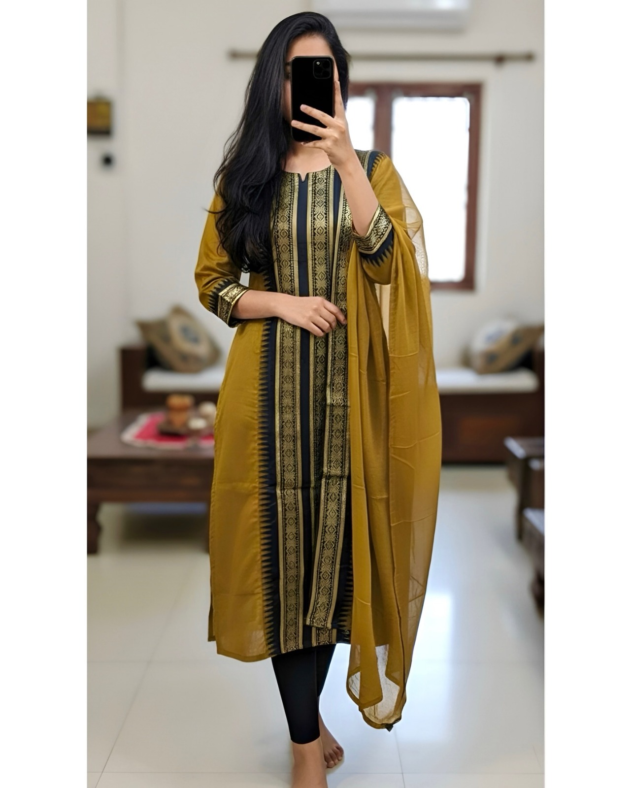
The Black White Floral Embroidered Readymade Salwar Suit can take red bangles or a red potli if the dupatta introduces red. A cream suit with an indigo dupatta can be finished with blue earrings or neutral sandals. Matching every accessory exactly to the dupatta can make the outfit look overly coordinated, so a related shade is often more sophisticated.
Drape also changes the visual impact of contrast. Wearing the dupatta open over both shoulders distributes the colour evenly. Carrying one end over the opposite shoulder creates a diagonal line and adds movement. A neat front pleat makes a strong contrast look more formal, while a relaxed one-shoulder drape suits daytime dressing.
Before leaving home, check the outfit in natural light and from a distance of about two metres. Artificial indoor light can make red, purple and green appear darker than they will look outdoors. A full-length mirror reveals whether the dupatta interrupts the vertical line gracefully or creates an unintended block across the torso.
Apply the Final Decision Rule
A straight salwar suit needs a contrasting dupatta when the contrast solves a visible styling problem without creating a second competing focal point. If the kurta is plain, a stronger dupatta can add character. If the kurta is already ornate, a quieter contrast usually gives the outfit better balance.
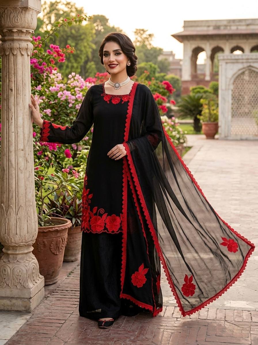
Use a three-part check before choosing. First, identify the dominant colour or pattern on the kurta. Second, select a contrast that repeats a minor shade or creates a controlled light-dark difference. Third, reduce jewellery, border detail or print intensity if the dupatta becomes the strongest element.
The Cream Pink Printed Rayon Readymade Salwar Suit may need only a tonal pink dupatta for a polished daytime look, while the Black Red Fendy Silk 3 Piece Readymade Salwar Suit Set can carry a more dramatic festive contrast. The same rule applies across cotton, khadi, rayon and silk blends: colour should clarify the outfit's purpose, not merely make it louder.
A matching dupatta remains the better choice when the suit has elaborate embroidery, a distinctive woven border, several colours or a fabric that already carries strong sheen. Contrast is a styling option, not a requirement. The most successful straight salwar suit looks balanced when the kurta, dupatta, accessories and occasion all speak at a similar visual volume.
Common Questions About Contrasting Dupattas for Straight Salwar Suits
When does a straight salwar suit need a contrasting dupatta?
A straight salwar suit needs a contrasting dupatta when the kurta looks visually flat, has a simple silhouette, or contains a secondary colour that can be repeated in the drape. A matching dupatta is usually better for heavily embroidered, multicoloured or strongly bordered kurtas.
Should a printed straight suit have a plain or printed dupatta?
A printed straight suit usually looks more balanced with a plain dupatta, especially when the print is dense or multicoloured. A printed dupatta can work with a lightly printed kurta when both pieces share an anchor colour and their motifs differ in scale.
Which dupatta colour suits a cream straight salwar suit?
Cream straight salwar suits pair well with red, wine, rust, indigo, emerald, black and dusty pink dupattas. Choose a deeper shade for evening contrast and a muted earthy or tonal shade for daytime styling.
Can a straight salwar suit have a contrasting dupatta for office wear?
A straight salwar suit can have a contrasting dupatta for office wear when the contrast is controlled and the fabric is comfortable. Indigo with cream, muted green with beige and terracotta with ivory are practical combinations with restrained borders and modest prints.
How do I match a dupatta with a silk-blend straight suit?
Match a silk-blend straight suit with a dupatta that repeats one colour from the print, border or embroidery. A softly lustrous dupatta with a narrow zari edge can look festive, but combining several glossy surfaces may make the outfit appear heavy.
Is a contrasting dupatta suitable for a Haldi ceremony?
A contrasting dupatta is suitable for a Haldi ceremony when the colours are bright and the fabric remains lightweight enough for movement. Yellow with pink, orange with green and ivory with turmeric yellow create festive contrast without requiring heavy embellishment.