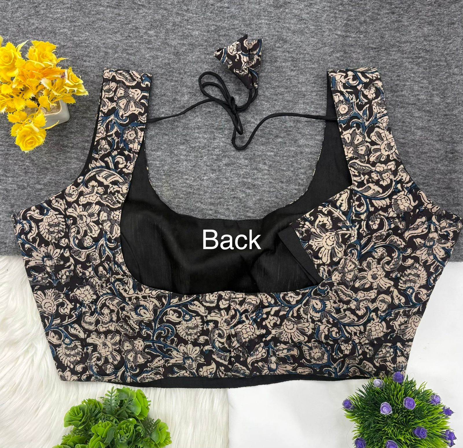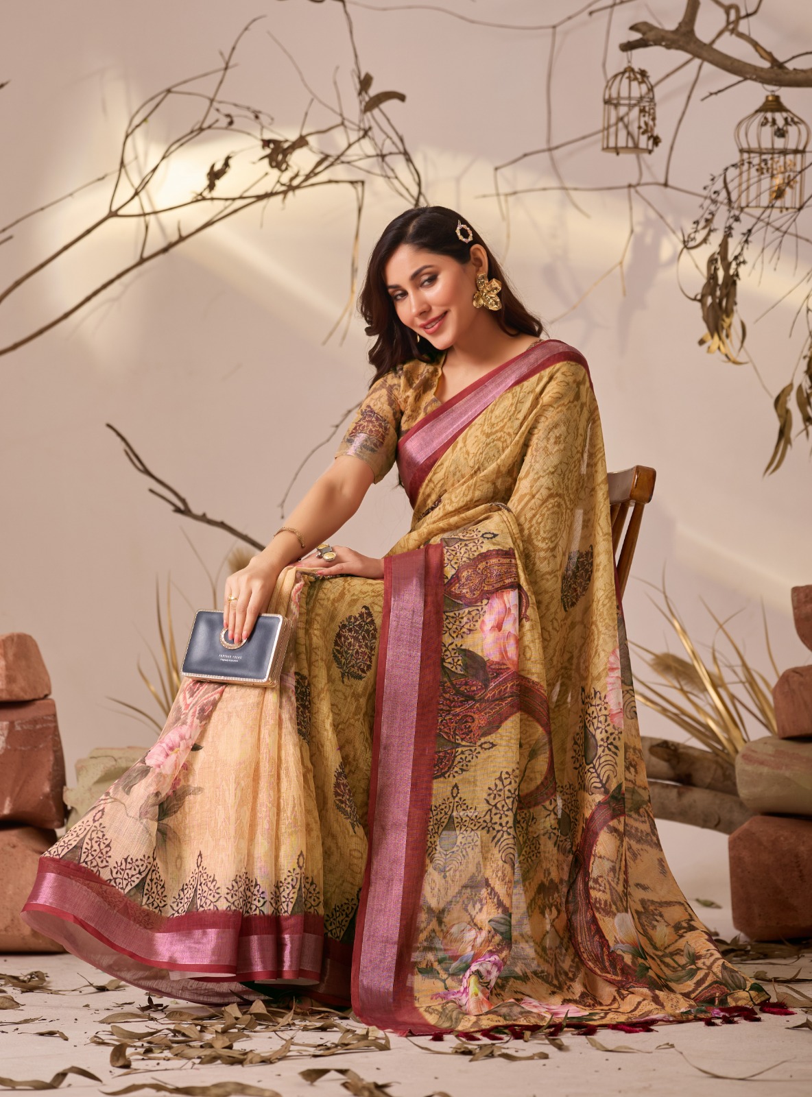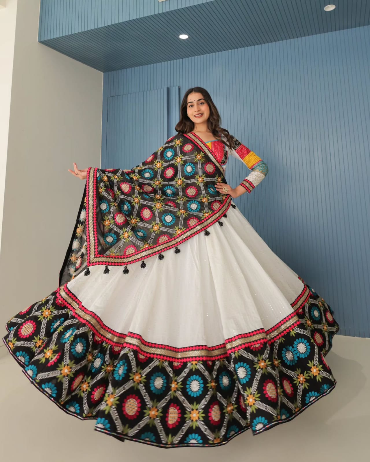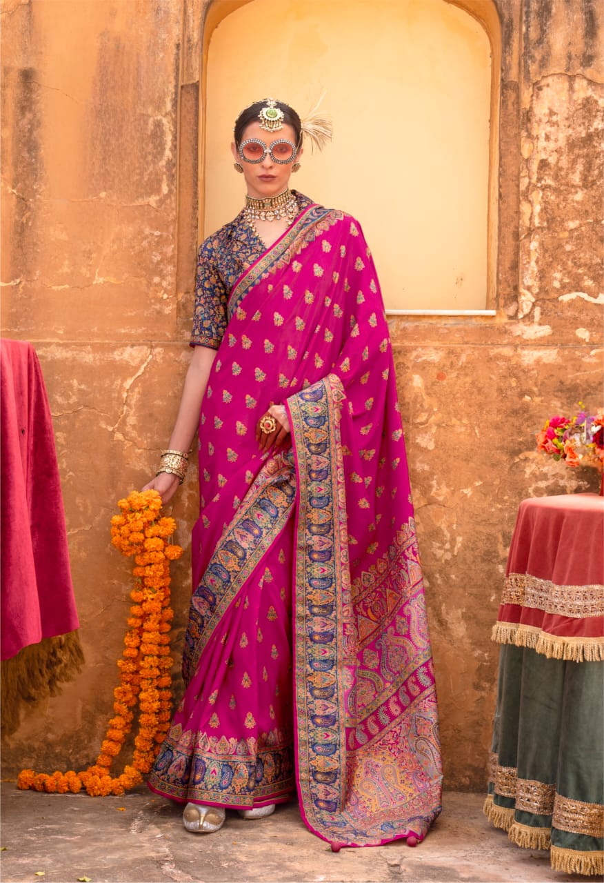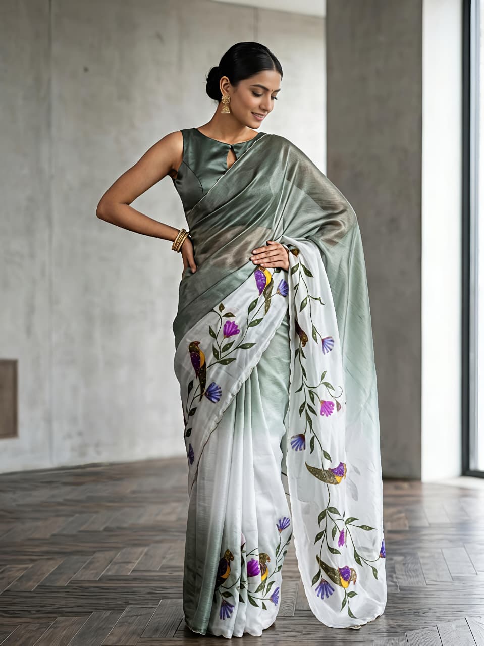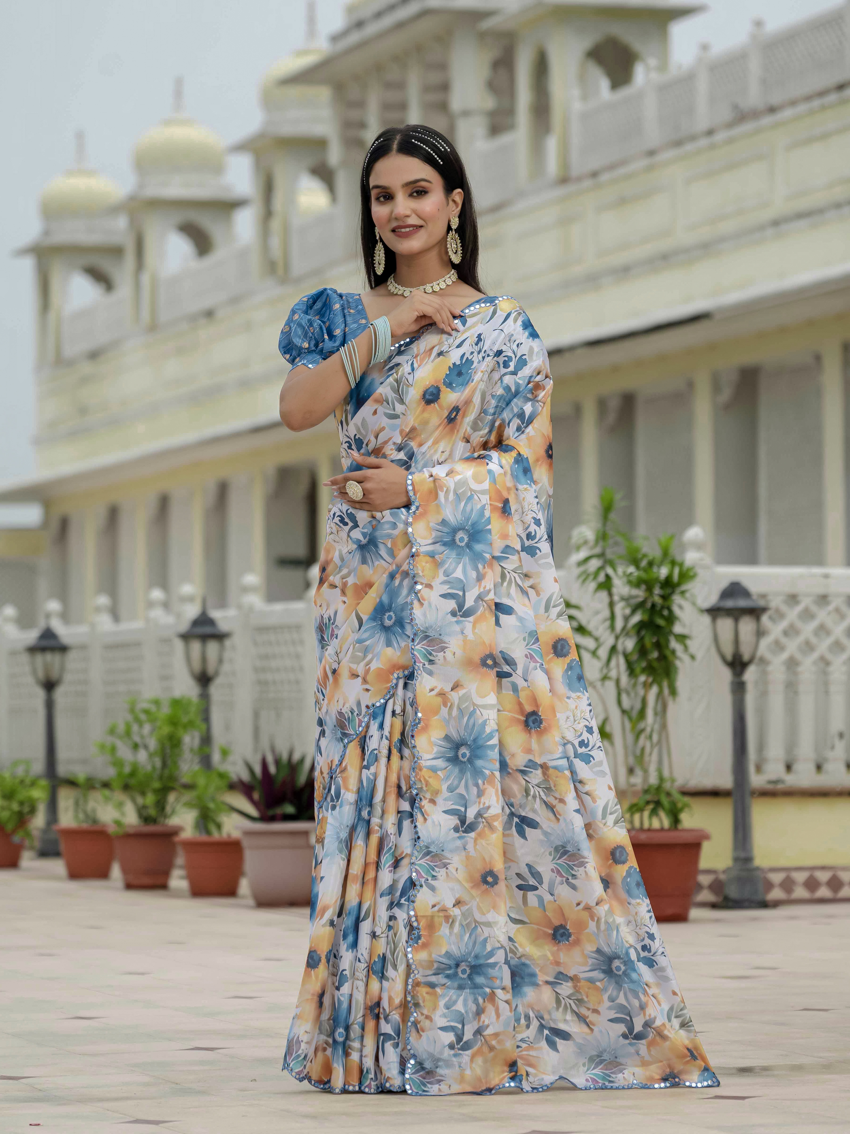
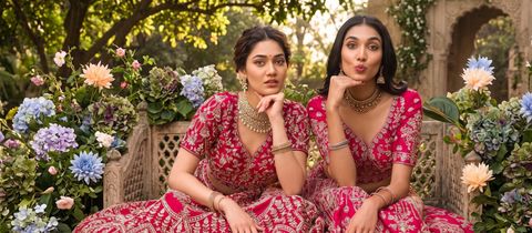
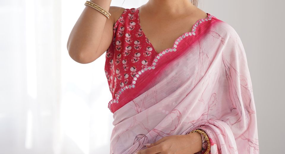
How to Pick Blouse Color for a Saree becomes much easier when you stop treating the blouse as a separate purchase. The saree's dominant colour, undertone, border, print, fabric texture and the formality of the event all provide clues. A pink floral Chinon saree may need a quiet rose or ivory blouse, while a plain Royal Blue Linen Saree with Vibrant Orange Border Design can support a more deliberate orange contrast. The most reliable choice is the shade that either repeats an important saree detail or creates a controlled contrast.
How to Pick Blouse Color for a Saree: Start With the Saree's Visual Hierarchy
The blouse colour should support the saree's most noticeable feature rather than compete with every feature at once. Identify the colour that occupies the largest area, the colour that appears in the border or motif, and the colour that catches attention first when the saree is viewed from a distance.
A useful three-step test is to place the saree in natural daylight, name its dominant colour, and then identify one secondary colour. The dominant colour usually creates a matching or tonal blouse, while the secondary colour provides a safe contrast. A third colour is worth considering only when the saree has a strong printed, embroidered or woven detail that clearly justifies it.
- Dominant colour: Use it for a polished monochromatic look or choose a nearby shade for subtle depth.
- Border colour: Use it when you want the blouse and pallu to frame the saree clearly.
- Motif colour: Use it for a contrast blouse, especially when the print has repeated flowers, leaves or geometric shapes.
- Metallic detail: Use gold, silver or antique tones only when zari, sequins or metallic embroidery is substantial enough to balance the blouse.
The same rule works across different fabrics. A Banarasi silk saree with a dense zari surface can take a solid jewel-tone blouse, whereas a lightweight printed saree often looks better with a colour extracted from one small motif. Colour placement matters as much as colour selection because a blouse occupies the upper frame of the outfit and sits close to the face.
Matching, Tonal or Contrast: Which Blouse Strategy Works?
Matching, tonal and contrast blouses each work well, but the right strategy depends on the saree's pattern density and the impression you want to create.
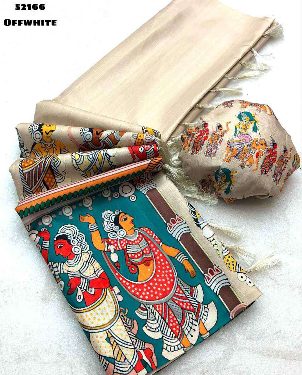
Matching blouse colours
A matching blouse repeats the saree's main colour and gives the outfit a continuous, streamlined appearance. Matching works especially well for solid sarees, formal silk sarees and sarees with elaborate borders because the blouse doesn't interrupt the saree's visual flow.
Exact colour matching isn't always necessary. A blouse in the same colour family can look more considered than a supposedly identical shade that differs visibly under indoor lighting. For example, a deep rose blouse can sit comfortably with a medium pink saree, while a bright fuchsia blouse may make the saree look dull by comparison.
Tonal blouse colours
A tonal blouse uses a lighter or darker version of the saree colour. Tonal dressing adds dimension without introducing a new hue. Powder blue with sky blue, blush pink with rose pink, and wine with maroon are dependable combinations because the eye reads them as related shades.
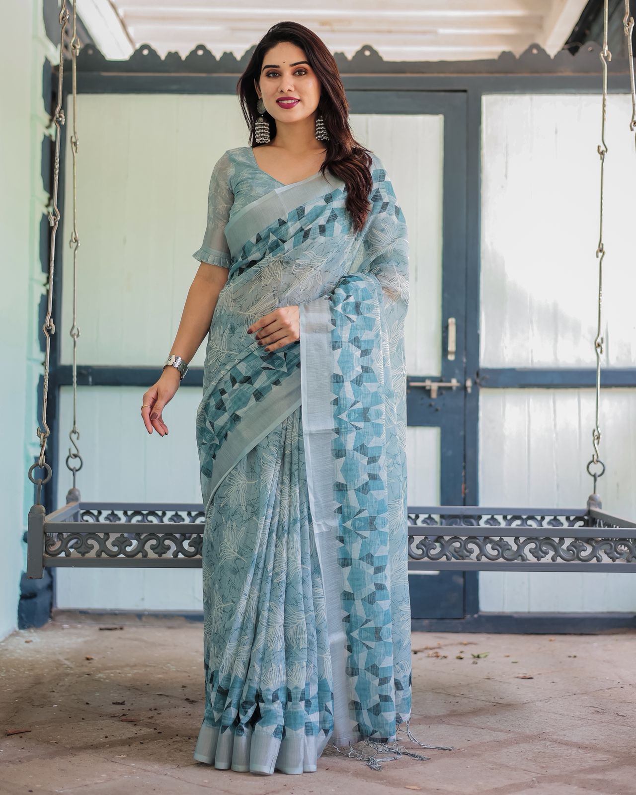
Tonal combinations are particularly useful for office sarees, daytime celebrations and minimal styling. A Pastel Blue Pure Linen Printed Saree with Blouse can be paired with a muted blue blouse for a calm result, provided the blouse fabric has enough structure to balance the relaxed linen texture.
Contrast blouse colours
A contrast blouse introduces a different colour that's already present in the saree or sits opposite it on the colour wheel. Contrast works best when the saree is plain, has a defined border, or contains a small but repeated accent colour.
Orange with royal blue, green with magenta, mustard with purple, and red with teal are high-impact combinations, but saturation should be controlled. A bright orange blouse with a muted blue saree can appear disconnected; a rust, terracotta or burnt-orange blouse may create a more balanced result.
Use Undertones Before You Compare Colour Names
Undertone matters because two colours with the same name can look different against the skin and beside the saree. Warm colours contain yellow, orange or red, while cool colours contain blue, violet or grey; neutral colours sit between those families.
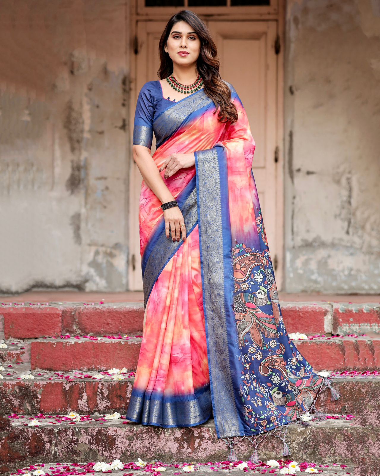
Warm pinks, coral, peach, rust, tomato red and mustard generally harmonise with warm sarees such as cream-gold, marigold, coral, warm red and olive. Cool pinks, lavender, blue-red, emerald, cobalt and icy blue usually suit cool sarees such as lilac, sky blue, blue-green and cherry-toned pink.
Neutral blouse colours are valuable when a saree combines several shades. Ivory, beige, charcoal, black, navy and soft metallics can calm a multicoloured print, although the neutral should relate to the saree's intensity. A black blouse can anchor a dramatic print, but it may look too severe beside a delicate pastel floral saree unless black appears in the print or accessories.
Skin tone doesn't impose a fixed colour rule. A blouse should first coordinate with the saree, then flatter the wearer's face. Holding the blouse fabric near the face in daylight reveals whether a shade creates brightness or makes the complexion appear grey, yellow or overly red.
Let Borders, Prints and Zari Decide the Blouse
The saree's border and surface design often provide a more accurate blouse colour cue than the base fabric. Repeating a border colour creates intentional coordination, while repeating a small motif colour creates a livelier contrast.
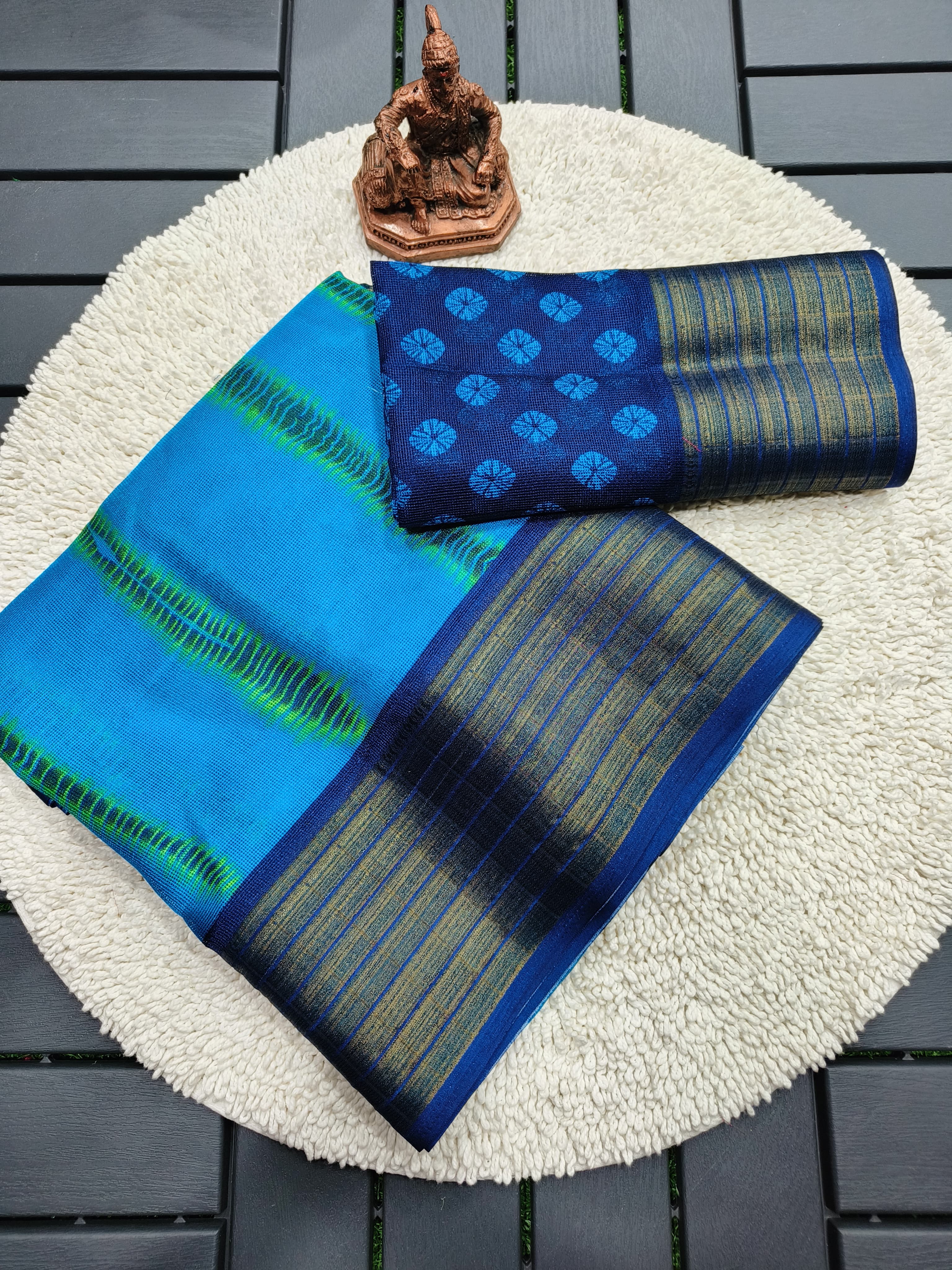
Printed sarees
Printed sarees usually look best with a solid blouse in one of the print colours. Choose the least dominant print shade when the floral or geometric pattern is busy; choose the strongest accent when the print is sparse and the blouse needs to become a visible styling element.
The Soft Pink Floral Chinon Saree for Women illustrates why print scale matters. A dusty rose, ivory or muted green blouse can pull out its floral character without adding another pattern. A heavily embroidered blouse would compete with the soft fall of Chinon unless the event specifically calls for a more ornate look.
The Pastel Linen Cotton Floral Print Saree with Designer Blouse and the Pastel Linen Cotton Floral Print Saree with Designer Blouse both demonstrate a practical principle for daytime dressing: a floral saree can carry a blouse in a quiet solid shade when the print already supplies visual interest. Repeating a single flower colour is usually more elegant than matching every flower.
Bordered sarees
A border gives you a ready-made contrast option. The Royal Blue Linen Saree with Vibrant Orange Border Design can be styled with orange to highlight the border, royal blue for continuity, or a neutral beige to soften the contrast for daytime wear.
Keep the blouse neckline and embellishment simpler when the border is broad or highly decorative. A broad zari border already creates a strong horizontal line, so a blouse with a heavy contrasting neckline may make the upper body look visually crowded.
Zari and metallic details
Gold zari pairs naturally with warm colours such as maroon, rust, mustard, bottle green and deep pink, while silver zari often works with cool pink, blue, lavender, charcoal and emerald. The metallic thread doesn't require a metallic blouse; a plain colour that echoes the saree generally looks more refined.
The Pink Woven Zari Silk Blend Saree With Brocade Blouse can support a deeper pink, wine or antique-gold direction because the woven zari and brocade already make the outfit festive. Introducing a completely unrelated neon shade would distract from the textile detail.
Match the Blouse Colour to the Fabric and Occasion
The fabric and event should influence colour intensity, finish and contrast level. A colour that succeeds at a sangeet may feel excessive at work, even when the saree remains the same.

- Workwear: Choose tonal, neutral or low-contrast colours with matte fabrics. Blue, charcoal, beige, muted green and dusty rose are easier to repeat across office wardrobes.
- Daytime festivities: Use fresh colours such as coral, powder blue, leaf green, peach or soft yellow, but keep metallic work limited if the event is outdoors.
- Wedding ceremonies: Richer colours such as wine, emerald, magenta, royal blue and antique gold can match the visual weight of silk, brocade and zari.
- Haldi ceremony: Yellow, marigold, green, pink and orange create a celebratory palette. A washable blouse lining and colourfast fabric matter because turmeric, oil and outdoor dust can mark garments.
- Evening receptions: Deeper shades and reflective details work well under artificial lighting. Navy, black, plum, bottle green and jewel-toned pink usually retain definition better than very pale pastels.
The Sky Blue Party Wear Saree with Embroidered Blouse already includes a strong occasion signal through its embroidery. A blouse in sky blue, silver-grey or a restrained cool pink keeps the outfit balanced, while a second heavily embellished colour can make the styling look fragmented.
Fabric texture also changes how colour is perceived. Chanderi can make a shade look airy because of its transparency and sheen, linen can mute saturated colours through its matte surface, and silk can deepen colour through its reflective weave. A Black Maroon Chanderi Printed Saree for Women therefore suits a good maroon, black or antique-gold blouse depending on whether the desired result is understated, dramatic or festive.
A Practical Colour-Picking Method Before You Buy
A five-minute comparison can prevent most blouse-colour mistakes. Lay the saree flat, place two or three blouse options beside the pallu, and assess the combination in daylight before checking it under warm indoor light.

- Photograph the saree: Take one photo in daylight and one indoors because cameras and bulbs can shift pink, blue and green noticeably.
- Crop the palette: Identify the dominant shade, the border shade and one small accent shade.
- Test three directions: Compare one matching option, one tonal option and one contrast option.
- Check distance: Step back two metres. A colour that looks attractive close up may overpower the saree from normal viewing distance.
- Check the face: Hold each blouse near the face, not only against the saree, and remove shades that make the skin look tired.
- Check the neckline area: Consider whether the blouse will show under the pallu. A high-contrast blouse becomes more prominent with a seedha pallu or a narrow drape.
- Check the reuse value: A solid blouse in navy, ivory, black, maroon or muted pink may work with several sarees and justify a better fabric or tailored fit.
Online colour selection needs an additional check because product photography can vary with screen brightness. Read the fabric description, inspect close-up images, and compare the blouse shade with the saree's border rather than relying only on the product title. A blouse labelled pink may be blush, rose, fuchsia or mauve in practice.
Shopping and Styling Choices That Make Colour Easier
A coordinated blouse doesn't need to be bought as part of the same set, but the neckline, sleeve length and fabric weight should suit the saree. A structured blouse can give linen and cotton sarees shape, while a softer blouse can preserve the fluid movement of Chinon or lightweight synthetic fabrics.
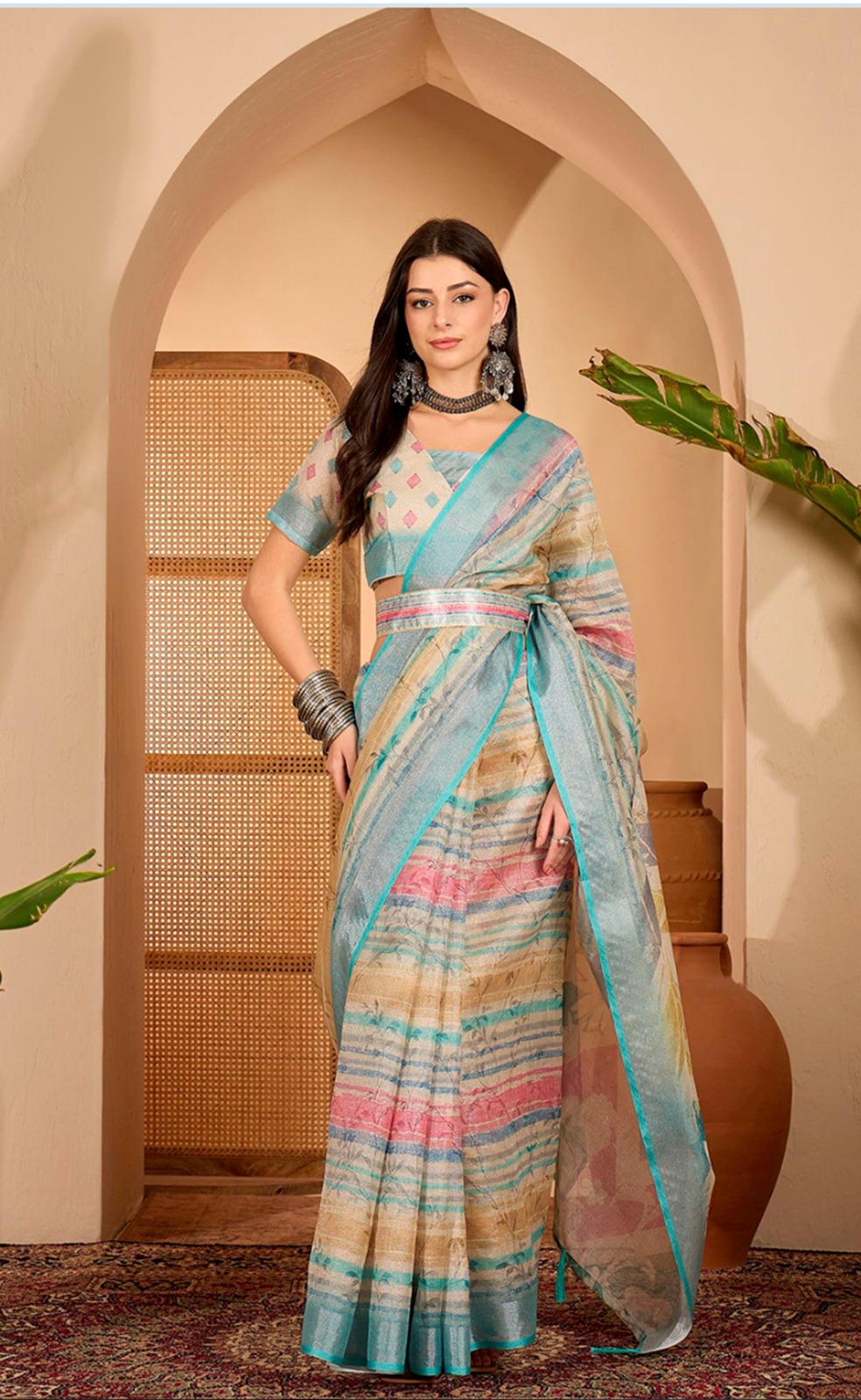
Budget-conscious shoppers can build a useful blouse wardrobe without buying one for every saree. Collections such as Sarees from Rs 1000 to Rs 1500 can be approached with a plan to reuse neutral blouses, while sale edits such as Sarees Under 20% Off and Sarees Under 10% Off may make it easier to choose a printed saree around an existing blouse.
Discount percentage should never be the reason for choosing a difficult colour. A blouse that works with three sarees is more useful than a heavily reduced blouse that matches only one garment. Deep maroon, ivory, black, navy, antique gold and muted pink are practical starting points, but personal wardrobe colours should guide the final choice.
For statement dressing, a sharper contrast is justified when the saree has a quiet base. For refined dressing, repeat one shade and let jewellery provide the secondary accent. The most successful blouse colour usually has a visible relationship with the saree even when the pairing isn't an exact match.
Common Blouse-Colour Mistakes to Avoid
The most common mistake is matching the blouse to a colour that appears only once in a print. A single tiny blue leaf can't always support a bright blue blouse, especially when the saree's main colour is warm pink or beige.
Another mistake is ignoring value, which means how light or dark a colour appears. A pale blouse beside a very dark saree creates strong separation, while two mid-tone colours may blend together and make the outfit look flat. Taking a black-and-white phone photograph can reveal value contrast more clearly than a colour image.
Overmatching metallic details can also reduce sophistication. Gold zari doesn't require gold fabric, gold jewellery and a gold blouse simultaneously. One metallic element, supported by a related solid shade, is often enough.
Finally, don't choose colour without considering the drape. A blouse that shows only at the shoulder and sleeve can be more adventurous than a blouse exposed across the entire upper torso. Drape style, pleat width, neckline and sleeve length change how much colour enters the overall composition.
How to Pick Blouse Color for a Saree ultimately comes down to reading evidence already present in the garment. Start with the dominant shade, test the border and motif colours, compare matching against tonal and contrast options, then filter the result through the fabric, occasion, lighting and your own complexion. That process produces a blouse that looks intentional rather than merely similar.
Real Questions About Choosing a Saree Blouse Colour
Should a saree blouse match the saree exactly?
A blouse does not have to match the saree exactly. A tonal shade, a border colour or a repeated motif colour can create a more balanced pairing than an imperfect exact match.
Which blouse colour suits a printed saree?
A solid blouse in one of the printed saree's colours usually suits a printed saree best. Choose a less dominant print colour when the pattern is busy, and use the strongest accent when the print is sparse.
Can I wear a contrast blouse with a silk saree?
A contrast blouse works well with a silk saree when the contrast colour appears in the border, motifs or zari styling. Royal blue with orange, maroon with mustard and emerald with pink are effective when their saturation and fabric weight are compatible.
What blouse colour goes with a pastel saree?
Pastel sarees pair well with a tonal pastel, ivory, soft grey or a deeper version of one pastel shade. A saturated contrast can work for evening wear, but a muted contrast is usually more harmonious during the day.
How do I choose a blouse colour for a saree online?
Compare the saree's dominant, border and accent colours from close-up images before choosing a blouse. Check the shade in both daylight and indoor photographs because screens and lighting can alter pink, blue and green significantly.
Which blouse colours are most versatile with sarees?
Ivory, black, navy, maroon, muted pink and antique gold are among the most versatile blouse colours. Their usefulness depends on fabric, neckline and embellishment, so a solid blouse with moderate detailing generally offers the widest reuse.